Medal of Honor Warfighter
August 2011 ––While serving as Design Director at the Black Swamp, munkowitz was asked by Electronic Arts to concept and design the Player Menus & HUD for their upcoming release Medal of Honor - Warfighter. So the crew at the Swamp, under munko's direction, crafted an array of deliverables that sought to push the narrative envelope of menu systems while focusing on usability and engagement.
The Design
–– 01
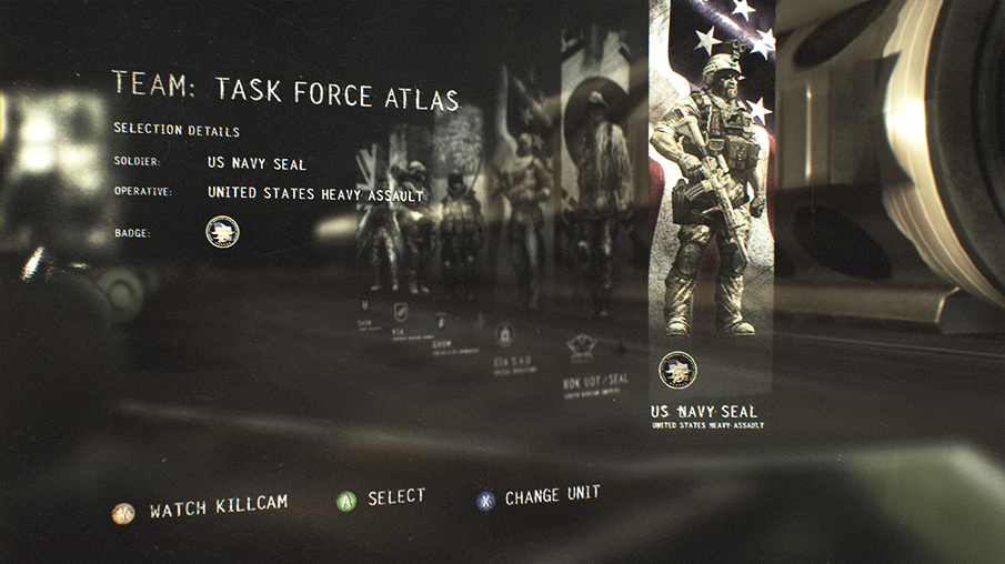
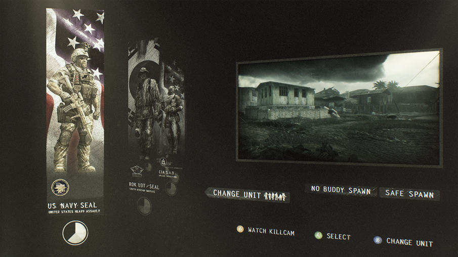
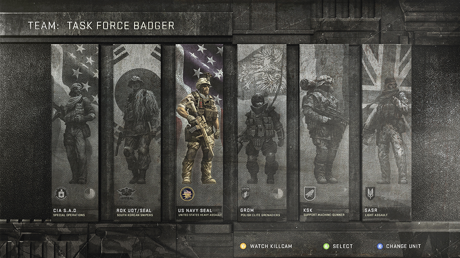
Player Select Screen
–– 02For the player-select screens, they took the traditional menu system that gamers have been accustomed to and challenged themselves to create something more cinematic. They felt a narrative approach would grasp the gamer from the start, pulling them into a world instantly instead of keeping them at arms length till the game begins. By moving between Point-of-View to Macro shots of a weapon being assembled they created atmosphere, depth and a tension that is usually reserved for in-game cinematic and game- play.
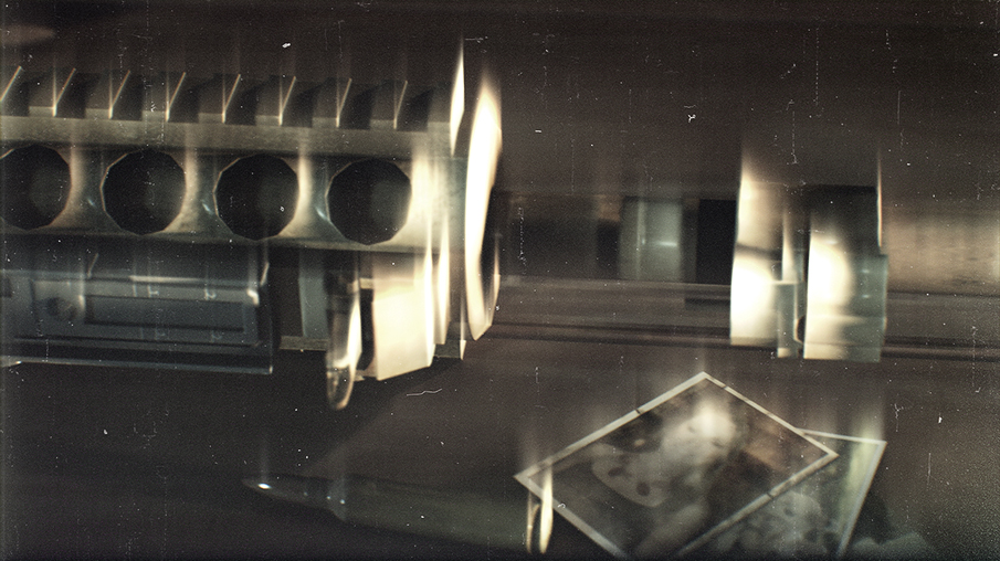
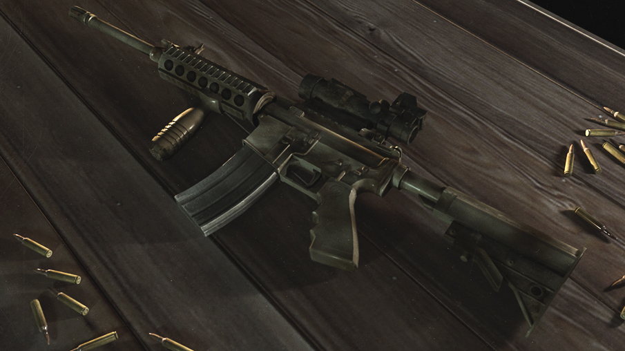
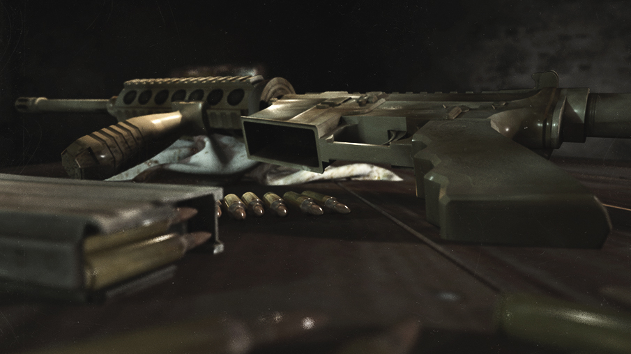
There is something incredibly beautiful about high frame rate cinematography, especially when applied to objects deconstructing or, in this case, being destroyed. They applied this technique to the scene in selection moments to establish a hypnotic visual that both mesmerizes the gamer while controlling the pulse of his/her actions. Everything is happening all at once, and its only in these moments where the gamer makes their selection that we slow down - their ‘training’ as the warrior makes time nearly freeze as choices are made.
Starting on an intense view of an assault out a window, we pull back into our current shelter. Our weapon, ready to go, is assembled piece by piece as we navigate the menu. This drives the narrative: a soldier getting ready for the fight of his life. When all selections are made we push back to the window, where the first shot is fired.

Hud Design
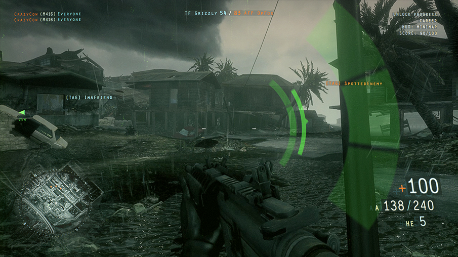
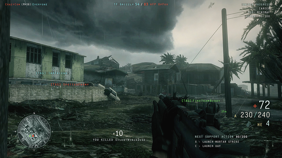
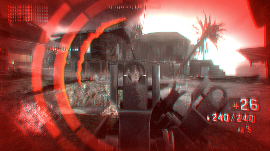
–– 03For the HUD of Medal of Honor, they felt it was important to maintain a no-frills style of design in the elements that echoed the need for the gamer to get information quickly and effectively. When facing down a team on the other side of a ravine, the hail fire of bullets coming your way is enough indication to duck and cover. They didn’t want our interface to interfere with the tense reality of the situations created during the Medal Of Honor gameplay.
Keeping that in mind, They utilized an elegantly minimal style that acts as an organic extension of the gamer. Numbers pulse and shift in space as our warrior runs, ducks, pulls the trigger and even takes heavy fire. This subtle movement acts as part of the soldier, keeping the information ingrained in his/her psyche instead of acting as a blanket that keeps the user at arm-length. Its the difference between a simulation and pulling the gamer into the body of the warrior.
Keeping that in mind, They utilized an elegantly minimal style that acts as an organic extension of the gamer. Numbers pulse and shift in space as our warrior runs, ducks, pulls the trigger and even takes heavy fire. This subtle movement acts as part of the soldier, keeping the information ingrained in his/her psyche instead of acting as a blanket that keeps the user at arm-length. Its the difference between a simulation and pulling the gamer into the body of the warrior.


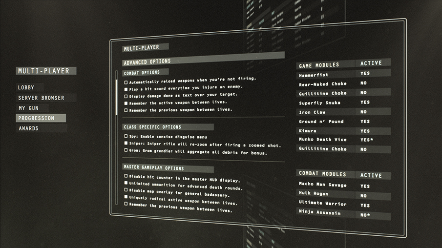
Information Screen
–– 04The information design during the initial setup of gameplay is important, enabling quick entry of the desired settings to usher in the gameplay. The BS team thought the best way to add flare and dimensionality was not in the information design, but in the way the screens transitioned from each other. They explored two different transition options to cycle through the screens, and also through the typography design and grid structure, defined a potential layout theory for the game.

Additional Design
–– 05During the first design submission - before the narrative-based menu system - the team explored a couple flat menu styles that the client hated. Regardless, they provide an interesting variation to the package.
Design 01: Each screen is custom designed to the ridges, curves, blocks and rivets of the metal, seeking to accommodate the respective information of the content. The rugged and industrial font choice focuses on legibility first and foremost, reflecting the no frills attitude of our tough-as-nails hero.
Design 02: The menu system has a hand-crafted aesthetic, inspired by the journal title sequence in Se7en. Items are scratched and scribbled onto distressed materials our soldier would use, including military manual pages, leather book covers and simple industrial surfaces he may come across. This helps us fashion a very personal menu system that reflects the journey and re- sourcefulness of our hero. The font is rendered as a hand-made distressed typeface - easily legible but reflecting the personal touches of our gritty soldier.
MOH Warfighter GFX Credit list
Design Company: BLACK SWAN
BS Executive Producer: Matt Winkel
BS Producer: Joyce Pancake
BS Creative Director: Nick Losq
BS Design Director: Bradley G Munkowitz
Lead Graphic Designer: Bradley G Munkowitz
Lead Graphics Animators: Chris Clyne, Nick Losq
Graphics Compositor: Bradley G Munkowitz
Design Company: BLACK SWAN
BS Executive Producer: Matt Winkel
BS Producer: Joyce Pancake
BS Creative Director: Nick Losq
BS Design Director: Bradley G Munkowitz
Lead Graphic Designer: Bradley G Munkowitz
Lead Graphics Animators: Chris Clyne, Nick Losq
Graphics Compositor: Bradley G Munkowitz