OFFF Cincinnati 2014
July 2014 ––Longtime friend and collaborator Hector Ayuso hit up the munkowitz to conceive the title sequence for the esteemed OFFF Conference, this iteration being held in beautiful Cincinnati, Ohio. For this particular task, munko reached out to his studio posse at the Autofuss - crafting a concept that would get as many of his loved ones involved in the spirit of collaboration, assigning each artist in the studio their own speaker title to design.
He then shot the whole damn thing with super DP Dr. Joseph Albert Picard, cut it with the great Ashley Rodholm, had a very fitting track composed by Harald Boyesen and colored the final cut with the always solid Carey Burens - the pure SF crew throwin' down on the Passion Project.. The best part is the final results are, well, rather unique for a title sequence, and that's the point my peoples.
He then shot the whole damn thing with super DP Dr. Joseph Albert Picard, cut it with the great Ashley Rodholm, had a very fitting track composed by Harald Boyesen and colored the final cut with the always solid Carey Burens - the pure SF crew throwin' down on the Passion Project.. The best part is the final results are, well, rather unique for a title sequence, and that's the point my peoples.
The Film
–– 01The Treatment
–– 02For the OFFF 2014 Cincinnati titles, we were seeking to break the norm and focus the sequence entirely on Typography. In some past sequences, the speaker names seem to be always be an afterthought, stamped on top of a short film just to accommodate the directive of someone's own personal project. In our title sequence, however, the typography ( and speaker name ) are the focus of the film.
We’ll build all the speaker names 100% practically, utilizing a variety of techniques from 3d printing, lazer-cutting, play on shadows and reflections, using natural elements to influence form and everything in between including classic set-making to construct a series of practical typographic setups.
We’ll then seamlessly move from setup to setup using time-lapse photography, only to lock-in the camera during the ‘presentation moment’ when the type construct is ready to be featured. These time-lapse builds and breakdowns of each setup will create intrigue for the final execution, and also to what speaker name will be manifested before our eyes.
The tone will be very theatrical, with the time-lapse moments between the ‘presentation’ and ‘build’ being more frenetic and free in tone and movement. However, both sequences married together will lead to the same ultimate result - to present the speaker names in a captivating and endearing way.
ANTON & IRENE
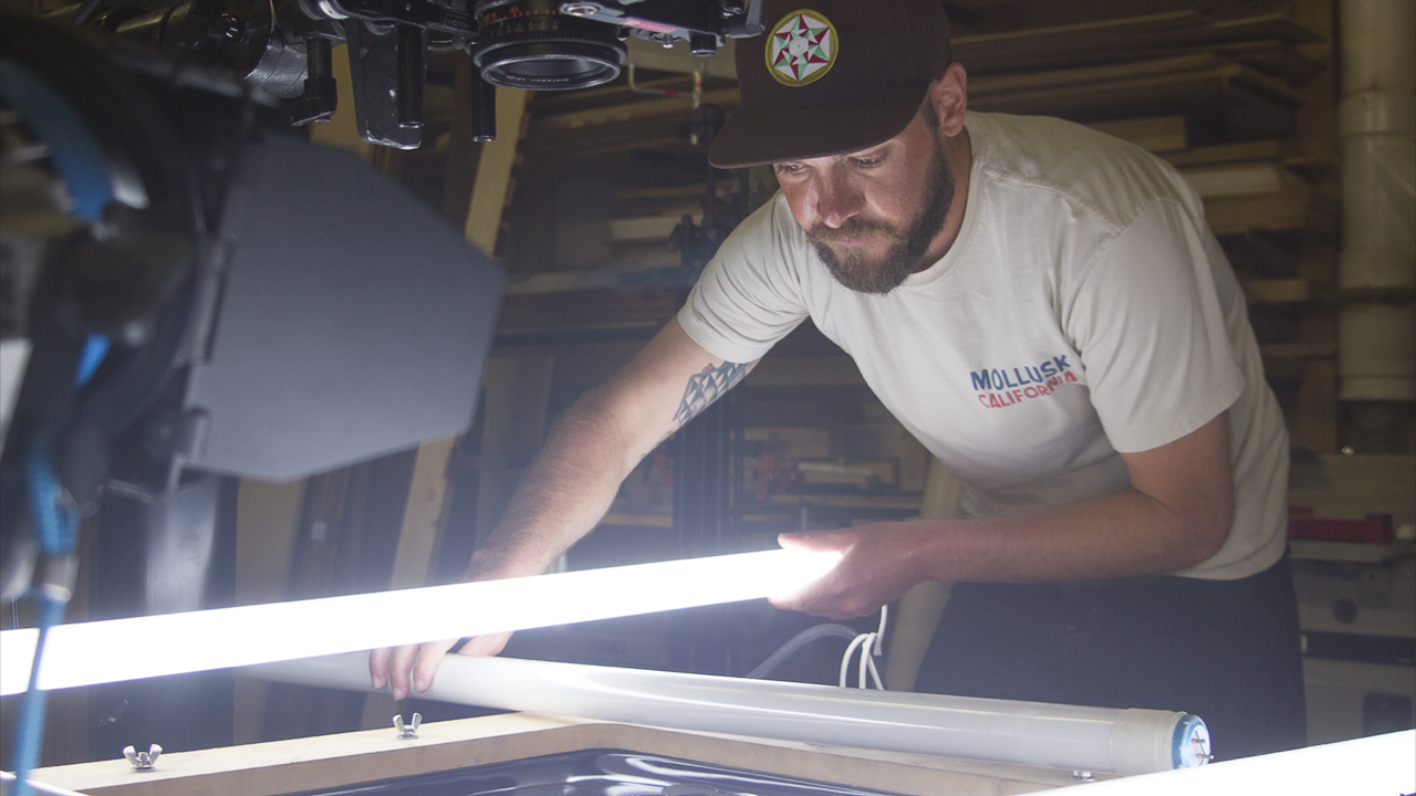
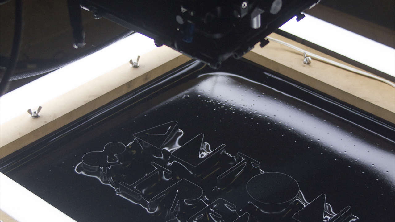
–– Designed by Peter ClarkFlexible Grid: Anton & Irene are information architects who reveal flexible solutions through their extensive exploration of interaction systems. We utilized their technique of reduction to reveal a flexible yet structured typographic surface.
Inspired by their process and Oskar Fischinger’s Lumigraph machine, we experimented with laser-cut typography and various forms of patterned styrene to create a flexible surface effect. We filmed the final reveal in slow motion, capturing all the sleek and sexy details of information reduction.

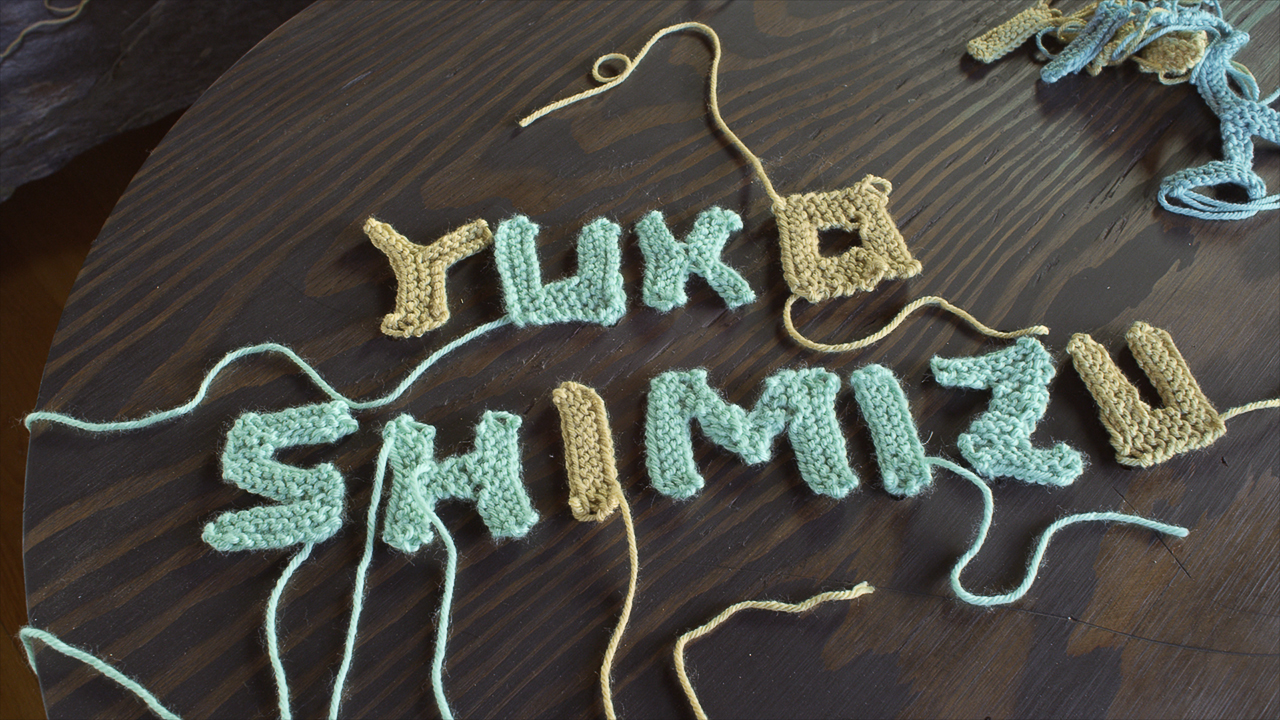
YUKO SHIMIZU
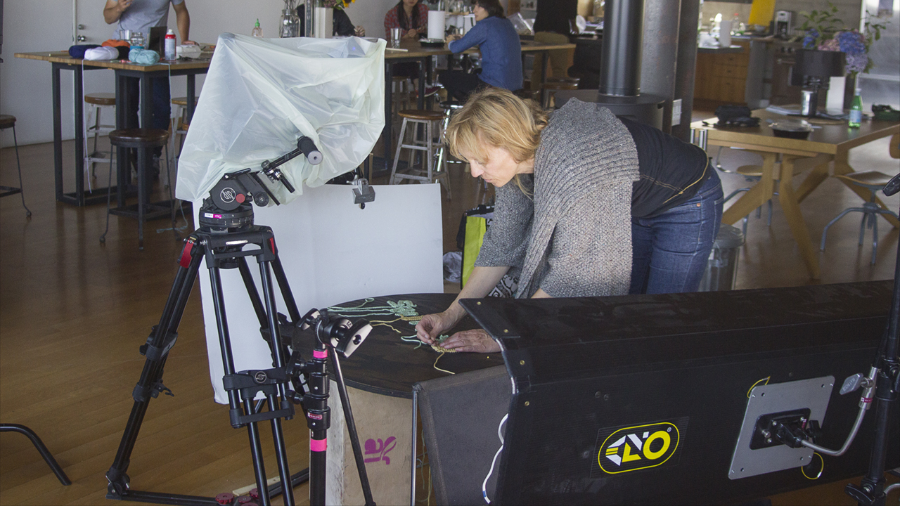
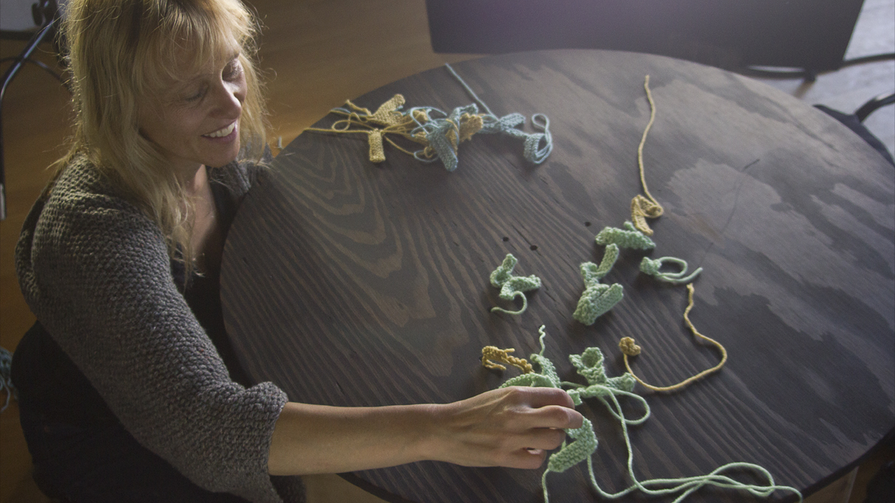
–– Designed by Kirsten RitschelKnitted Letters: Yuko Shimizu is a Japanese illustrator based in New York City and instructor at School of Visual Arts. Her quirky style, often illustrating some sort of entanglement inspired the use of yarn. In the sequence, we follow a person and watch her sit down and finish knitting the final piece as she puts the last letter on a coffee table.
We cut to a view above the coffee table, and see all the knitted letters lay out and spell her name.. We cut to a closeup to the knitted texture: lots of knots looped together, slowly unravel by pulling one string. We watch as all the letters de-integrate through the table as they are pulled. Someone picks up an unravelled piece of yarn, and with it walks over to the next scene to continue on to the next story.
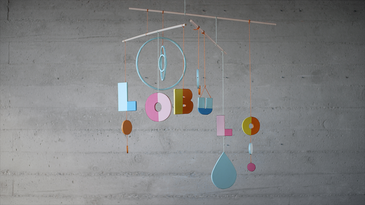
LOBULU
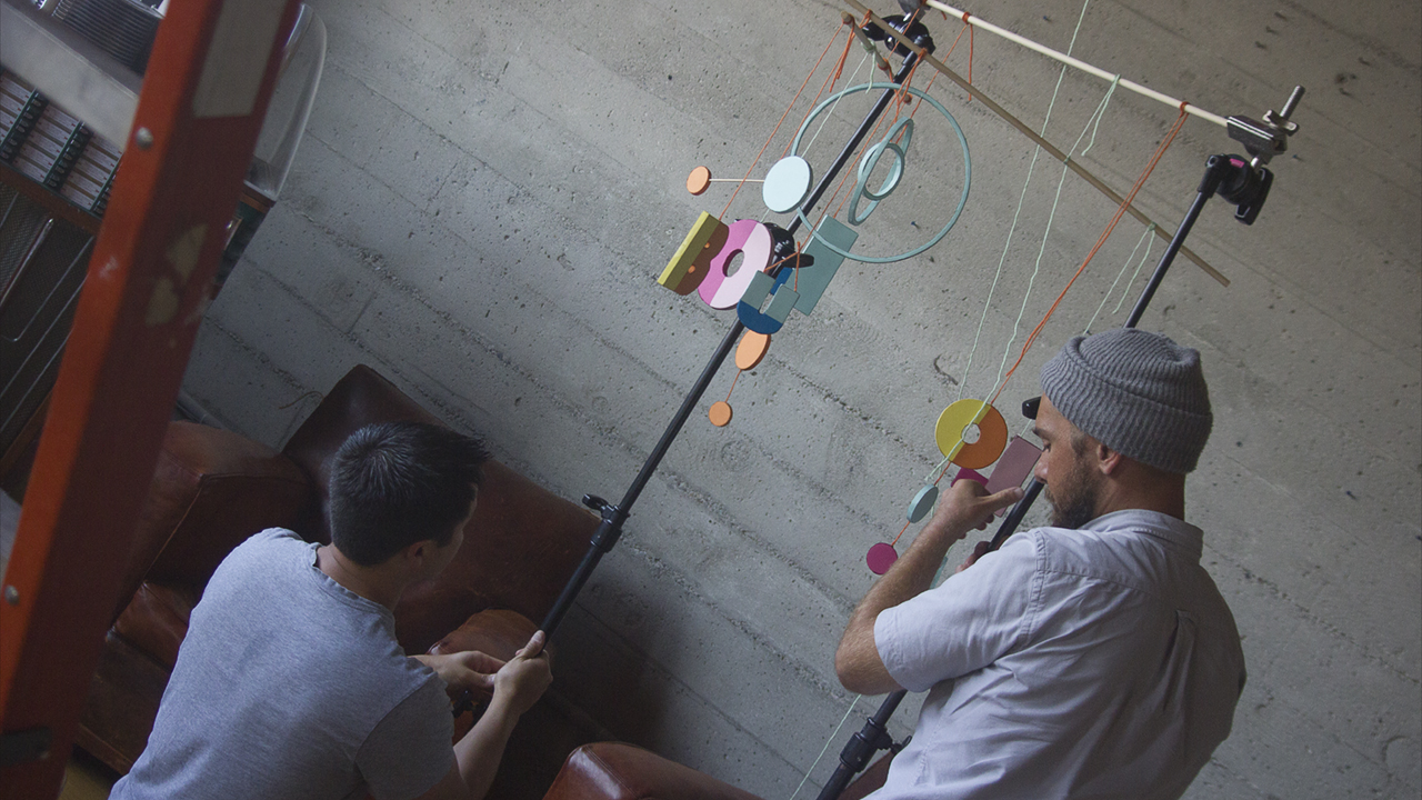
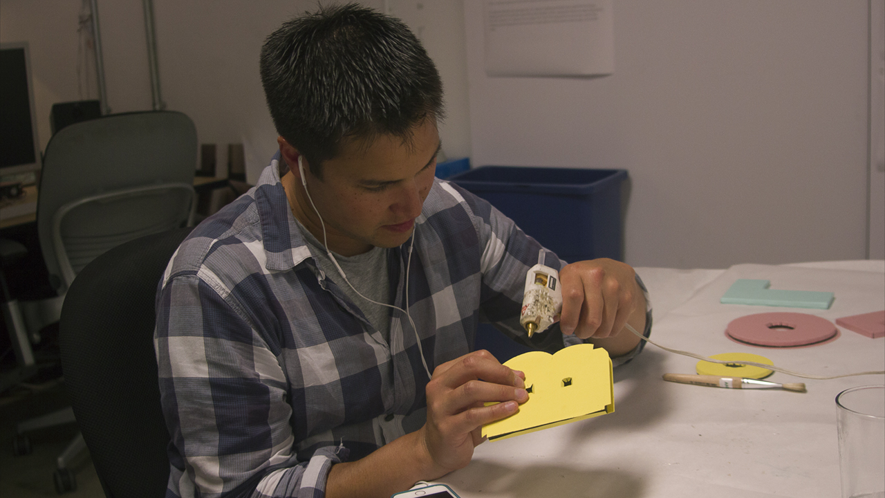
–– Designed by Ryan ChenMobile: This segment combined inspiration from Lobulo's whimsical paper craft style and suspended mobiles. We experimented with spatial relationships, positioning larger letters further from the camera while thinning the smaller type closest to the lens.
Each form was created with a laser cutter, wrapped in colorful paper, and hung from yarn strings. Their natural spinning created abstract compositions. During filming, Autofussers had to hold the letters still, then hit the floor so we could capture the type lockup in slow motion.

DIGITAL KITCHEN
–– Designed by Nate CostaMountain Type: Digital Kitchen is a group of creative misfits who together innovate and inspire. We took this idea of many parts woking together to create our topographic typography from which would capture projected light within a digital spectrum.
After experimenting with typography and cloth physics simulations we began fabricating using laser cut acrylics and animated light patterns to create the illuminated landscape as well as the letter forms which created a rich digital palette to introduce the innovative studio.
JAMES WHITE
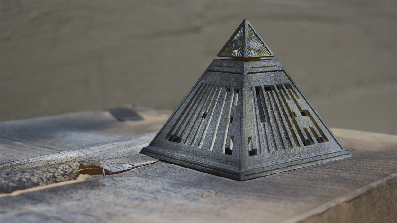
–– Designed by Jason KerrLevitron Pyramid: James White is a visual artist and designer with a special talent for creating colorful graphic posters of pop culture icons. We took inspiration from his OFFF Barcelona poster imbued with moody illuminati imagery and playful neon colors. After using Cinema 4D to carefully design our pyramid, it was 3D printed, painted, and installed with with our home made LED cartridge to give a glowing light to the interior.
With our nifty magnetic Levitron we magically floated the pyramid above a shallow pool of water. The final kiss of atmosphere was brought to life by placing a speaker below the water and playing various sound frequencies to manipulate the liquid into a sinister bubbling cauldron of mystery. For a more detailed breakdown of this sequence, do check out Jason Kerr's website where there's lots of fresh extra-ness.

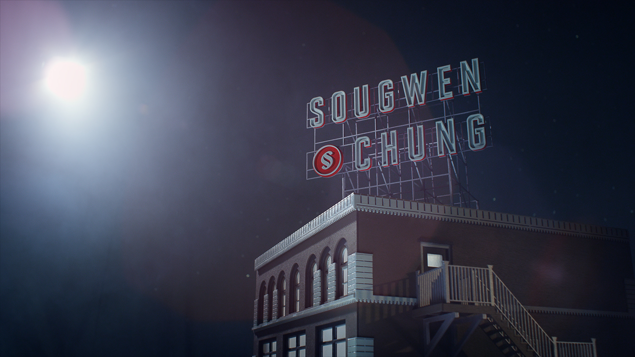
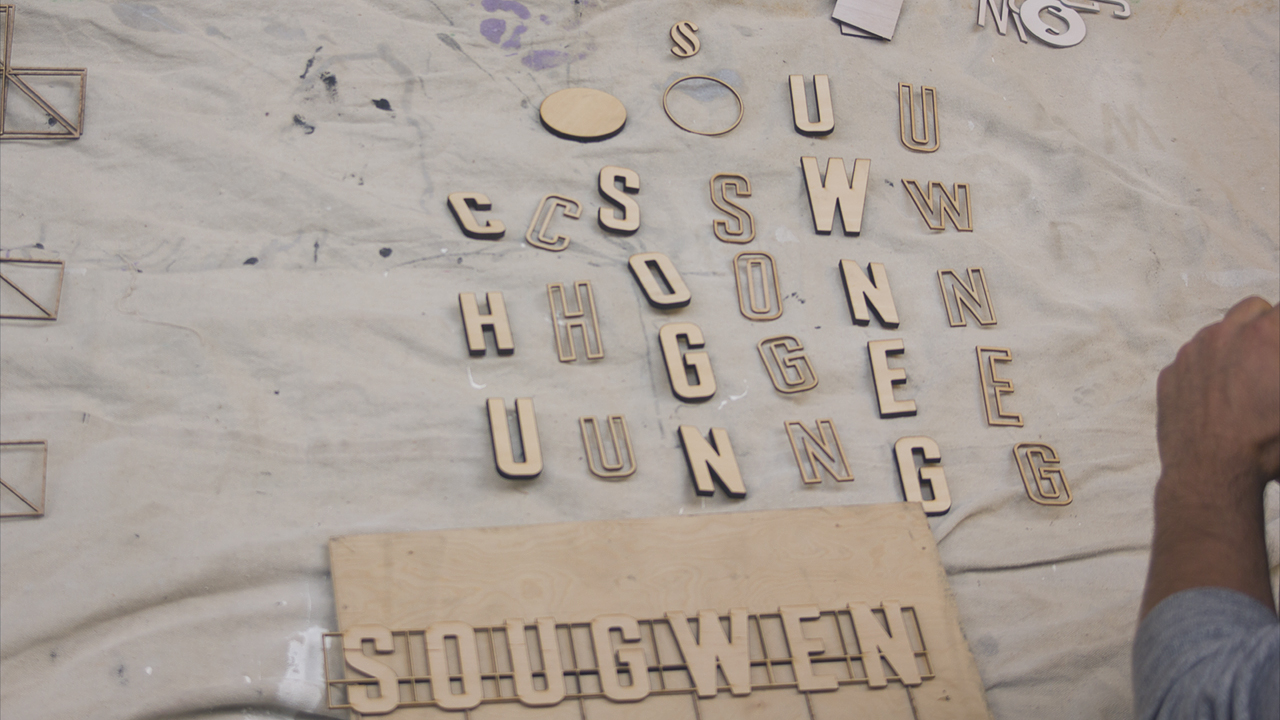
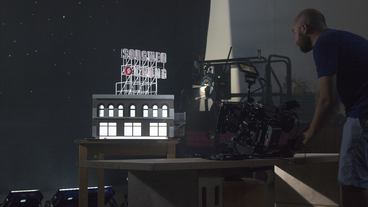
SOUGWEN CHUNG
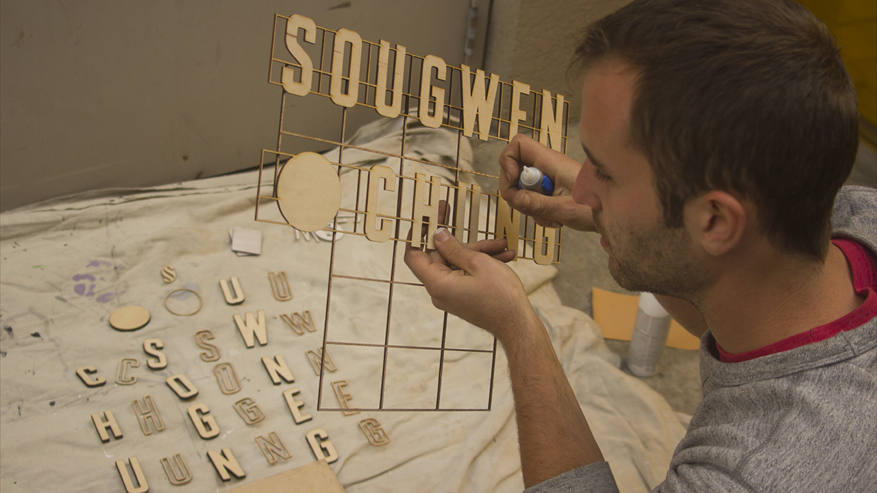
–– Designed by Rowan Ogden & Kenny JohnsonScaffolding Sign: The SG OFFF title sequence imagines Sougwen as artist colliding with an iconic American city, arranging her name in form consistent with classic elements of the American place. This collision is appropriate as Cincinnati is the home of the American Sign Museum, an organization whose mission is to celebrate the rich history of American signage through preservation and education.
The city is also filled with classic American architecture and signage. The combinations of form are unlikely and that is the appeal. Sougwen Chung names is expressed in the Vernacular aesthetic of the American Scaffold Sign (a classic outdoor sign with extruded forms and raised on metal scaffold structure) resting on the top portion of a classic Cincinnati building.
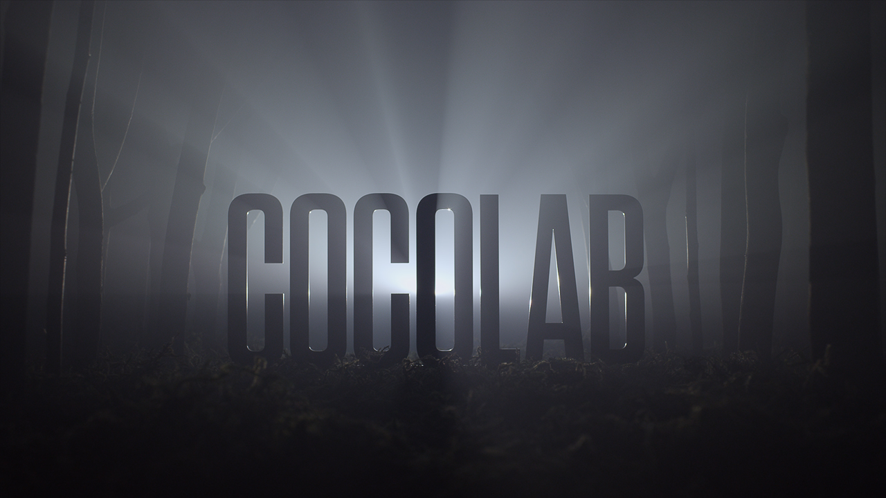
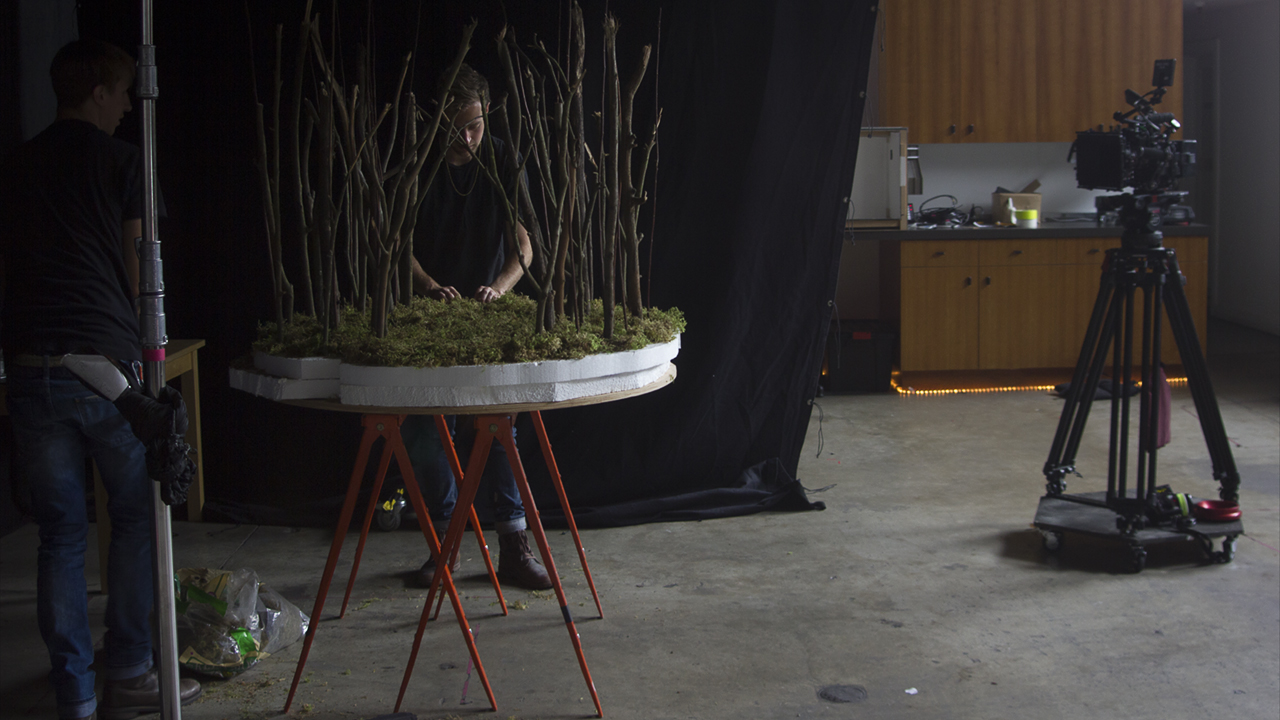
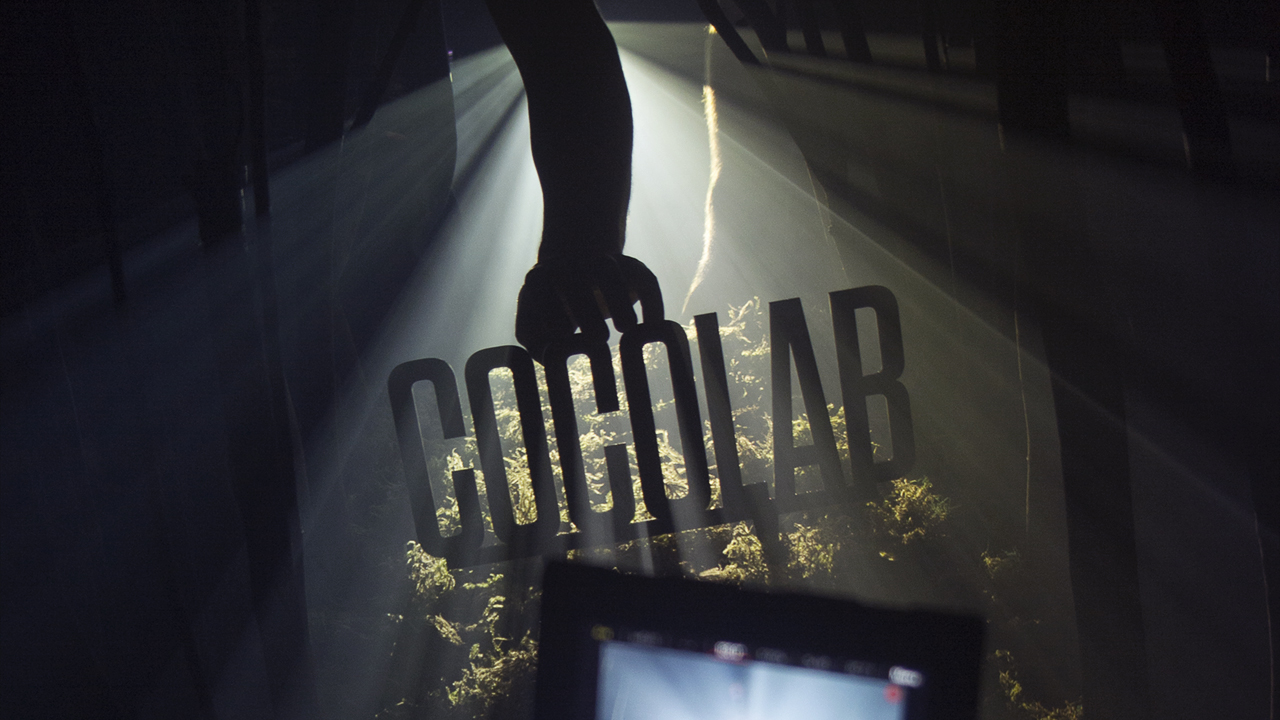
COCOLAB
–– Designed by Connie Kim GreebleFoggy Forest: Cocolab's work is an amazing collection of art that often transforms an entire room into an immersive environment. Either by manipulating the physical world, or using projections to transform it, their work is attention grabbing and stark. Using these factors as inspiration, we looked into our minds and searched for an aesthetic that could hold these qualities. The COCOLAB scene pushes you into the dark mist of a foggy and forgotten forest. Using real moss and branches, we hoped the texture and cadence would put the viewer on his feet, as if standing in the forest her/himself.
The entire rig was enclosed in a small 'hot box' made of mat-board and blankets, then filled with dense fog. A projector sitting directly across the scene, facing the camera, played simple line-work animation. When shot through the fog, the animations transformed into physical lines and shapes cutting through the trees and moss. For a more detailed breakdown of this sequence, do check out the Bedtimes.co website where there's lots of fresh extra-ness.
GMUNK
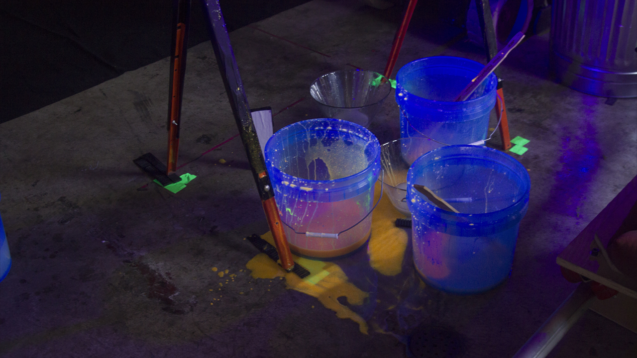
–– Designed by Bradley G MunkowitzCREAMUNK: The munk is all about the Lights n Sexy, so what a better way to express those feelings by constructing an extruded GMUNK Lightbox getting doused with heavy amounts of UV reactive Cream. The scene was initiated by fabricating the letterforms out of Milk Plex with RGB LED Tape embedded on the inside, illuminating the volume with sequenced DMX-controlled patterns.
The cream was a few patented formulas, one being Corn Syrup and Corn Starch with Atomic Glow UV paint dappled in for the rich orange color, the second being Laundry Detergent and Corn Starch with a Hot Pink UV paint spread throughout - concocting an oh so delicious visual candy-pop delight that munky would be oh so proud of.
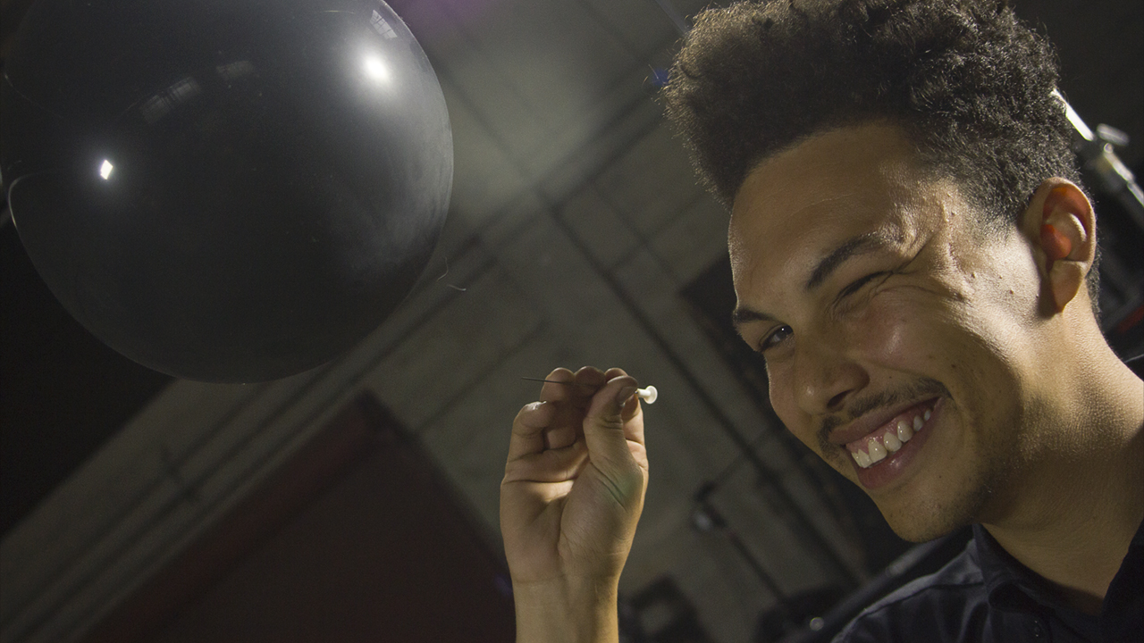
OFFF CINCINNATI 2014
–– Designed by Ian ColonHelium & BloDarts: OFFF is a celebration of designers and artists who have challenged themselves to go beyond their knowledge/skill zone and achieve something stunning. We wanted to create a meta-description of the creative process in this section by generating a challenge that seems both confusingly complex and ludicrous in its seriousness but pays off with a moment so brilliant that you want to see happen again and again.
The materials utilized were an homage to childhood birthday parties where exuberance and magic seemed par for the course; in manifesting this project, the wonder and thrill we felt concepting brought us back to the feeling that truly anything was possible.

The Process
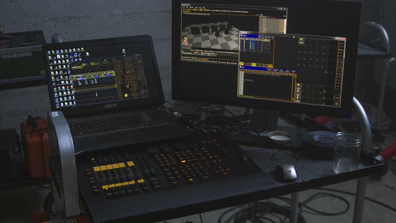
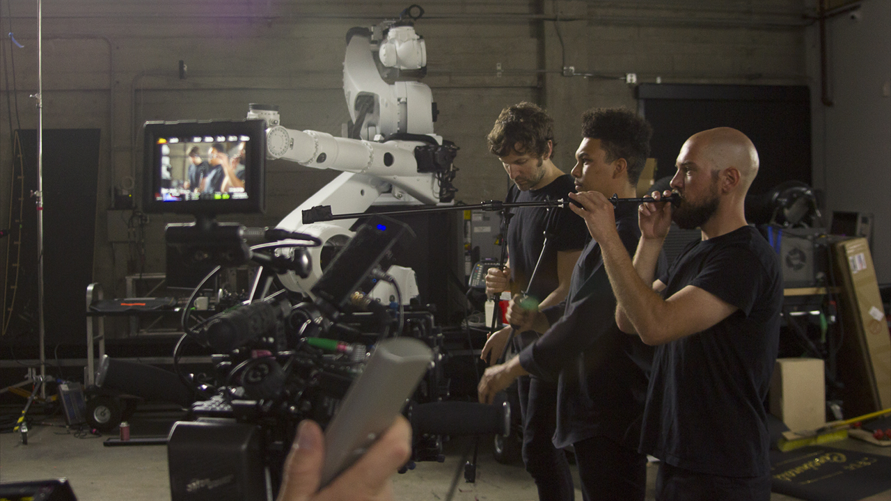
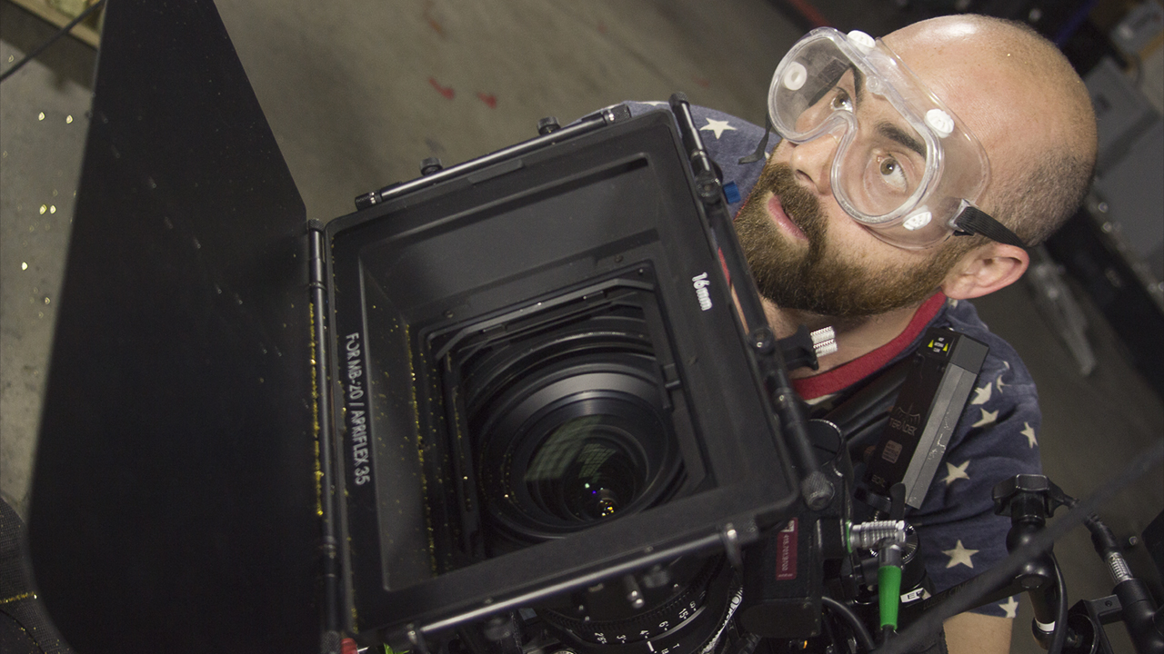
–– 03This project was all about collaboration, this time pulling in the favorite people from the Autofuss collective and crafting a piece that aimed to showcase the madness that is the Fuss studio and all the wild moments that occur daily inside the compound.
For Munko personally, the project carried great significance because it was the last during his tenure at the Fuss, and knowing this he wanted to bring everyone together one last time to collaborate within the spirit so unique to the studio.
For Munko personally, the project carried great significance because it was the last during his tenure at the Fuss, and knowing this he wanted to bring everyone together one last time to collaborate within the spirit so unique to the studio.


OFFF Cincinnati Credit List
Director: Autofuss
Creative Director: Bradley G Munkowitz
Director of Photography: Joe Picard
Producer: Andrew Devansky
Fabrication Advisor: Andrew Devansky
Editor: Ashley Rodholm
Colorist: Carey Burens
Music: Harald Boyesen
Anton & Irene by: Peter Clark
Yuko Shimizu by: Kirsten Ritschel
Lobulu by: Ryan Chen
Digital Kitchen by: Nate Costa
James White by: Jason Kerr
Sougwen Chung by: Rowan Ogden & Kenny Johnson
Cocolab by: Conor Grebel
GMUNK by: Bradley G Munkowitz GMUNK typography by: Brian Gossett
OFFF Cincinnati 2014 by: Ian Colon
Lightbox Fabrication: Barry Bradshaw
DMX Master Control: Michael Beardsworth
Key Grips: Dakota Wilder, Branson Stowell