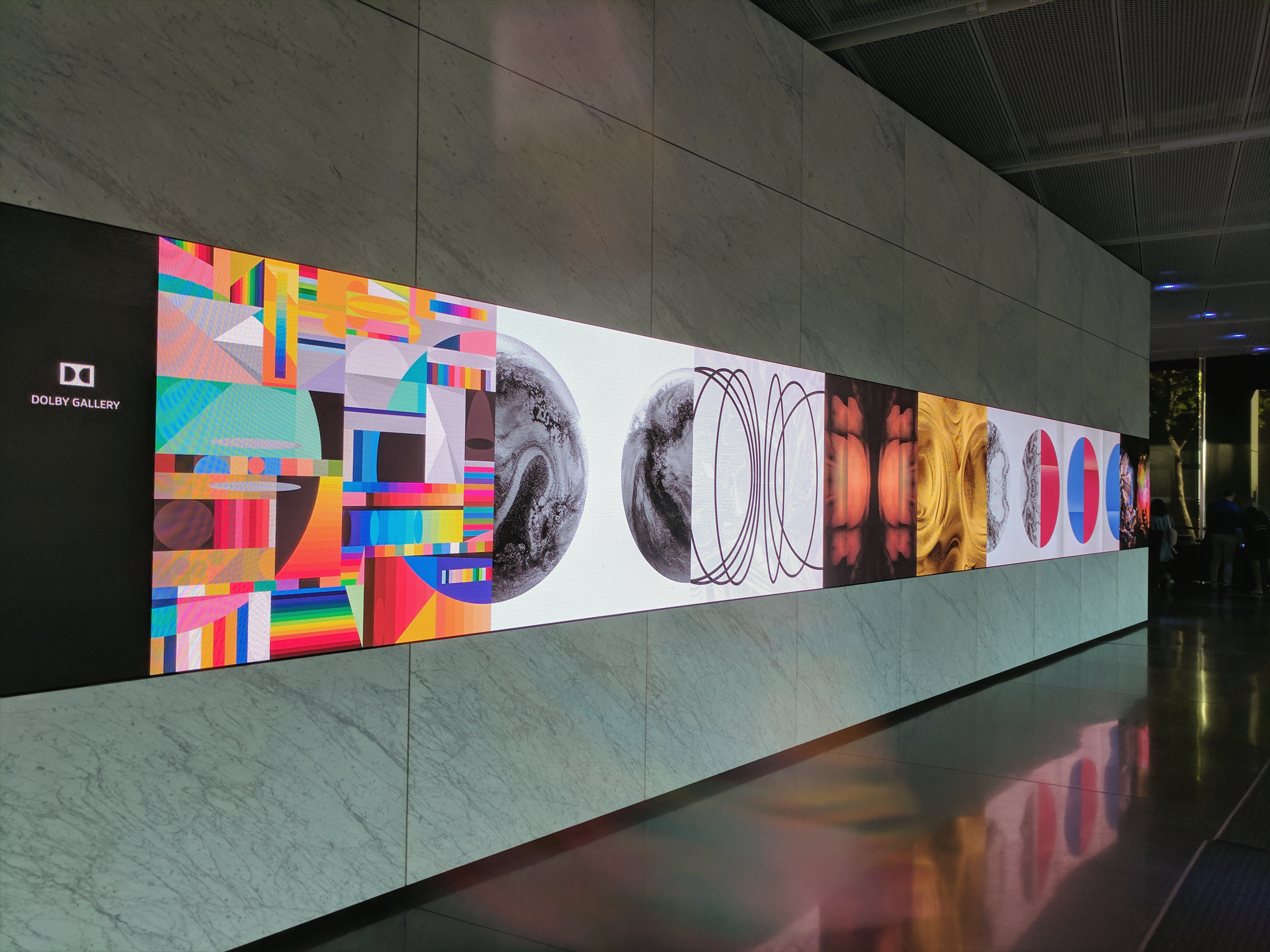
Dolby Art Series
July 2017 ––The Dolby Art Series is a collaboration with 22 international artists and design studios, with each artwork inspired by the two half circles of Dolby's iconic logo mark. Fortunately enough Munkowitz was one of the selected artists and got to play with their fairly open brief, in which all that was required the reinterpretation of the brand’s Double D’s logo using any medium of choice.
With Dolby being an Innovation Company that works within a multitude of mediums, Munkowitz directly applied this as an influencing parameter to his design approach. Generally, these parameters can be harnessed and applied as Color, Light and Sound - or specifically, Effervescence, Illumination and Vibration. These three inputs were the guiding influencers for the concepts created for the series.
With Dolby being an Innovation Company that works within a multitude of mediums, Munkowitz directly applied this as an influencing parameter to his design approach. Generally, these parameters can be harnessed and applied as Color, Light and Sound - or specifically, Effervescence, Illumination and Vibration. These three inputs were the guiding influencers for the concepts created for the series.
Radial Wave Emanation
–– 01
Gentle Ripple Vibration
–– 02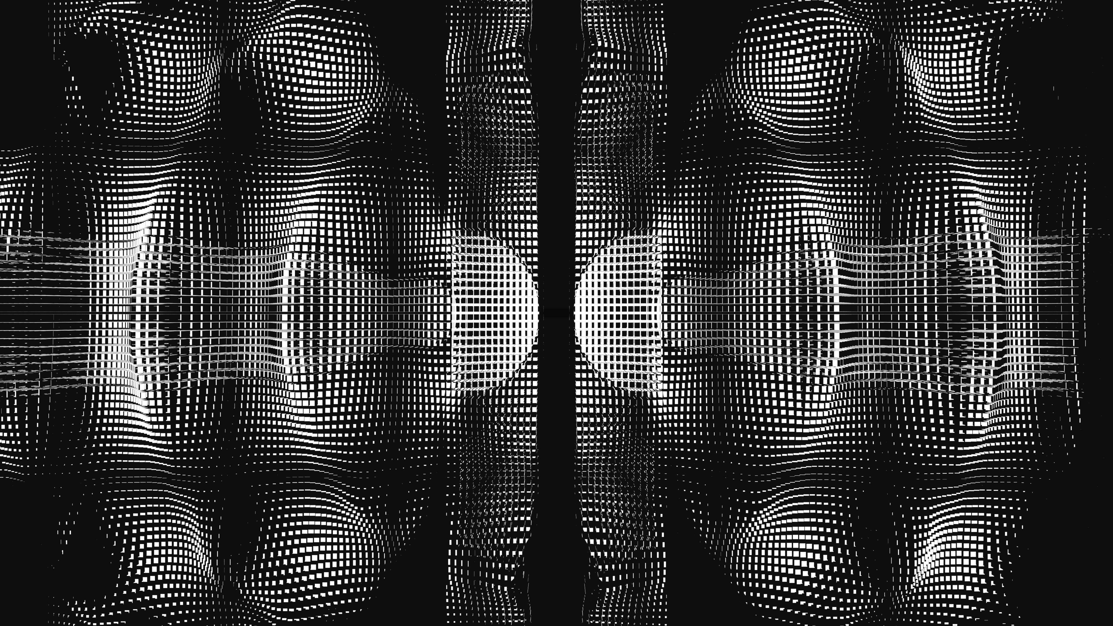
Microdose Infant Mutation
–– 03
Progressive Wave Simulation
–– 04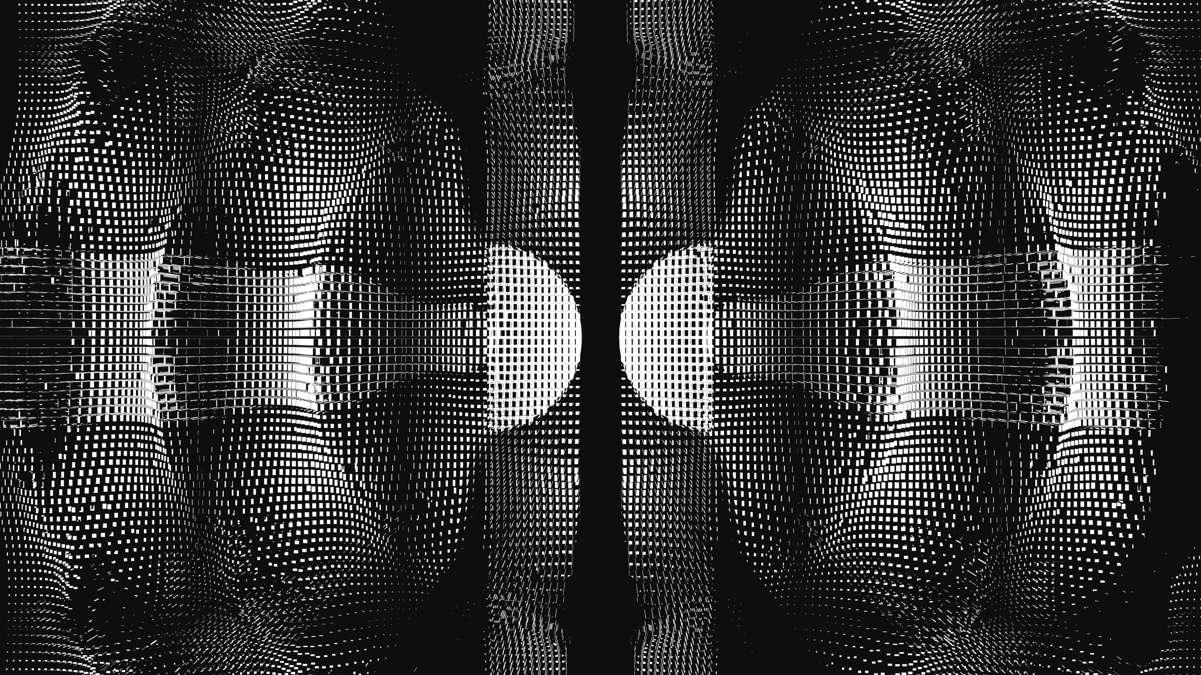
Final Execution
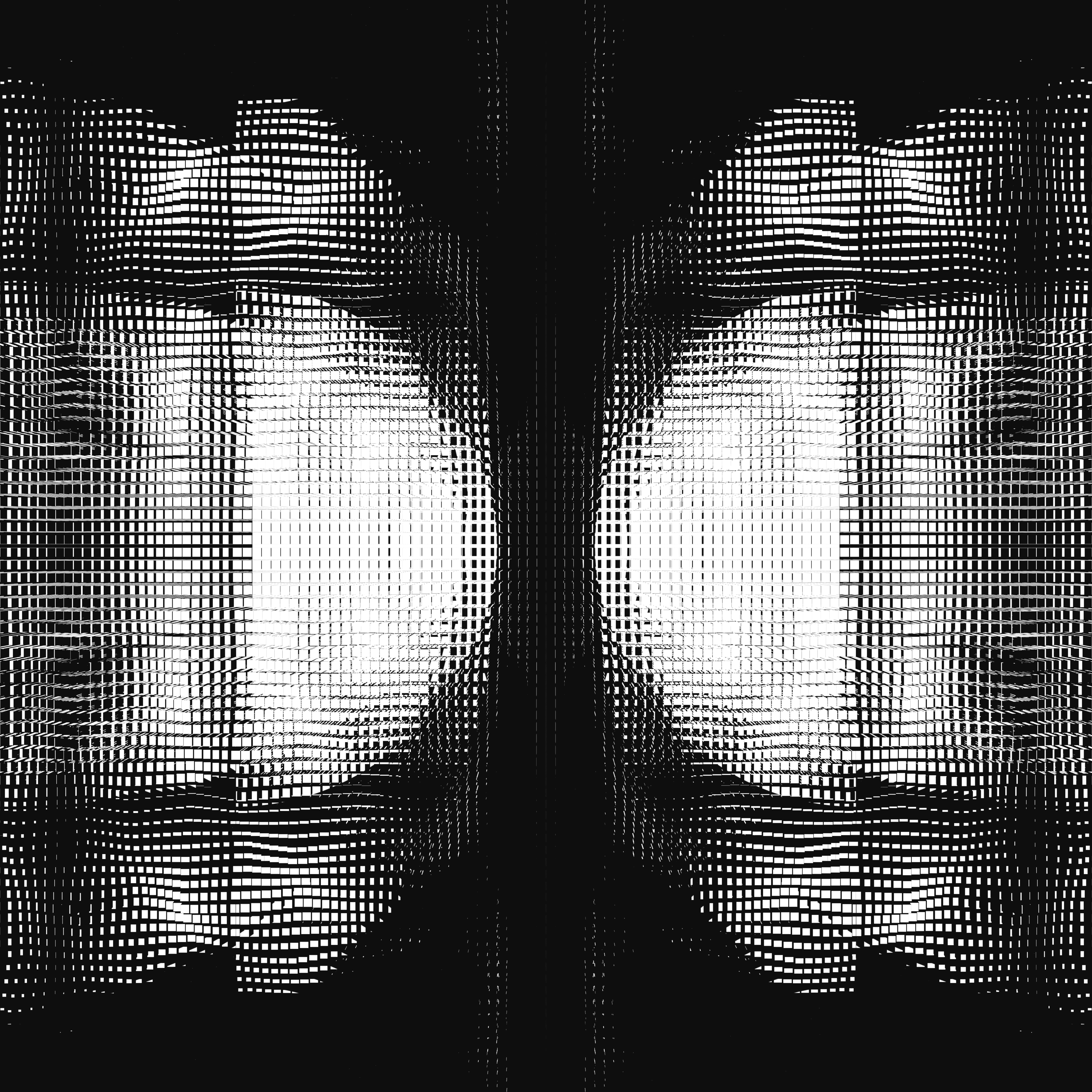
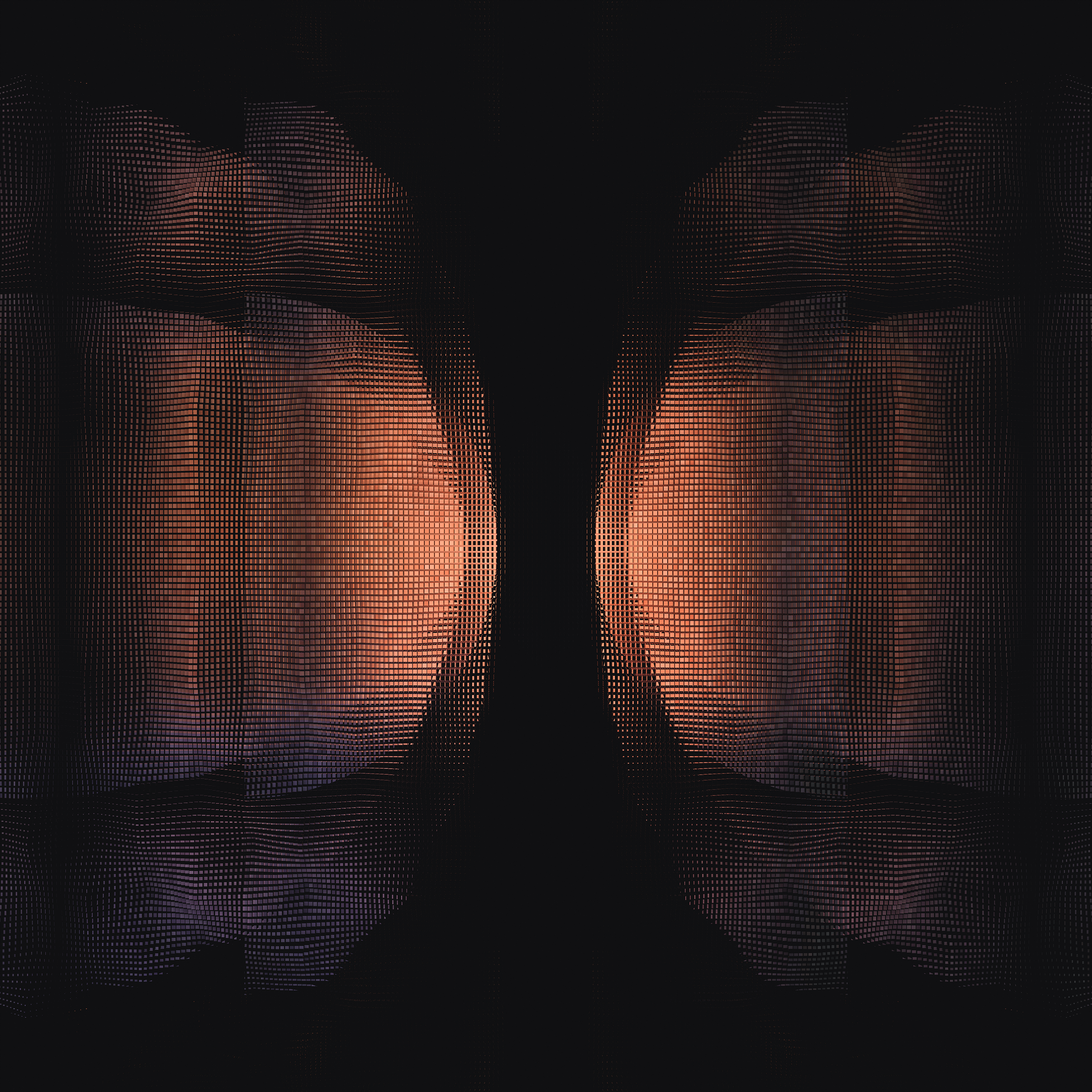
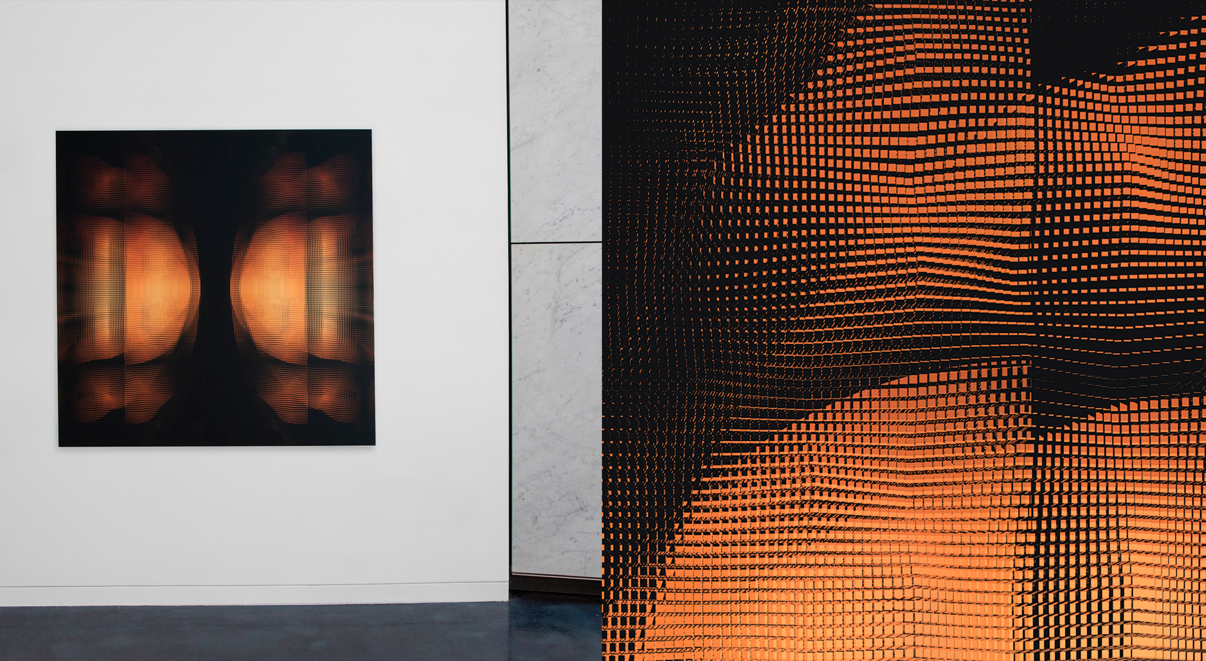
–– 05The Final Execution found the Dolby logo embedded in a large volume of instanced cubes, creating a thick layer of occlusion between the logo and the camera. These arrays of cubes had a glass shader applied to them, and aggressively refracted the logo through their multitude of glass walls, which were heavily distorted by a variety of 4D noise patterns. The result translated the logo as a vibrational distortion, rendering a detailed, tastefully refracted design statement.
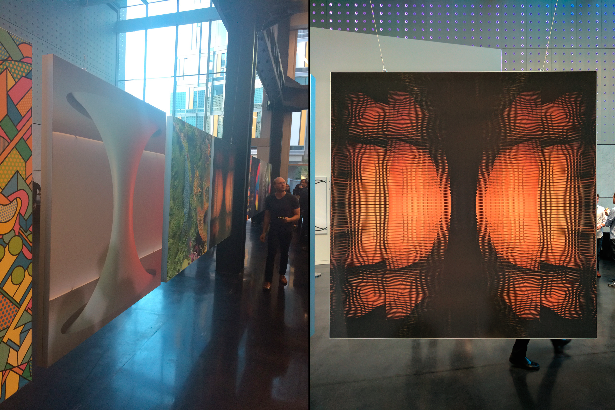
The importance of the resulting image having a physical presence was paramount to the concept, as with so much of Dolby's industry equating to vibration and transmission - the physical properties of refraction represented these phenomena and translated it into high-level graphic design principles. The final artwork is part of the larger series exhibited in Dolby offices worldwide to celebrate their values, inspire creativity, and transport Dolby to new dimensions.
The importance of the resulting image having a physical presence was paramount to the concept, as with so much of Dolby's industry equating to vibration and transmission - the physical properties of refraction represented these phenomena and translated it into high-level graphic design principles. The final artwork is part of the larger series exhibited in Dolby offices worldwide to celebrate their values, inspire creativity, and transport Dolby to new dimensions.
–– 05
