DoorDash Mosaic
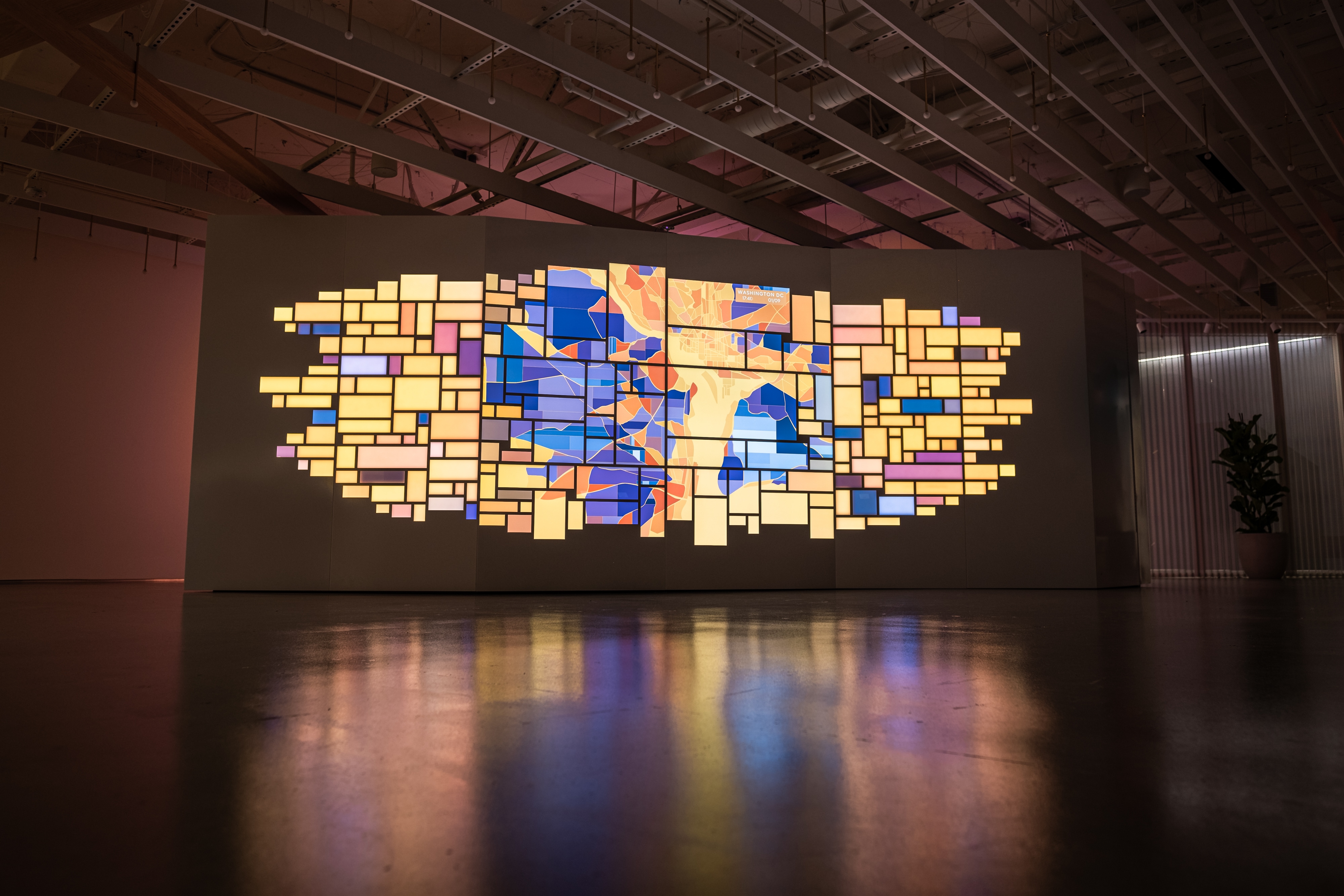
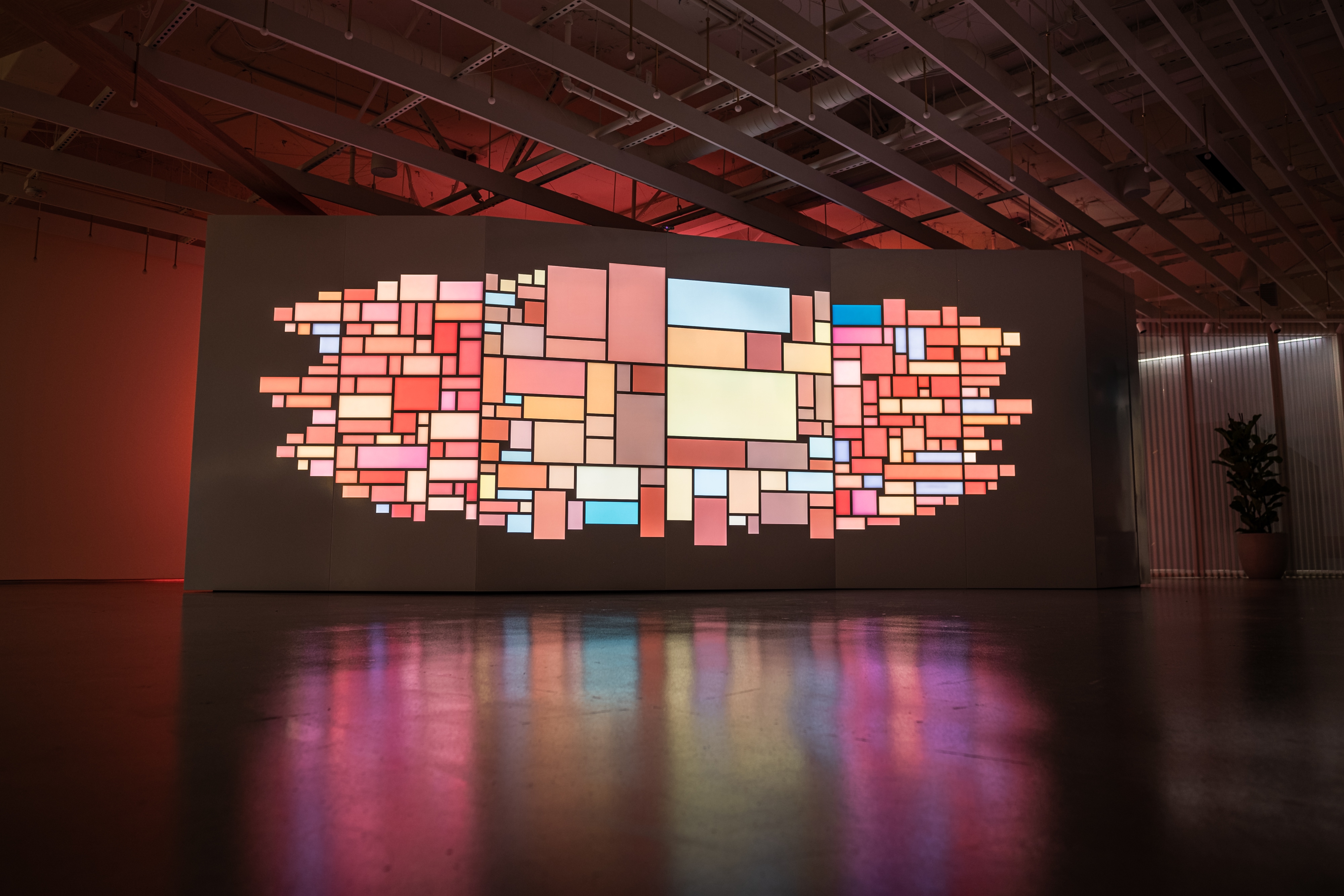
December 2019 ––Most of us think of DoorDash as a company that brings you your food. But the real essence of the brand is about the human element and the millions of connections that happen everyday between Dashers, merchants and DoorDash users. For this project, the team of GMUNK, Tool of North America and VT Pro Design wanted to create a powerful and artful sculpture that could live as an evergreen platform in the lobby of their new SF Headquarters, and was entitled the DoorDash Mosaic.
This sculptural LED wall was powered by a robust CMS that was populated with photos and videos from the brand and populated the mosaic in artful and unexpected ways. The team also leveraged the DoorDash data in abstract and painterly ways, creating map-based data visualizations that infused the office with the life and dynamism of the DoorDash brand. These data visualizations were a live and intimate look into the company and its activities, showcasing that human connection behind the brand as painterly and vivid washes of generative activity.
This sculptural LED wall was powered by a robust CMS that was populated with photos and videos from the brand and populated the mosaic in artful and unexpected ways. The team also leveraged the DoorDash data in abstract and painterly ways, creating map-based data visualizations that infused the office with the life and dynamism of the DoorDash brand. These data visualizations were a live and intimate look into the company and its activities, showcasing that human connection behind the brand as painterly and vivid washes of generative activity.
Case Study
–– 01The Concept
–– 02
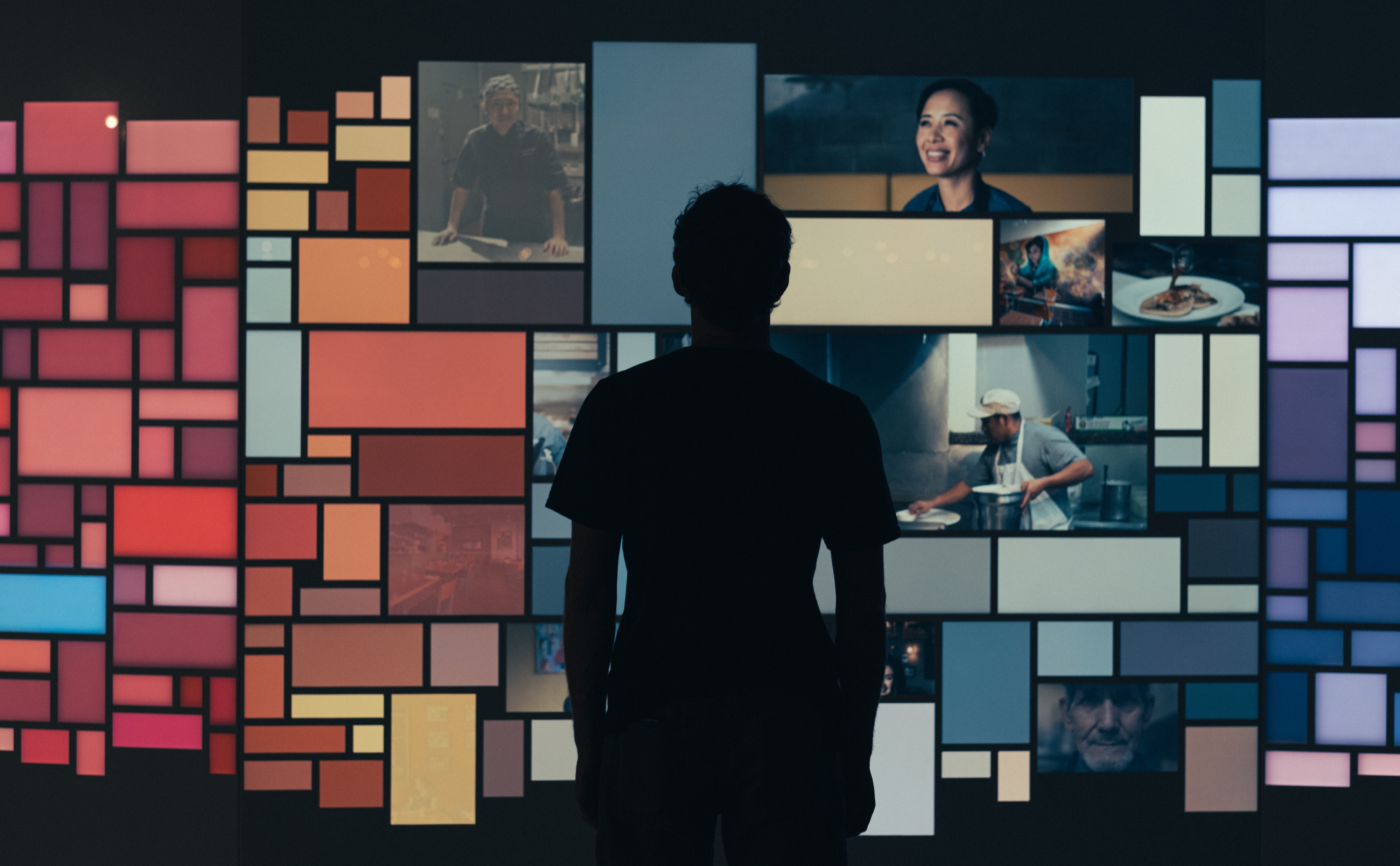
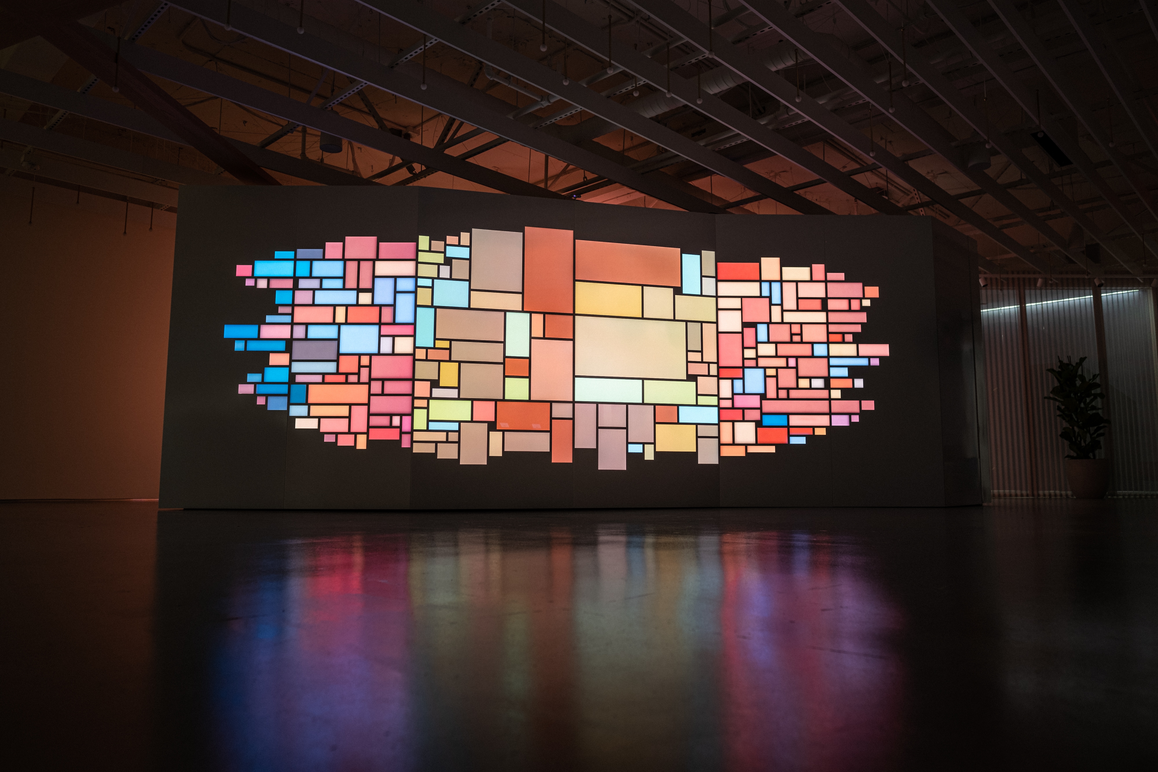
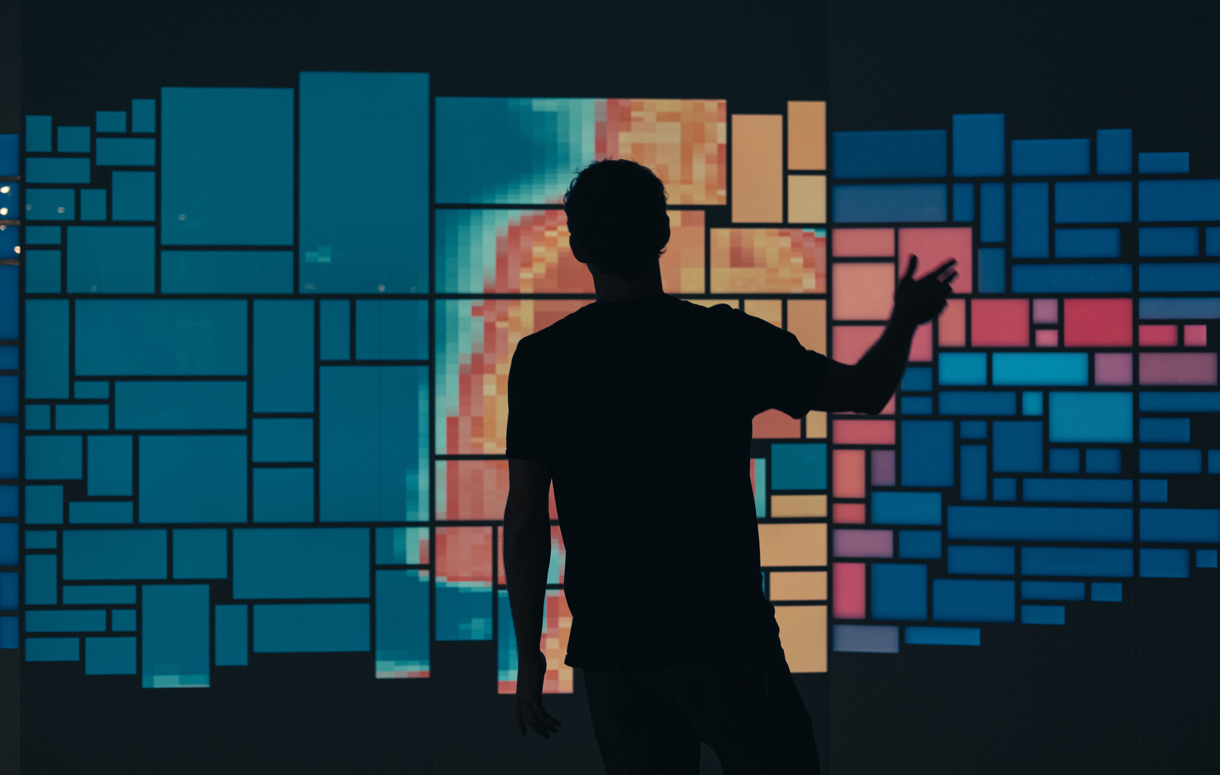
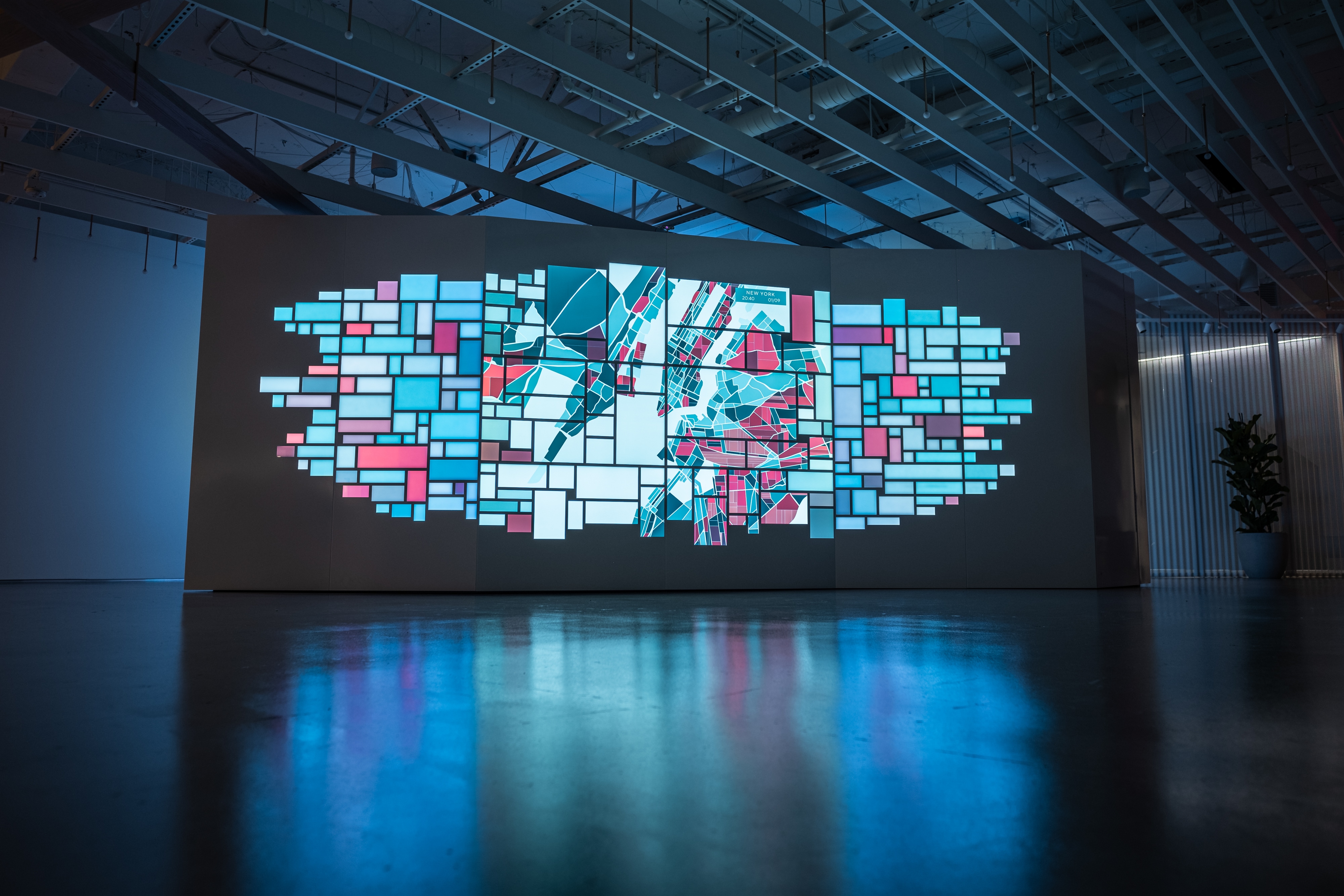
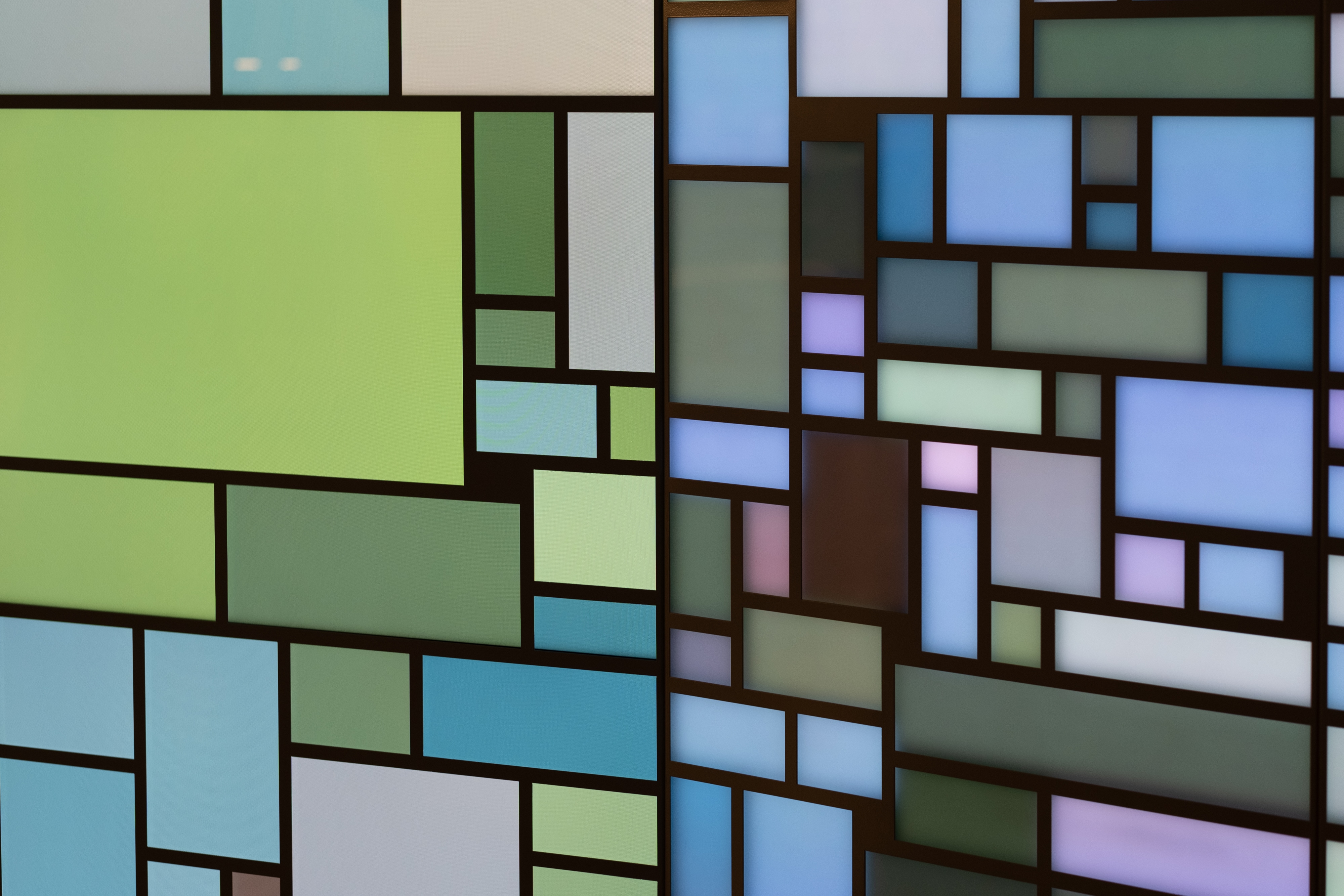
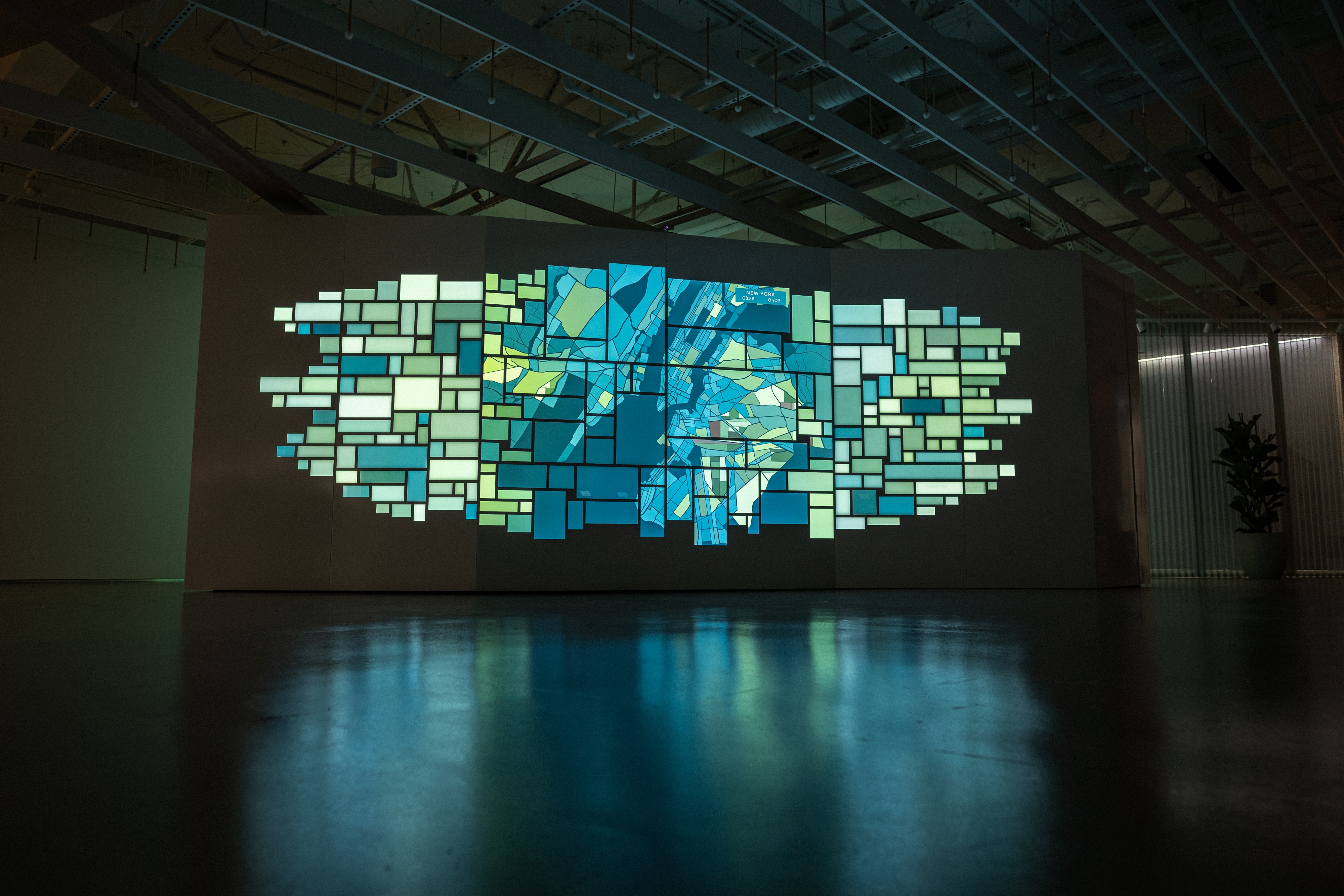
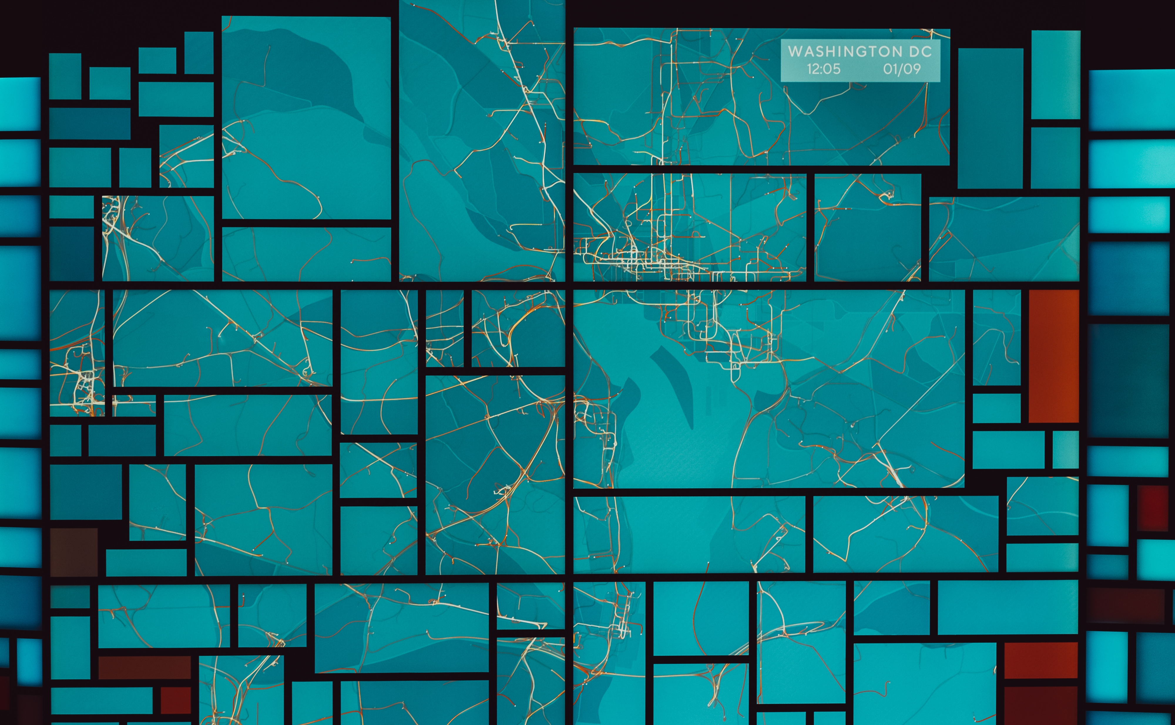
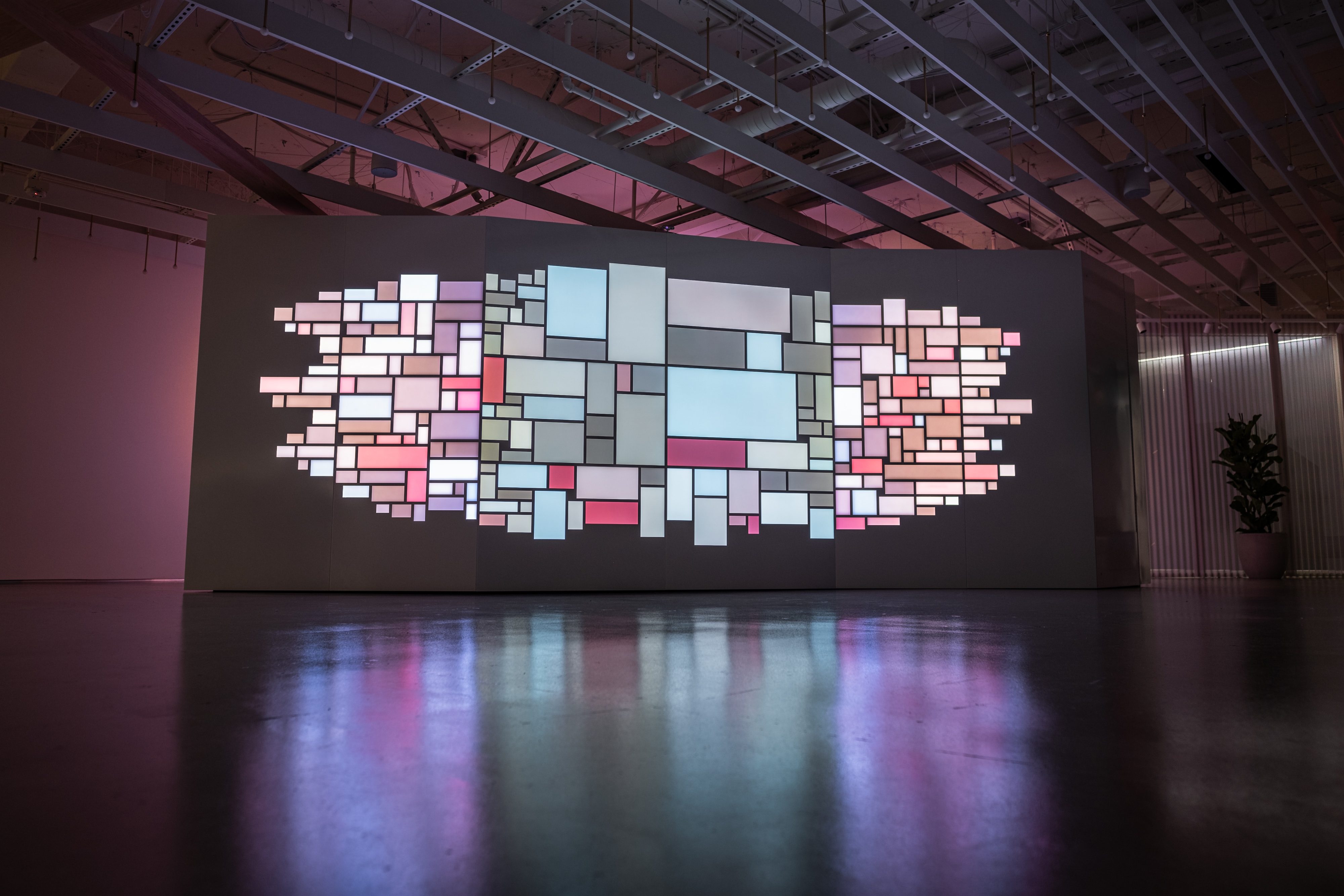
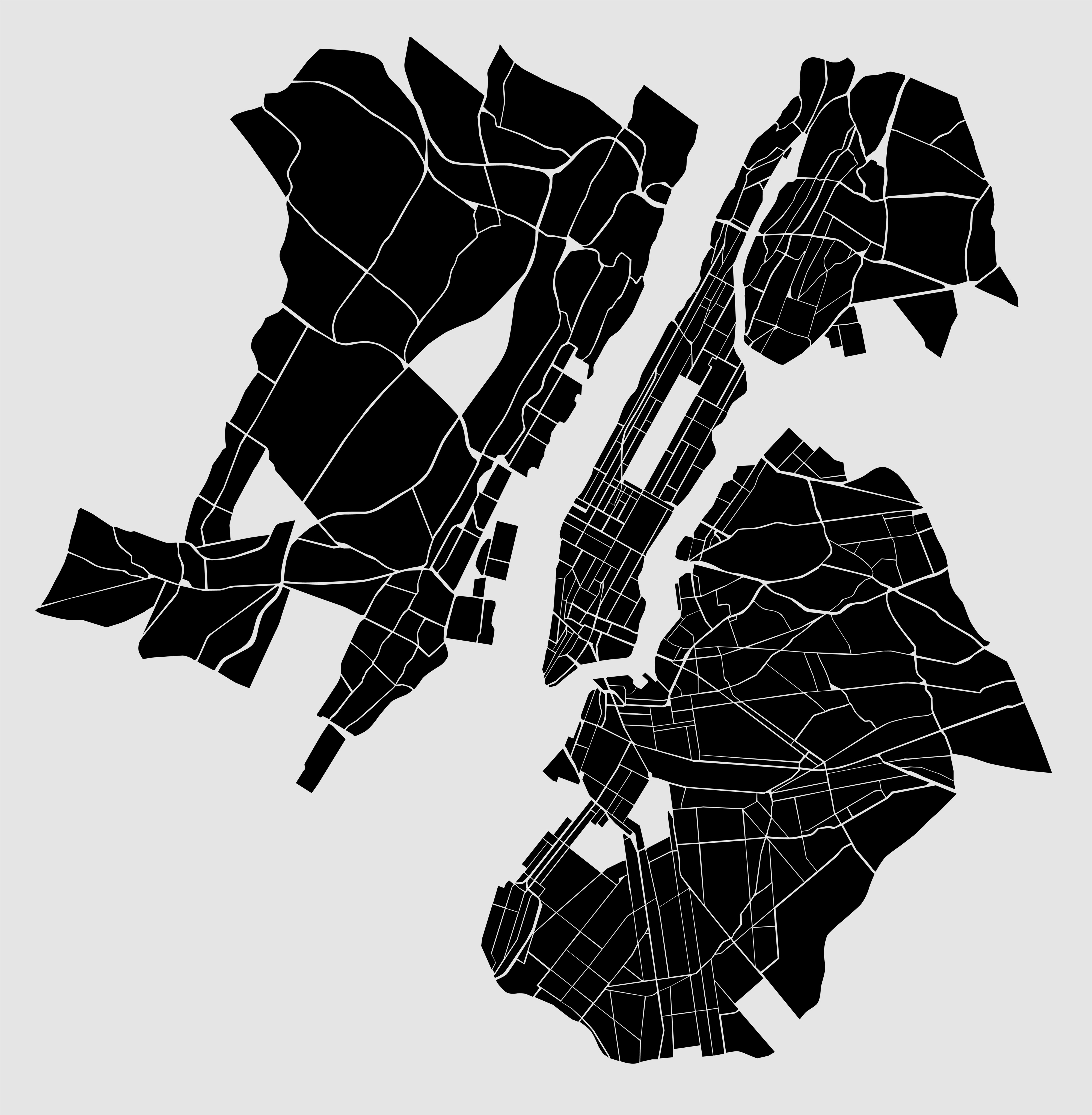
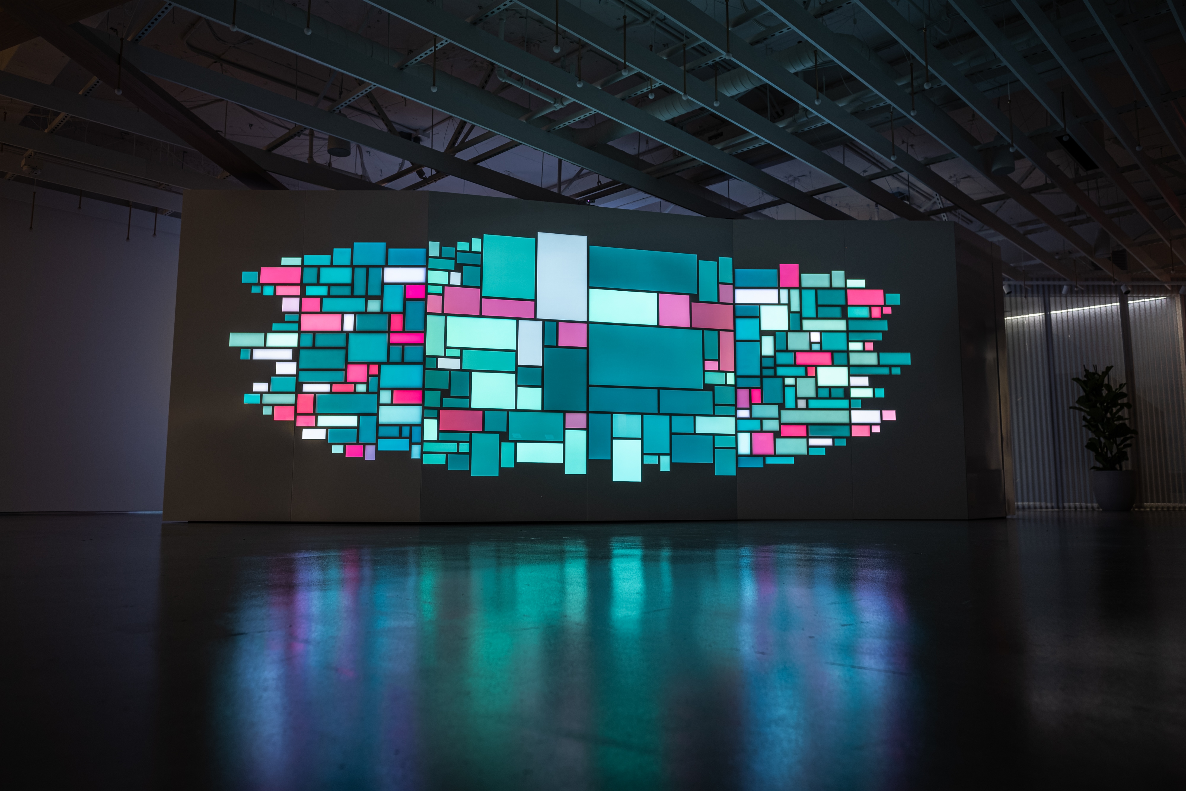
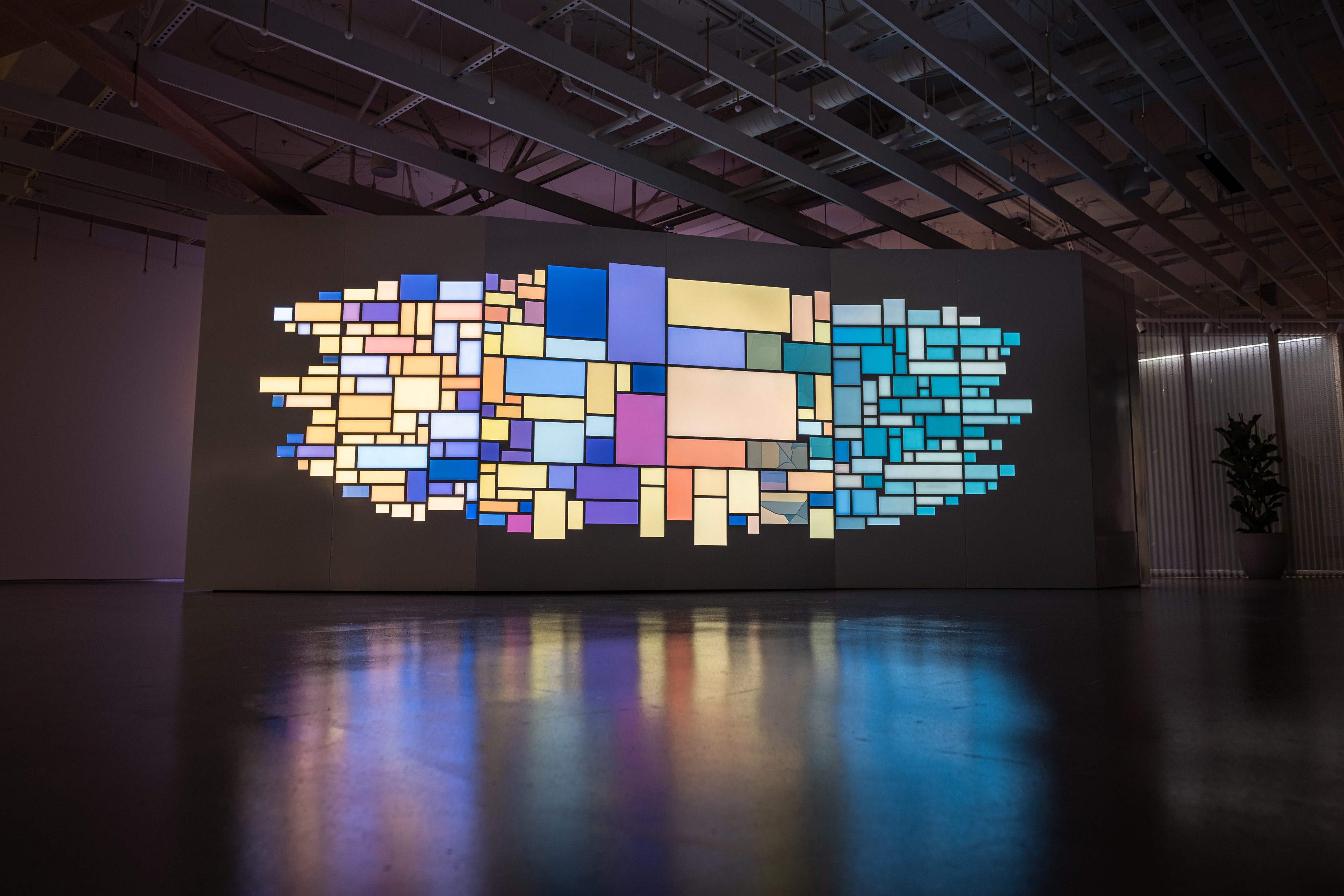
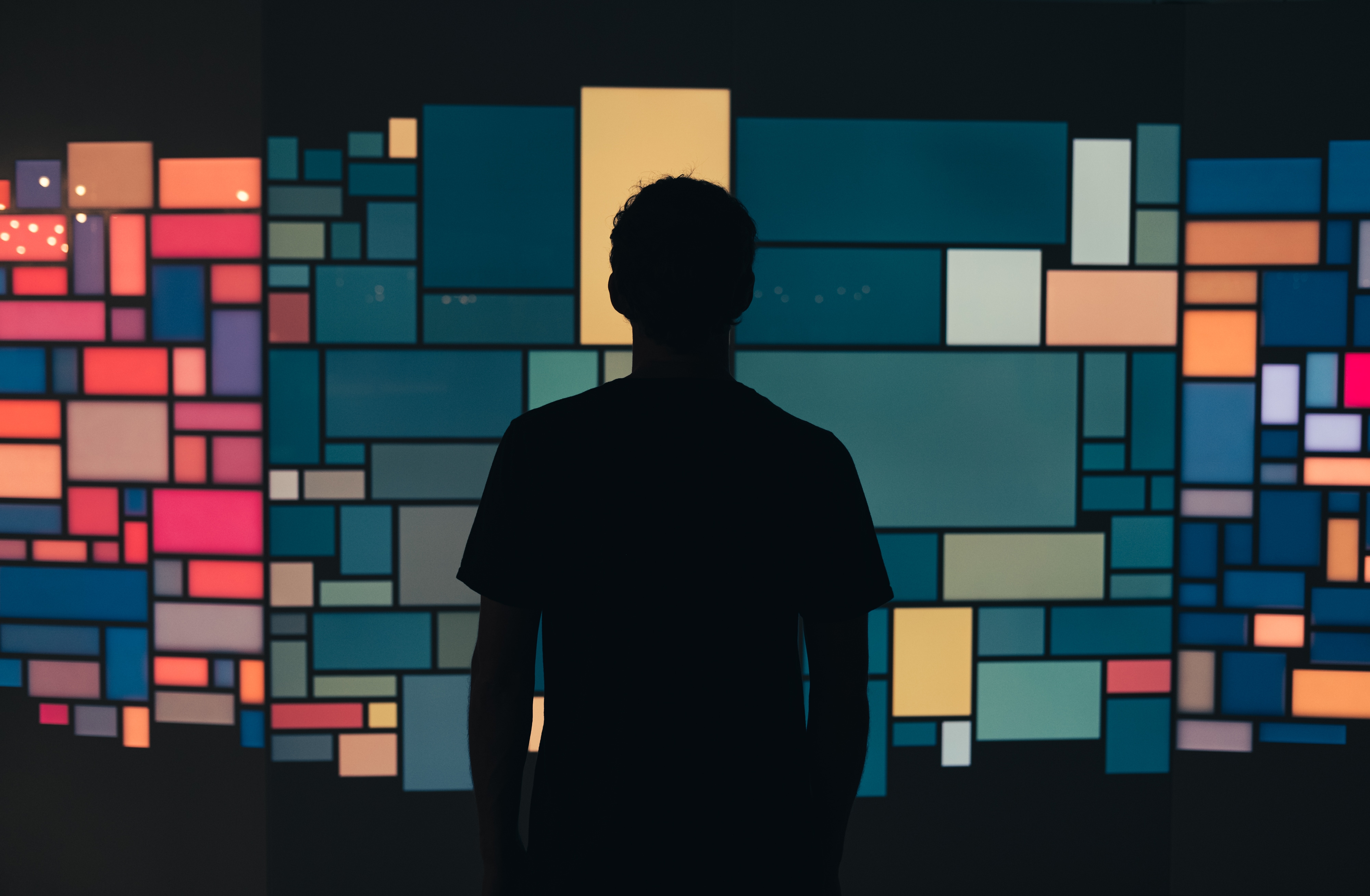
For this execution, the team was inspired by grid-based graphic design and applying that to an architectural screen platform, invoking the characteristics of a sculptural mosaic of emissive light. The approach was to take a multitude of screens and present them in a richly detailed grid array, utilizing the negative space between the screens as the defining boundaries for the content framework, allowing the assignment of color and form within the grid delineations.
The approach was to always have the center screens be able to showcase the live-action and generative content in the form of photos, videos, and data visualizations – while the surrounding grid units would sample from the center screens and present single-diode color washes to form a complimentary container of color framing the primary content.
This created a reliance on the audience to piece together images broken up in the grid, as they intentionally presented the photos, video and data visualizations in a more experimental fashion to encourage the audience to piece the information together in their own way throughout the Mosaic Grid. The goal with this approach was to encourage a higher audience engagement and a fresher way to present heavy amounts of content on a screen-based platform.
–– 02
The Content
–– 03Every aspect of the content was generative – meaning that no two moments in the content program would ever be the same. From how the mosaic grid was populated with photos and videos with a random seed placement, to the real-time data visualizations presenting the living data behind the brands activity, to the library of color palettes applied as permutations of display algorithims – the key to the content was variety, to always be surprised and discover something new with unexpected permutations of variables.
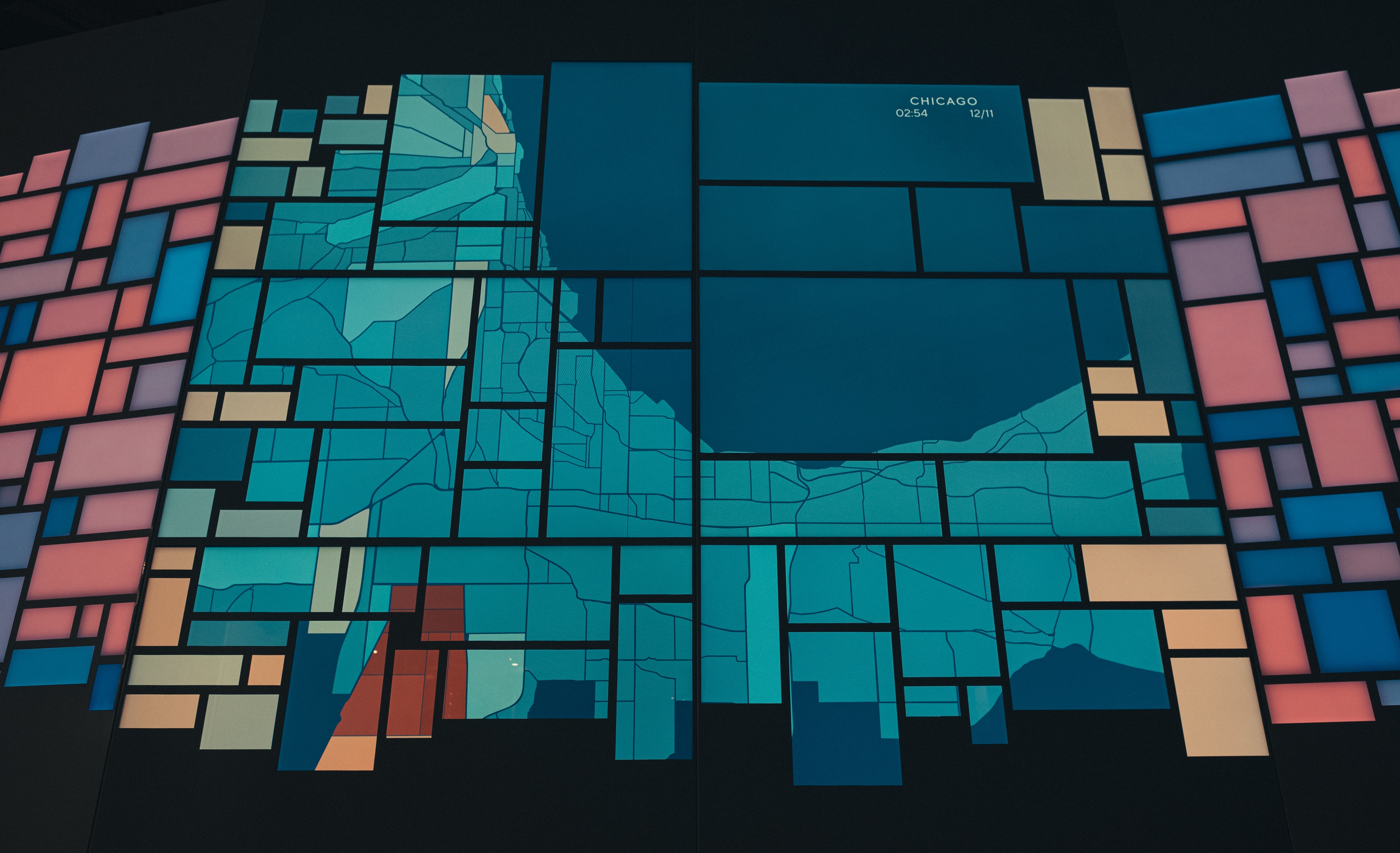
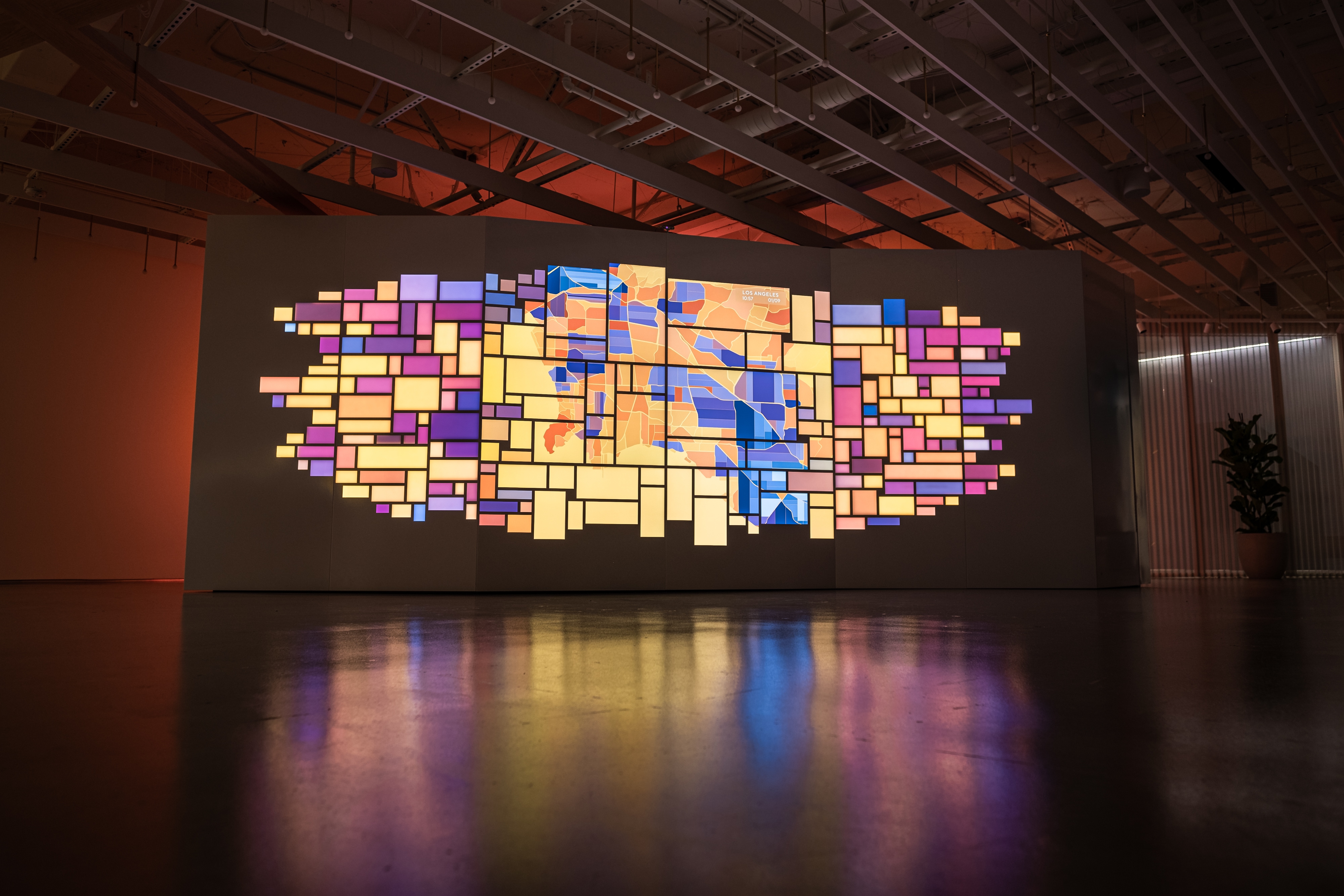
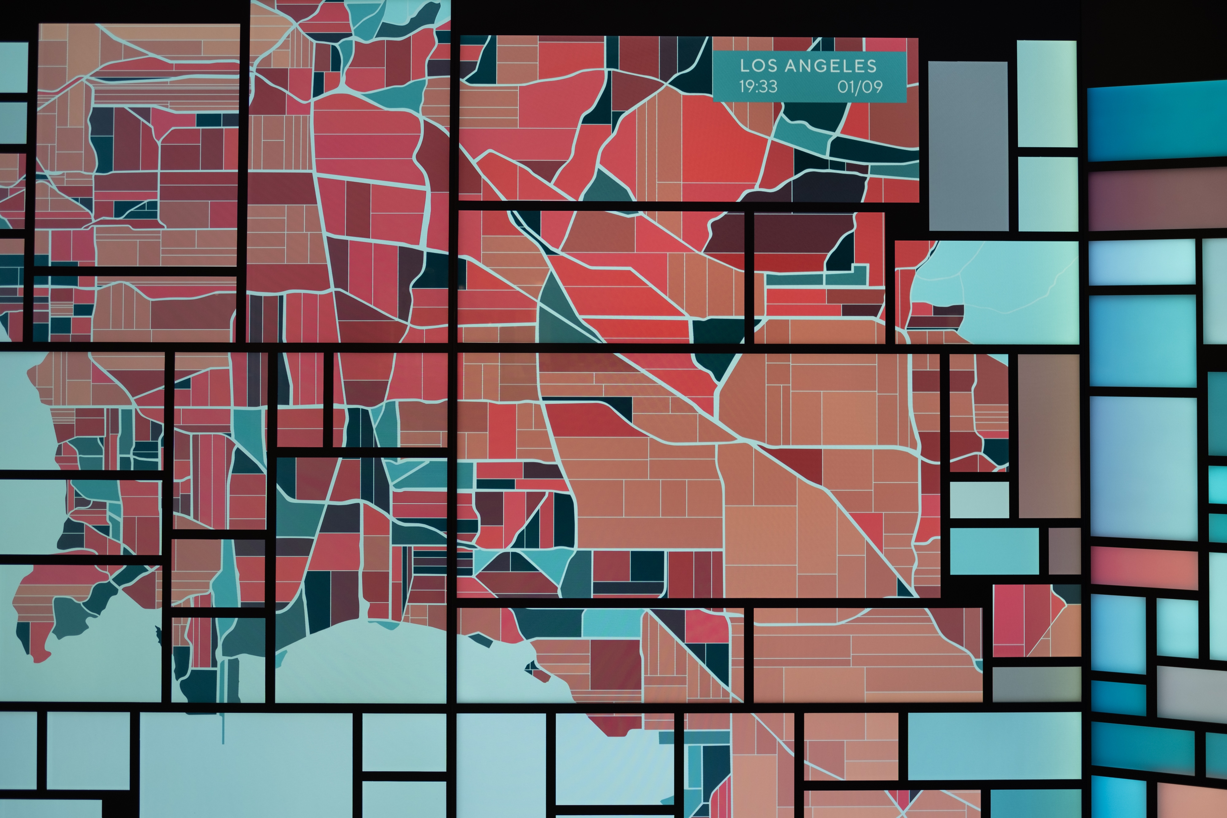
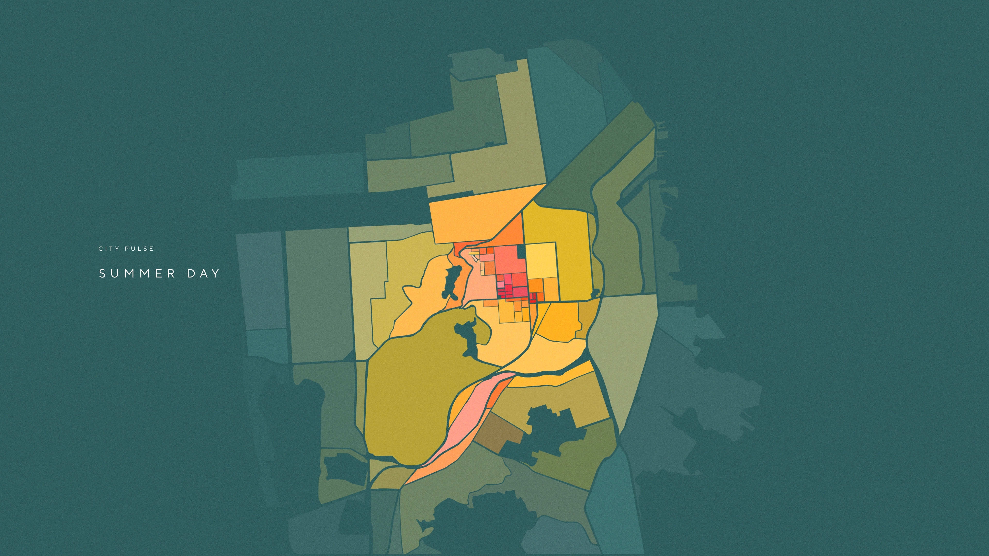
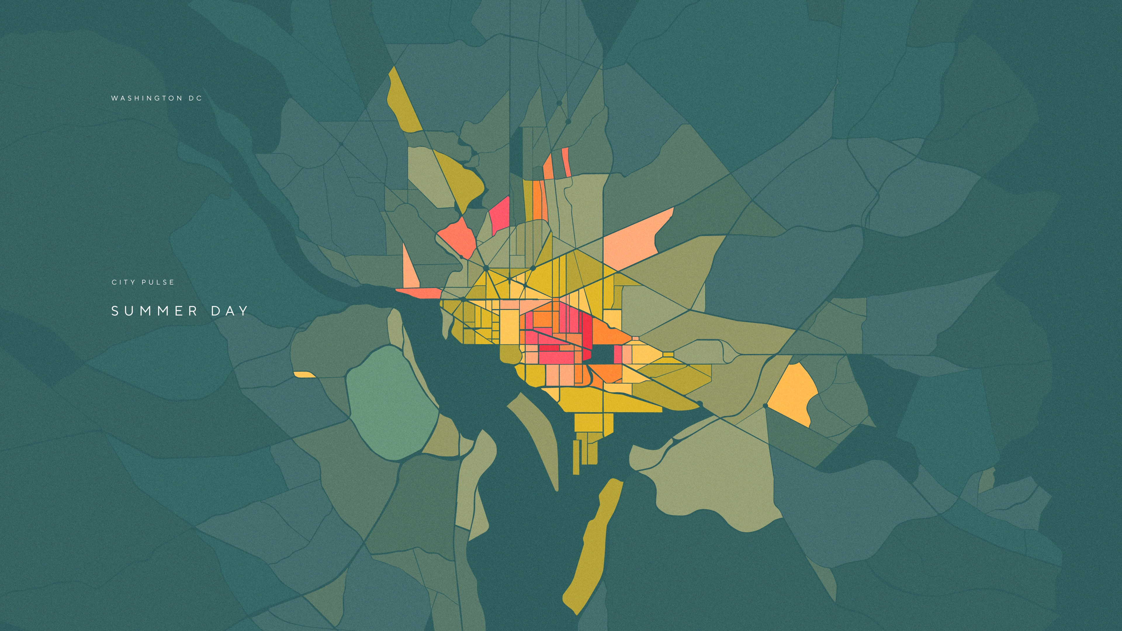
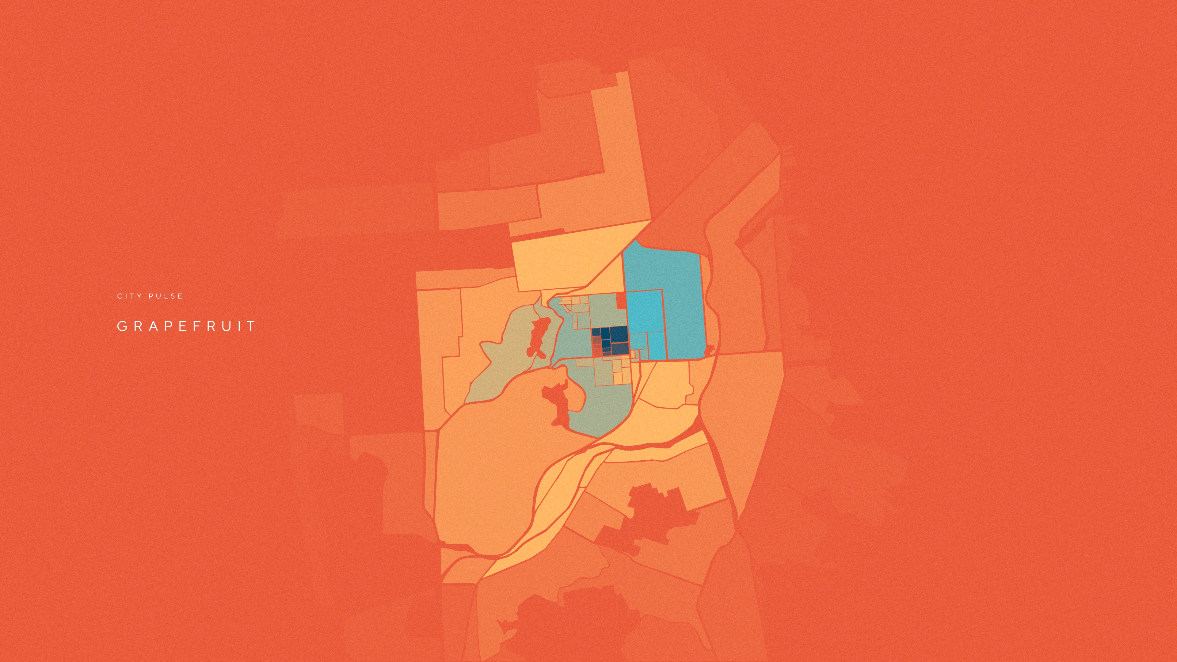
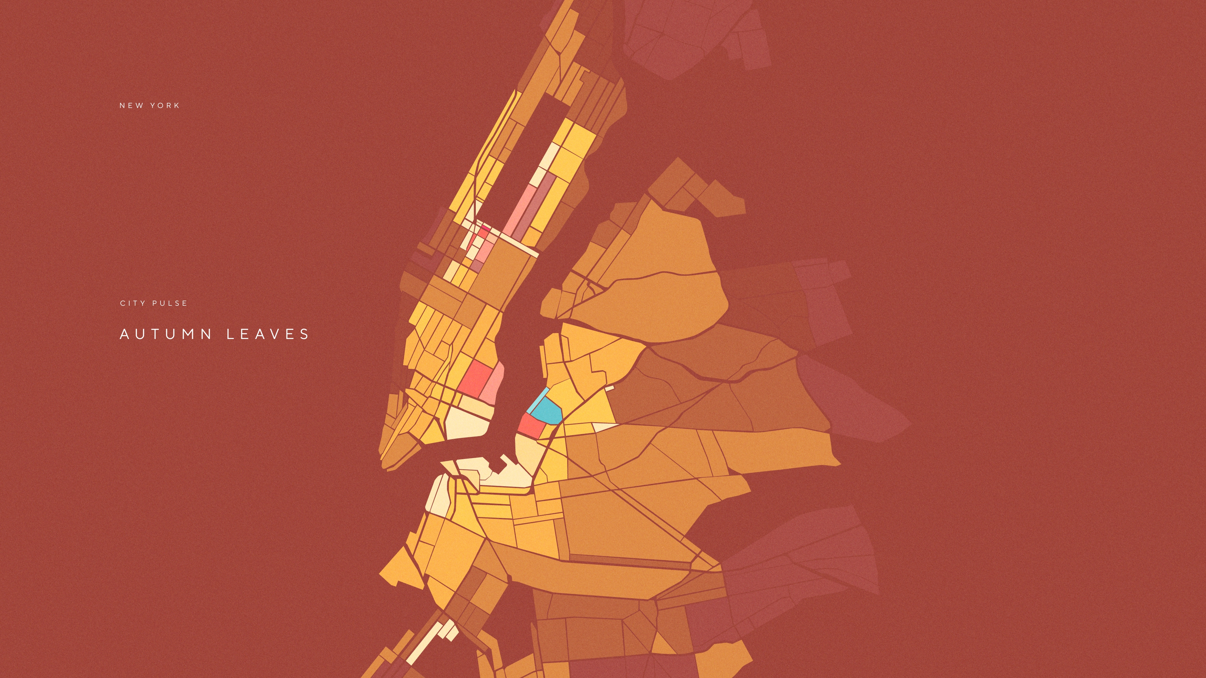
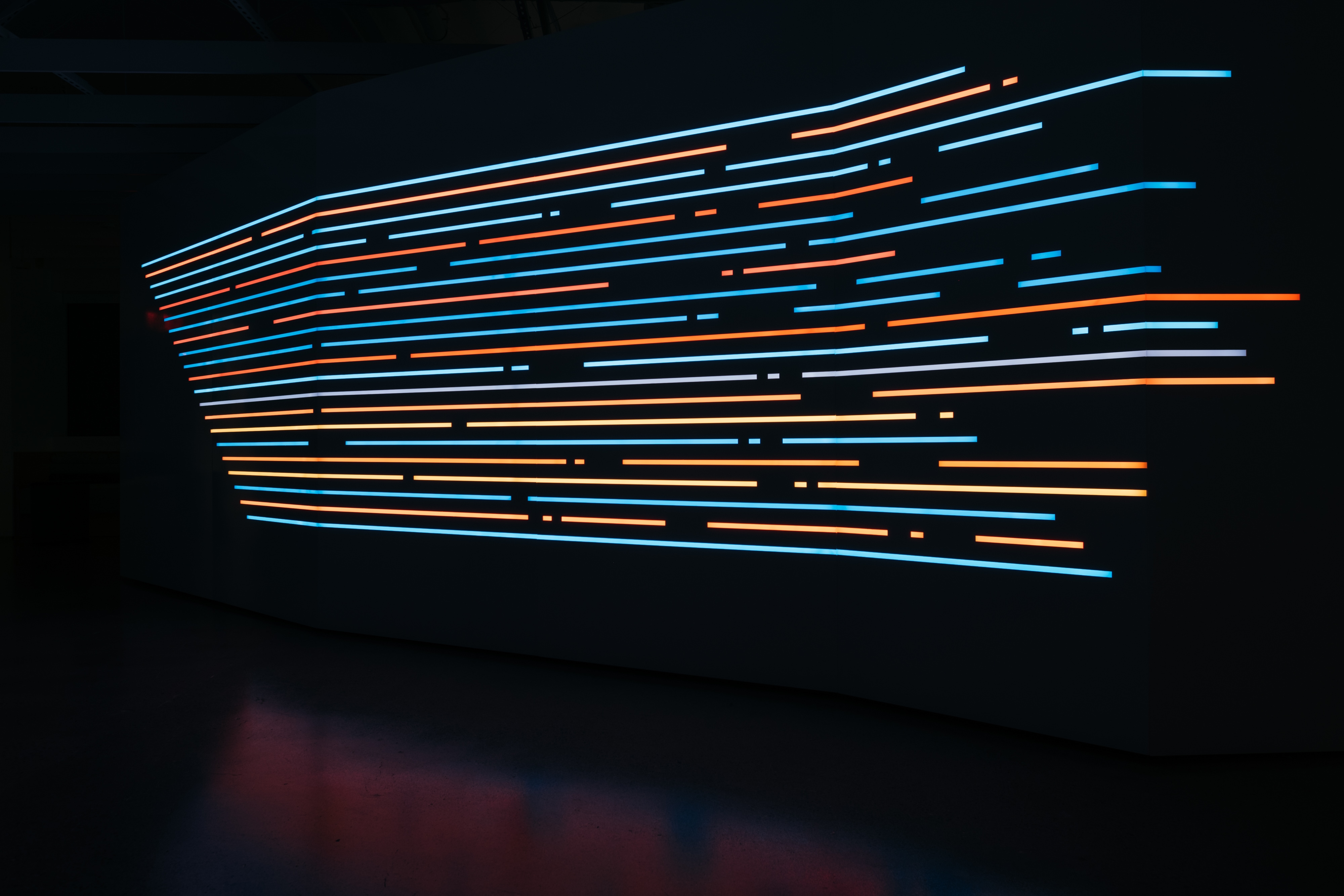
The content featured two data visualizations, entitled City Pulse and Urban Path. City Pulse illustrated how the featured city comes alive with vibrant activity via an animated heat map. Through data, it tells the story of how DoorDash empowers local economies in these urban locales. As transactions and deliveries increase, the heat map activation grows and changes with saturated colors and graphic detail, reflecting the human connections made possible through the DoorDash platform.
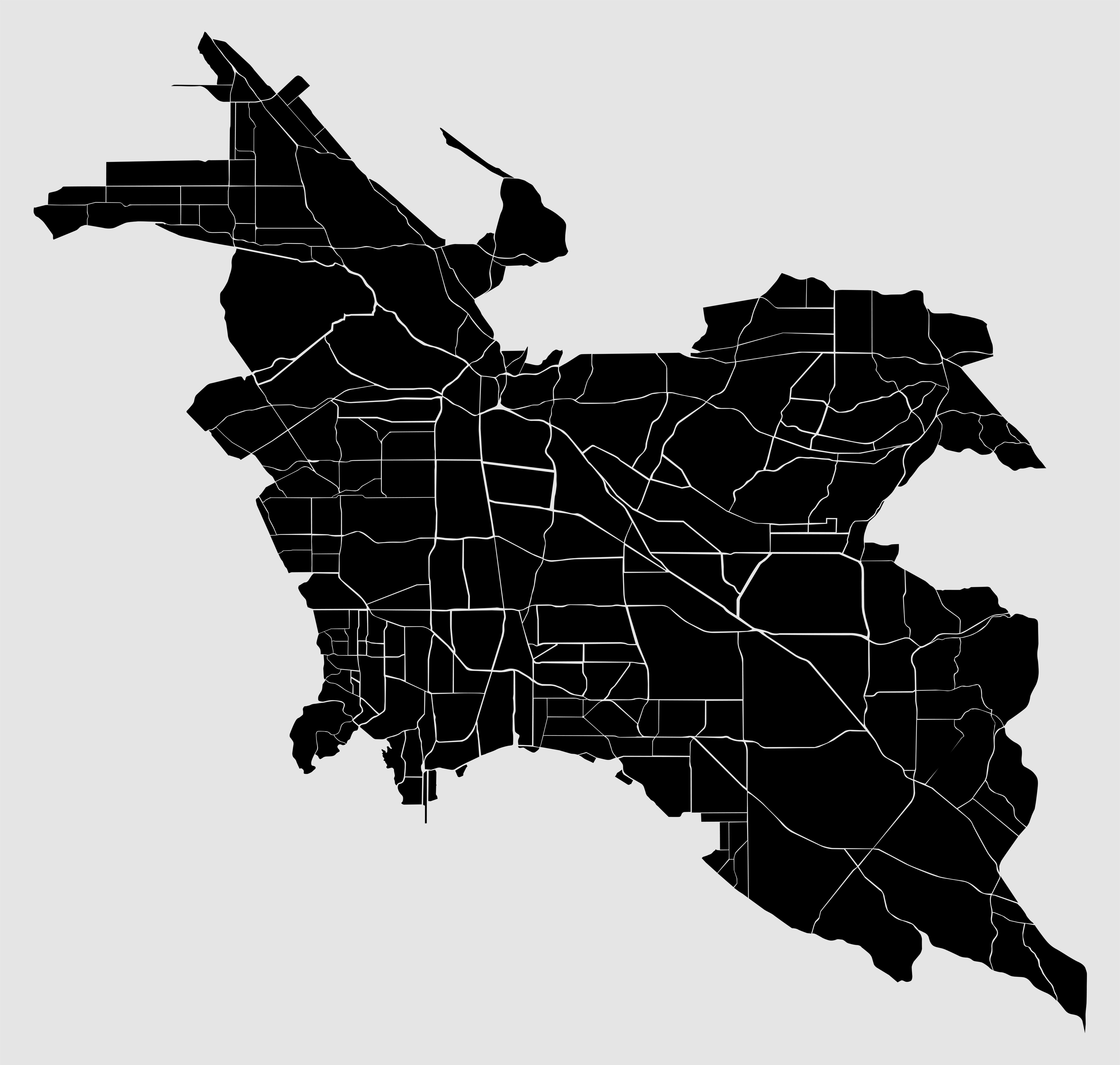
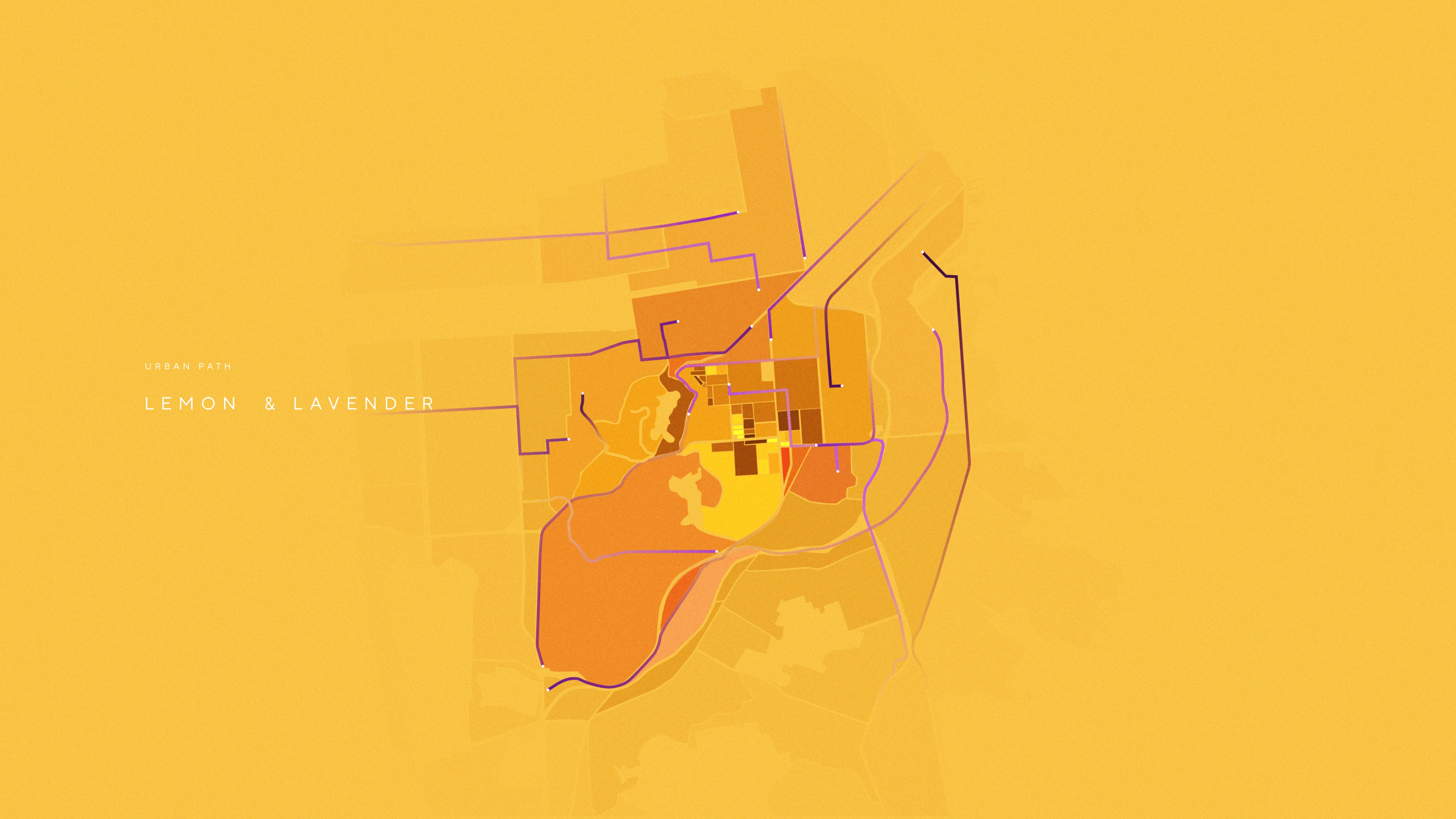
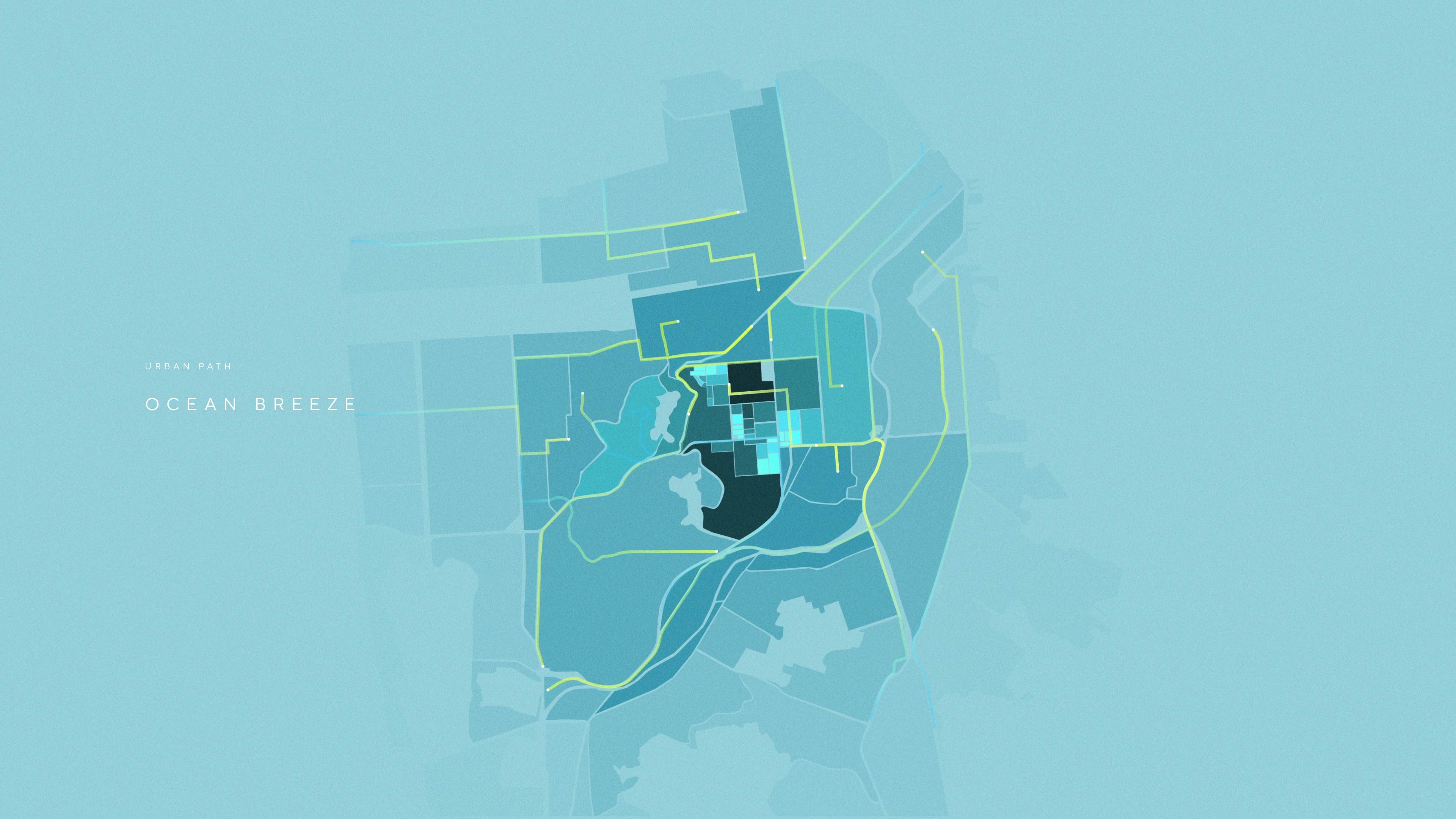
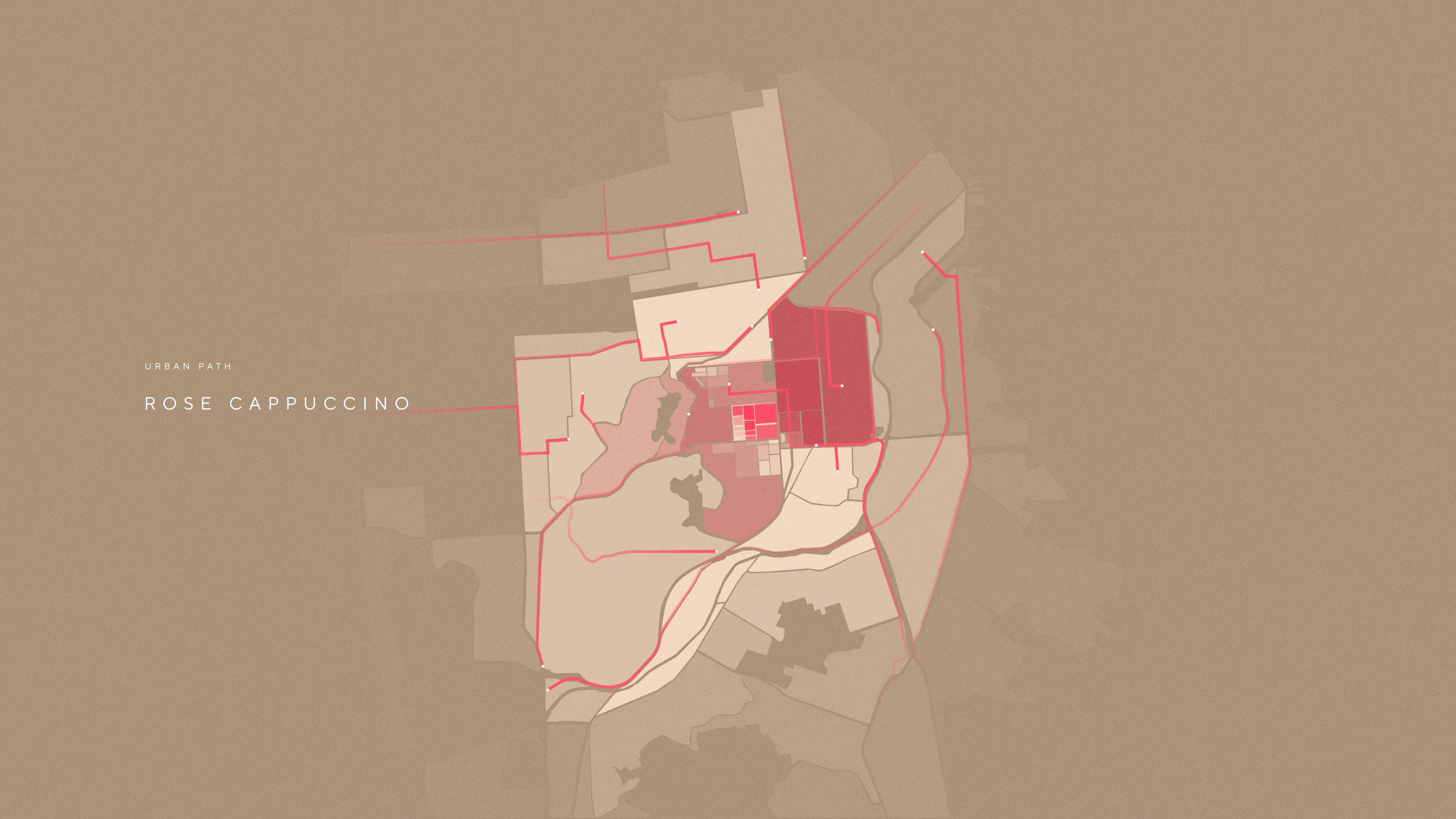
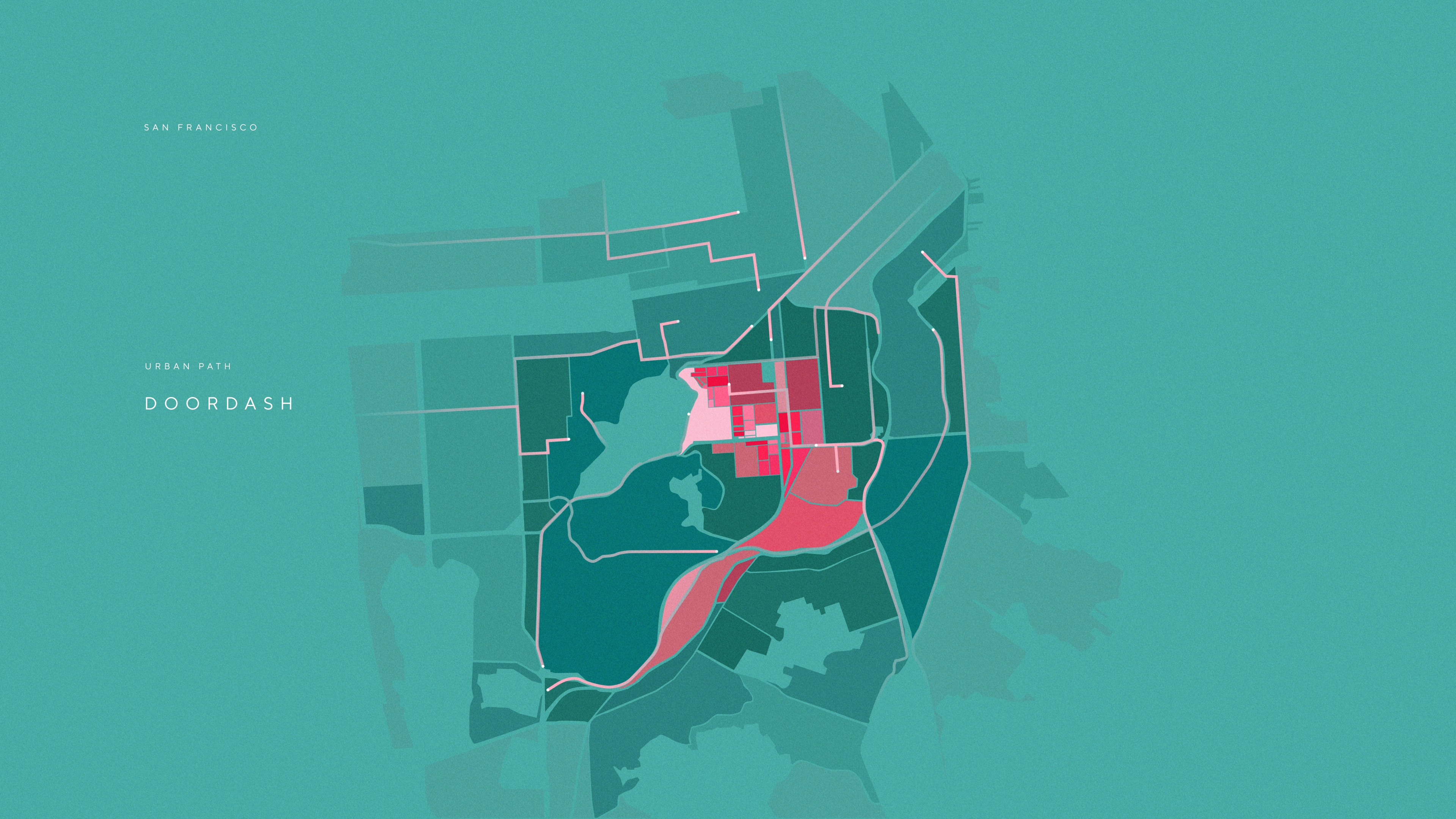
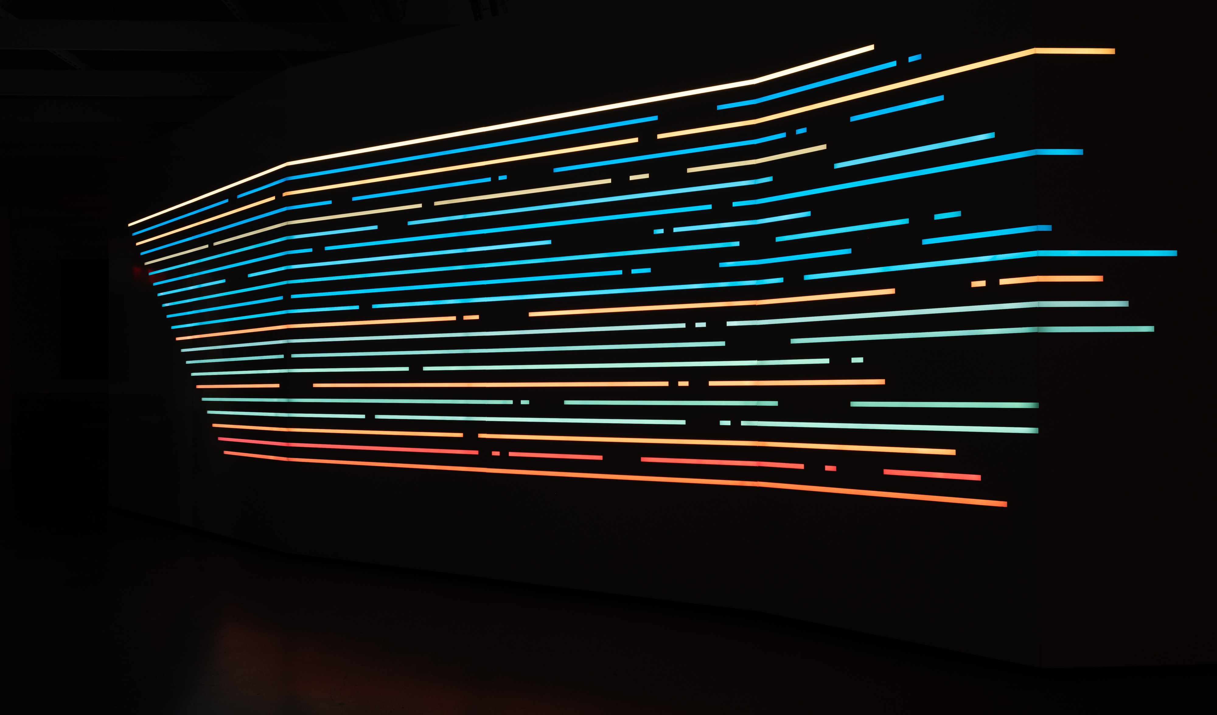
Urban Path illustrated the routes of Dashers as they complete their deliveries throughout the featured city. In this visualization, the entire city grid becomes systems of traveling line work, color-coded based on duration and lifespan to represent the entirety of the delivery route. The resulting visualization is an artistic urban bloom of activity that highlights how closely local communities are connected within the DoorDash platform.
There was also a Self-Portrait mode, which was an artful, interactive mode where lobby guests can connect with each other within the Mosaic. It represented the ideals that DoorDash stands for: inclusion, connection, access and possibility.
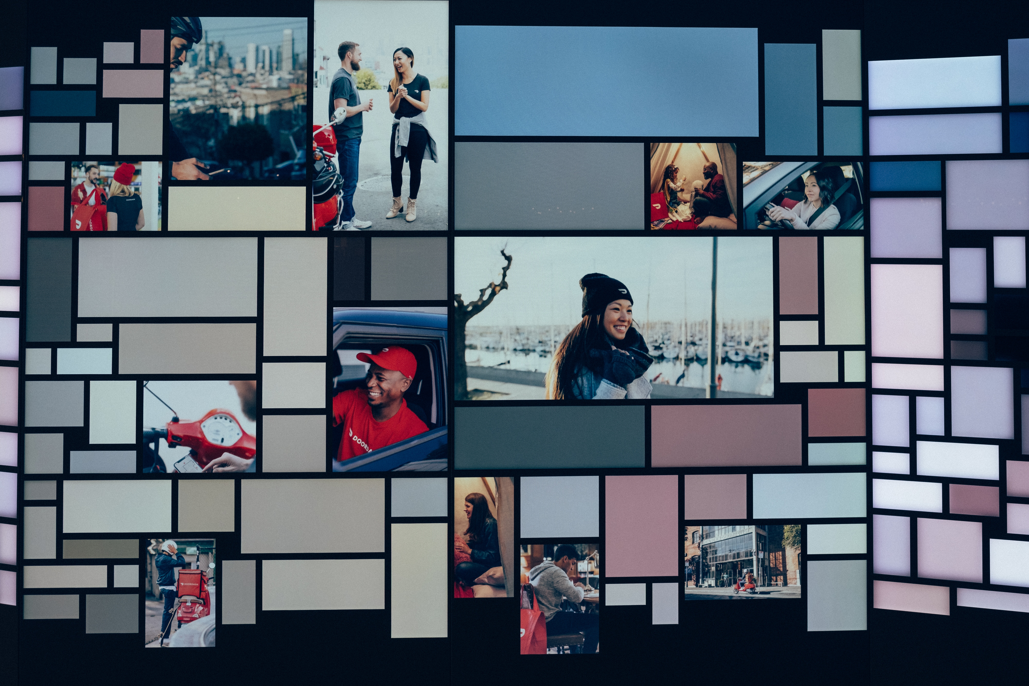
Lastly, there were three photographic content buckets featuring the Dashers, the Vendors and Cuisine offerings applied generatively throughout the grid as rich photo montages. These DoorDash-focused image grids richly show how DoorDash brings people together and creates new experiences centered around food and culture – helping grow local businesses and the communities that support them by creating new bonds between people through culinary and cultural moments.
The content featured two data visualizations, entitled City Pulse and Urban Path. City Pulse illustrated how the featured city comes alive with vibrant activity via an animated heat map. Through data, it tells the story of how DoorDash empowers local economies in these urban locales. As transactions and deliveries increase, the heat map activation grows and changes with saturated colors and graphic detail, reflecting the human connections made possible through the DoorDash platform.
Urban Path illustrated the routes of Dashers as they complete their deliveries throughout the featured city. In this visualization, the entire city grid becomes systems of traveling line work, color-coded based on duration and lifespan to represent the entirety of the delivery route. The resulting visualization is an artistic urban bloom of activity that highlights how closely local communities are connected within the DoorDash platform.
There was also a Self-Portrait mode, which was an artful, interactive mode where lobby guests can connect with each other within the Mosaic. It represented the ideals that DoorDash stands for: inclusion, connection, access and possibility.
Lastly, there were three photographic content buckets featuring the Dashers, the Vendors and Cuisine offerings applied generatively throughout the grid as rich photo montages. These DoorDash-focused image grids richly show how DoorDash brings people together and creates new experiences centered around food and culture – helping grow local businesses and the communities that support them by creating new bonds between people through culinary and cultural moments.
–– 03


The Build
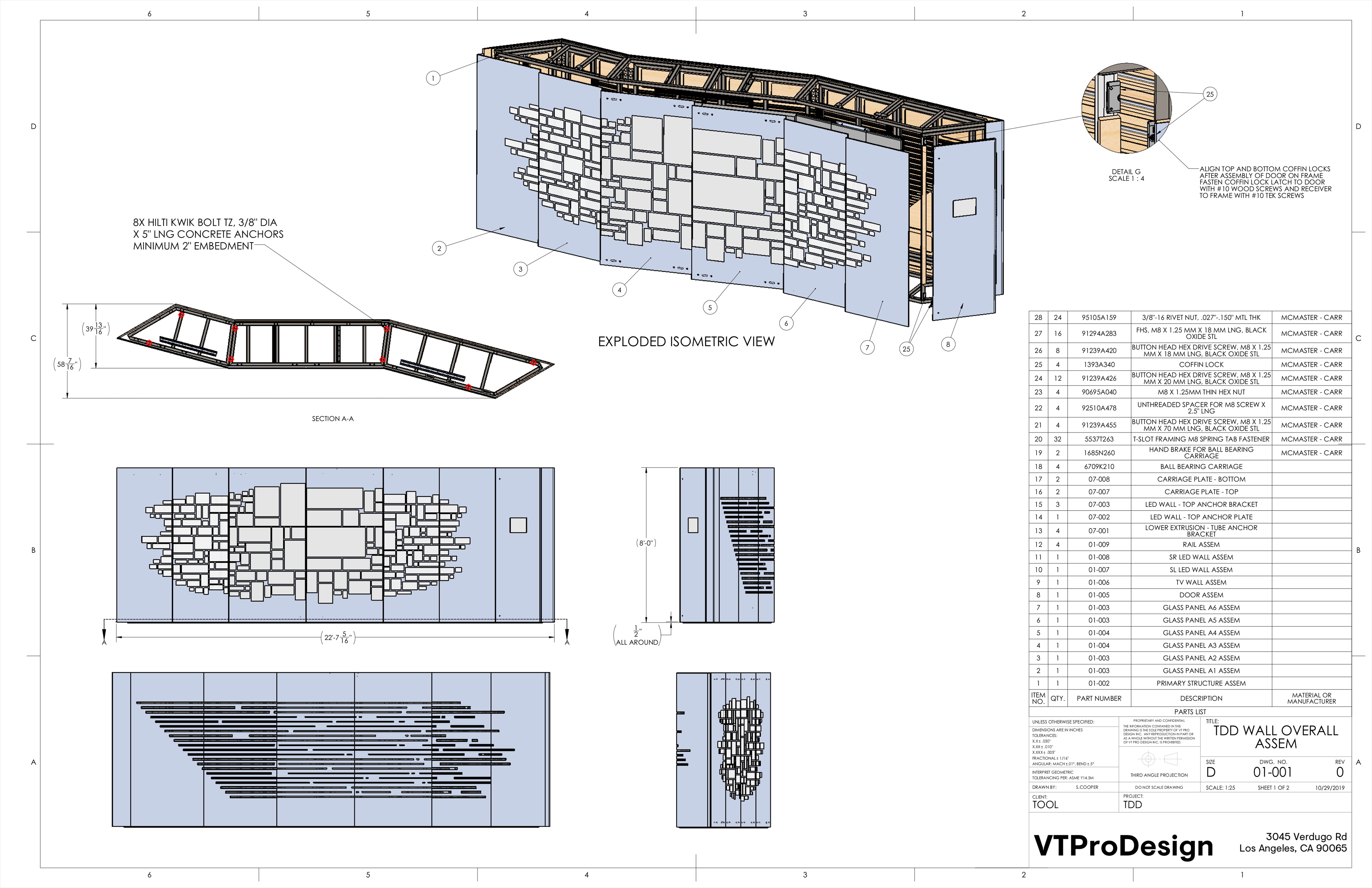
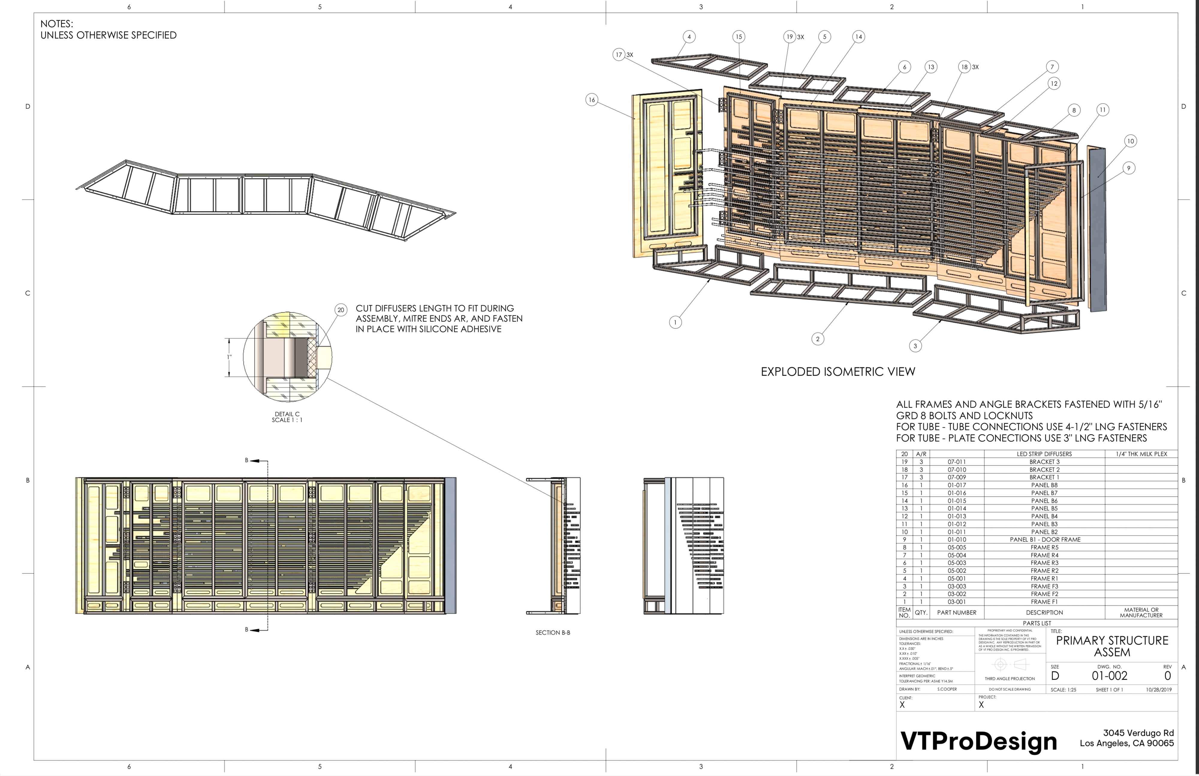
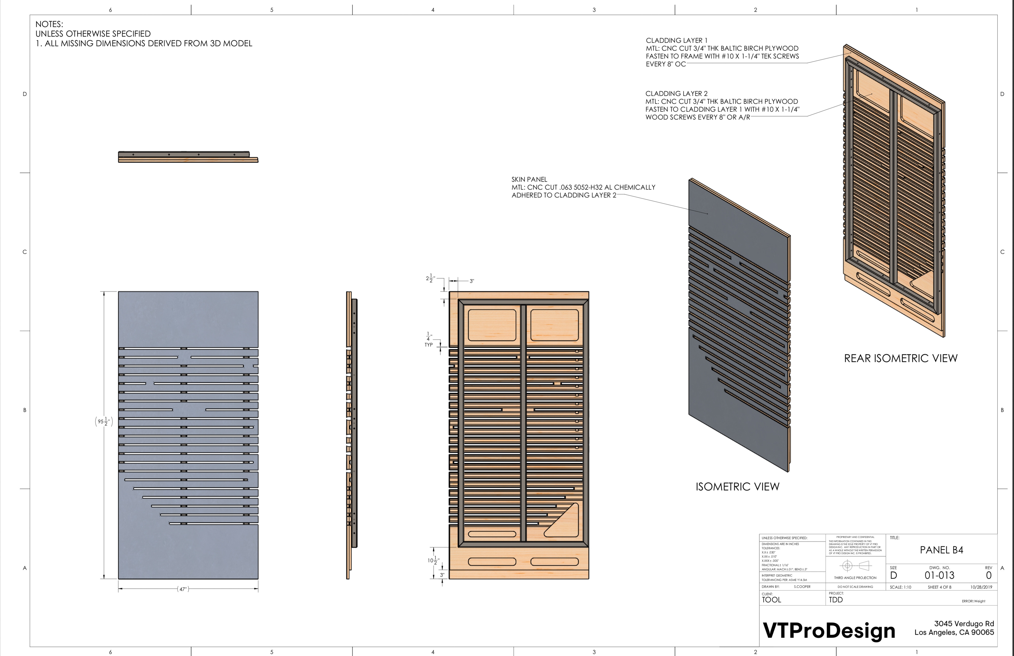
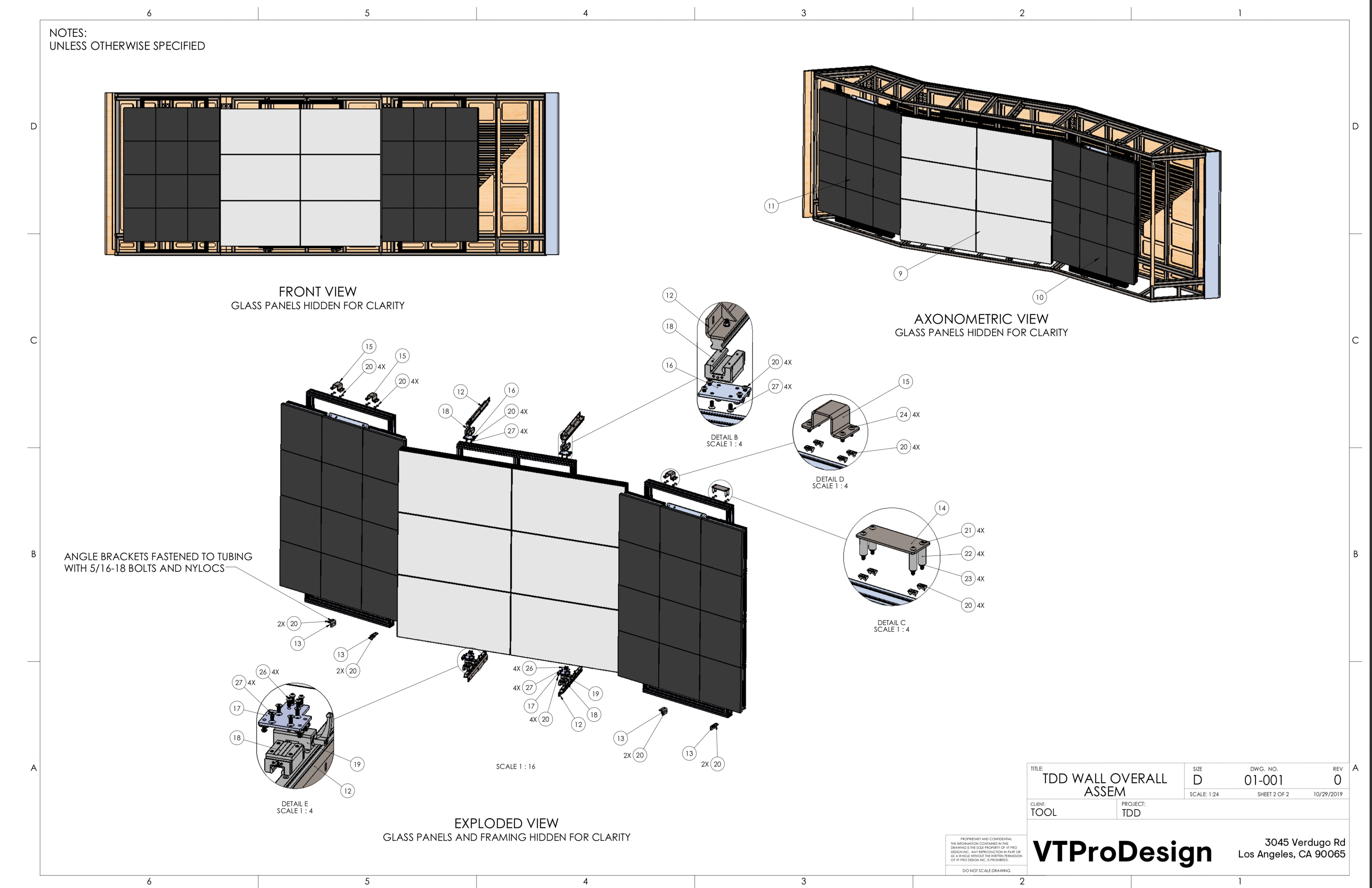
–– 04For the design of the platform, the goal was to create something highly detailed and polished with a deep foundation in design thinking and execution. A screen platform was desired by the client because of all the specific content and data to be presented, so a multi-planar experience was invoked in front and back with a keen eye for detail and refined material selection.
The team at VT Pro Design was exceptional in taking the platform designs and bringing them to reality with meticulous precision, flawlessly executing the build while creating the robust content program in TouchDesigner, including the data visualizations and all the generative algorithims presenting the content.
They also created an easy to use admin tool, similar to a Spotify playlist so that the DoorDash admin could program the content program that cycled through the various modes and color palettes that match the time of day and desired ambience of the office space – creating a rich platform with infinite content modes and possibilities so there were always new discoveries along the way.
A truly legendary job well done by the VT on this one.
–– 04

Credit List
Director: GMUNK
Production Company: Tool of North America
President: Dustin Califf
Executive Producer: Adam Baskin
Producer: Rebeca Diaz
Production Design: VT Pro Design
Chief Executive Officer: Vartan Tchekmedyian
Chief Creative Officer: Michael Fullman
Project Manager: Paul Elsberg
Chief Technology Officer: Harry Souders
TouchDesigner Lead: Matt Wachter
Touch Designer: Aki Yamashita
Architect: Anass Benhachmi
Senior Creative Technologist: Colin Honigman
Creative Technologist: Dom Ricci
Production Director: Hayk Khanjian
Production Manager: Nicolas Yernazian
Content Designer: Toros Kose
Case Study Director: Andrew Curtis
Case Study Director: Aaron Marcellino
Case Study Photography: Bradley G Munkowitz