Mediatemple Clear
April 2009 ––While at Buck Los Angeles, munkowitz was given the most excellent opportunity to design and direct a launching piece for his dear friends at Mediatemple, visually ushering in their ambitous and highly respectable 'Clear Initiative' to the public. The conceptual challenges were varied, as a lengthy two and a half minute script detailing the initiative was to be featured and visually supported with an open brief, so two different treatments were presented.
The Film
–– 01Framework
–– 02
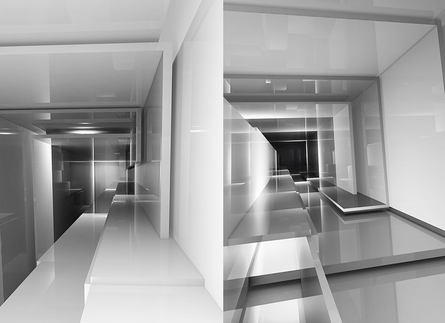
We open on a glossy rendering of a dark grey gradient with some subtle reflections. As the VO begins to discuss the complications of consumerism, a cluster of sharply angled shapes extrude from the surface, making up a very rigid maze of rectangular planes, all opaque yet highly glossy and reflective. The composition becomes architecturally inspired, creating an complex and dynamic maze-like space for the camera to fly through while the VO continues to discuss the costs of how businesses operate.
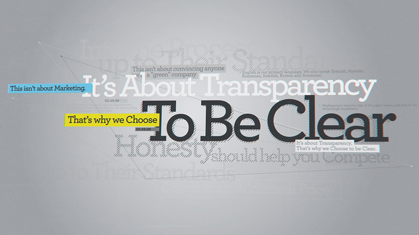
Key phrases of text project from beneath the glossy walls of the maze, as do minimal, abstract graphic depictions of their meaning. These projections light up the space and add flashes of cool tones to the composition, and are removed as more opaque walls shift to cover them. The camera continues to explore the space, which is constantly transforming and building itself to continue the infinite feel of the maze. One key effect of integration occurs when the 3d composition flattens out to a 2D graphic clone of the same composition, keeping the fluid camera motion but giving a fresh variety of style to the piece. During these 2D moments, key typographic phrases are revealed beneath animating shapes, providing a simple graphic aesthetic to translate the message.
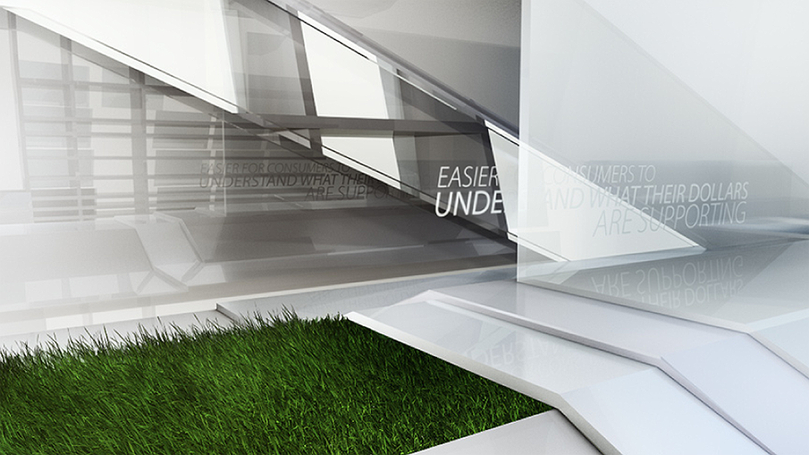
As the script progresses to discuss Mediatemple's clearer view, noticeable differences occur in the visuals. First, the opaque, glossy boundaries of the space begin to recede behind clear, transparent materials, gradually opening up the space. It's not a 'morph' or a material shift, just a simple move where the opaque materials shift out of frame as the new materials are revealed on both sides of them. This continues to occur, rendering the frame with more light and a fresher, clarifying feeling. Text and minimal graphics still are projected beneath the new, clear surfaces, but in a slightly different style. Another noticeable difference is in the shapes of the panels and the maze; it becomes more spherical, more organic and curved instead of the rigid, hard architectural angles of the opaque space. And finally, the 2D moment using the clear materials is also noticeably different in its color palette and complexity, rendering a much fresher composition.
This transformation of the space occurs all the way through the end of the script line 'It's about Transparency' where at that moment, all the opaque materials have receded and the transparent ones have overlapped themselves to create and clear, beautifully crafted spherical formation around the camera. The sphere lights up with a grahic pattern one last time before disassembling, leaving the frame blank as the VO reads 'it should help make everything a lot less complicated.''
Key phrases of text project from beneath the glossy walls of the maze, as do minimal, abstract graphic depictions of their meaning. These projections light up the space and add flashes of cool tones to the composition, and are removed as more opaque walls shift to cover them. The camera continues to explore the space, which is constantly transforming and building itself to continue the infinite feel of the maze. One key effect of integration occurs when the 3d composition flattens out to a 2D graphic clone of the same composition, keeping the fluid camera motion but giving a fresh variety of style to the piece. During these 2D moments, key typographic phrases are revealed beneath animating shapes, providing a simple graphic aesthetic to translate the message.
As the script progresses to discuss Mediatemple's clearer view, noticeable differences occur in the visuals. First, the opaque, glossy boundaries of the space begin to recede behind clear, transparent materials, gradually opening up the space. It's not a 'morph' or a material shift, just a simple move where the opaque materials shift out of frame as the new materials are revealed on both sides of them. This continues to occur, rendering the frame with more light and a fresher, clarifying feeling. Text and minimal graphics still are projected beneath the new, clear surfaces, but in a slightly different style. Another noticeable difference is in the shapes of the panels and the maze; it becomes more spherical, more organic and curved instead of the rigid, hard architectural angles of the opaque space. And finally, the 2D moment using the clear materials is also noticeably different in its color palette and complexity, rendering a much fresher composition.
This transformation of the space occurs all the way through the end of the script line 'It's about Transparency' where at that moment, all the opaque materials have receded and the transparent ones have overlapped themselves to create and clear, beautifully crafted spherical formation around the camera. The sphere lights up with a grahic pattern one last time before disassembling, leaving the frame blank as the VO reads 'it should help make everything a lot less complicated.''

Release
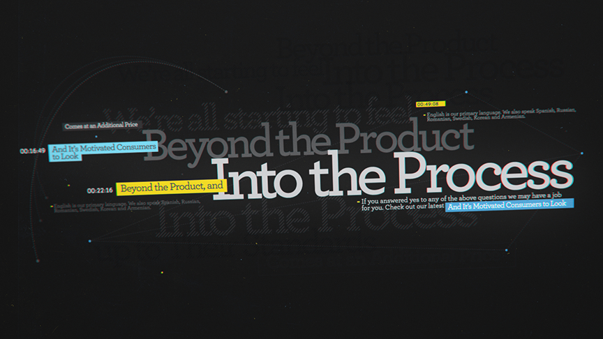
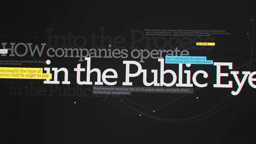
–– 03We open on a dark gradient, flickering slightly as a hand-held camera examines the frame. As the VO begins to discuss the complications of consumerism, a gathering of typography fills the frame in a quick response, highlighting every detail of the script in an intricately designed, multi-layered composition. The typography varies dramatically in size and color, yet the font style remains consistent. As the next verse of the script is read, the type pushes back in Z space, becoming out a focus and darkening in color as new typography flies into frame from behind camera, keeping up with the voiceover.
As the spot progresses, the typography stack grows denser while the VO begins to outline the theories behind the Clear Initiative, the already recited typographic layers becoming background elements filled with 45 degree graphic hatches, barely visible in the distance. In addition, an introduction of small microtext elements join the stack, depicting all the data that Mediatemple is releasing to the public during the initiative. These small bits of information add texture to the composition and reinforce the premise of script.
By the culmination of the spot, the camera noticeably travels with more definitive movements, moving further in XYZ space as the mood of the spot becomes more positive. Also accompanying the upward mood of the spot is a gradual background transformation, from a dark gray to a brilliant light grey, so by the conclusion of the spot, the background becomes almost white, punctuating the script's concept of transparency while the informational data texture flows freely and fills the screen.
The Results
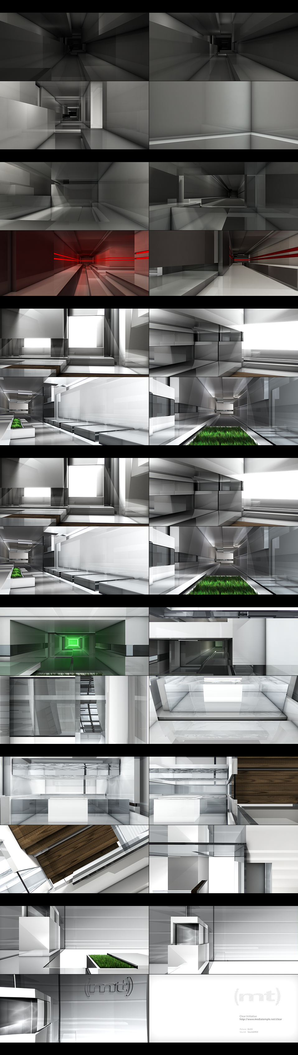
–– 04Mediatemple appreciated the more transformative properties of the framework treatment, feeling conceptually it supported their initiative most accurately, yet remained abstract and artistic enough to steer away from a corporate video feeling. Below is the final storyboard of keyframes from the piece.
Mediatemple Clear Credit List
Production Company: BUCK
Creative Director: Ryan Honey
Executive Producer: Maurie Enochson
Producer: Eric Badros
Design Director: Bradley G Munkowitz
Lead 3D Artist: Cody Smith
3D Artists: Doug Appleton, Andreas Weber
Compositor: Bradley G Munkowitz
Audio: SoundsRED
Production Company: BUCK
Creative Director: Ryan Honey
Executive Producer: Maurie Enochson
Producer: Eric Badros
Design Director: Bradley G Munkowitz
Lead 3D Artist: Cody Smith
3D Artists: Doug Appleton, Andreas Weber
Compositor: Bradley G Munkowitz
Audio: SoundsRED