Europa Clipper
October 2024 ––
NASA enlisted Mr. Munkowitz to work on the conceptual imagery for their Europa Clipper campaign, which in October embarked on a nearly six-year journey to Jupiter’s icy moon, Europa—a prime candidate for extraterrestrial life in our solar system. The discoveries there could impact all of humanity.
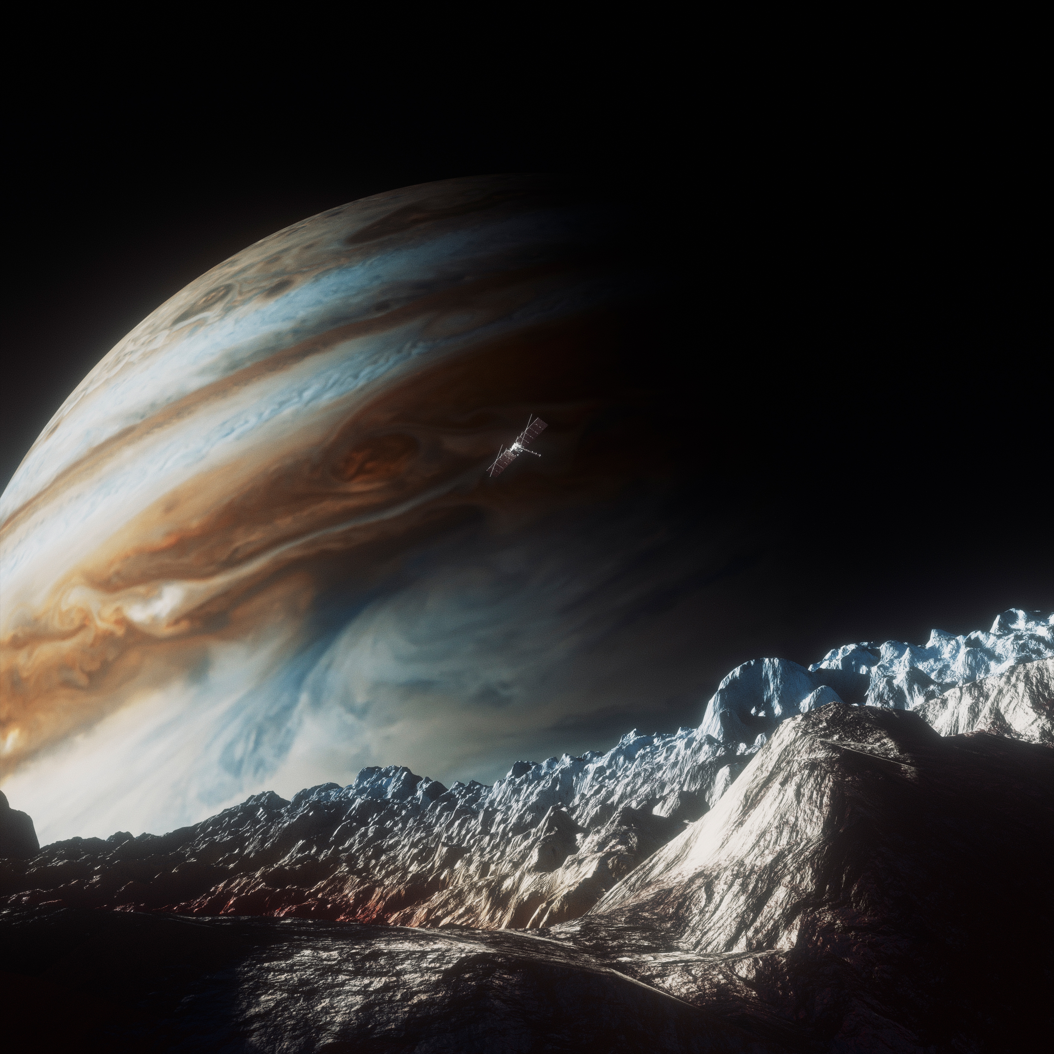
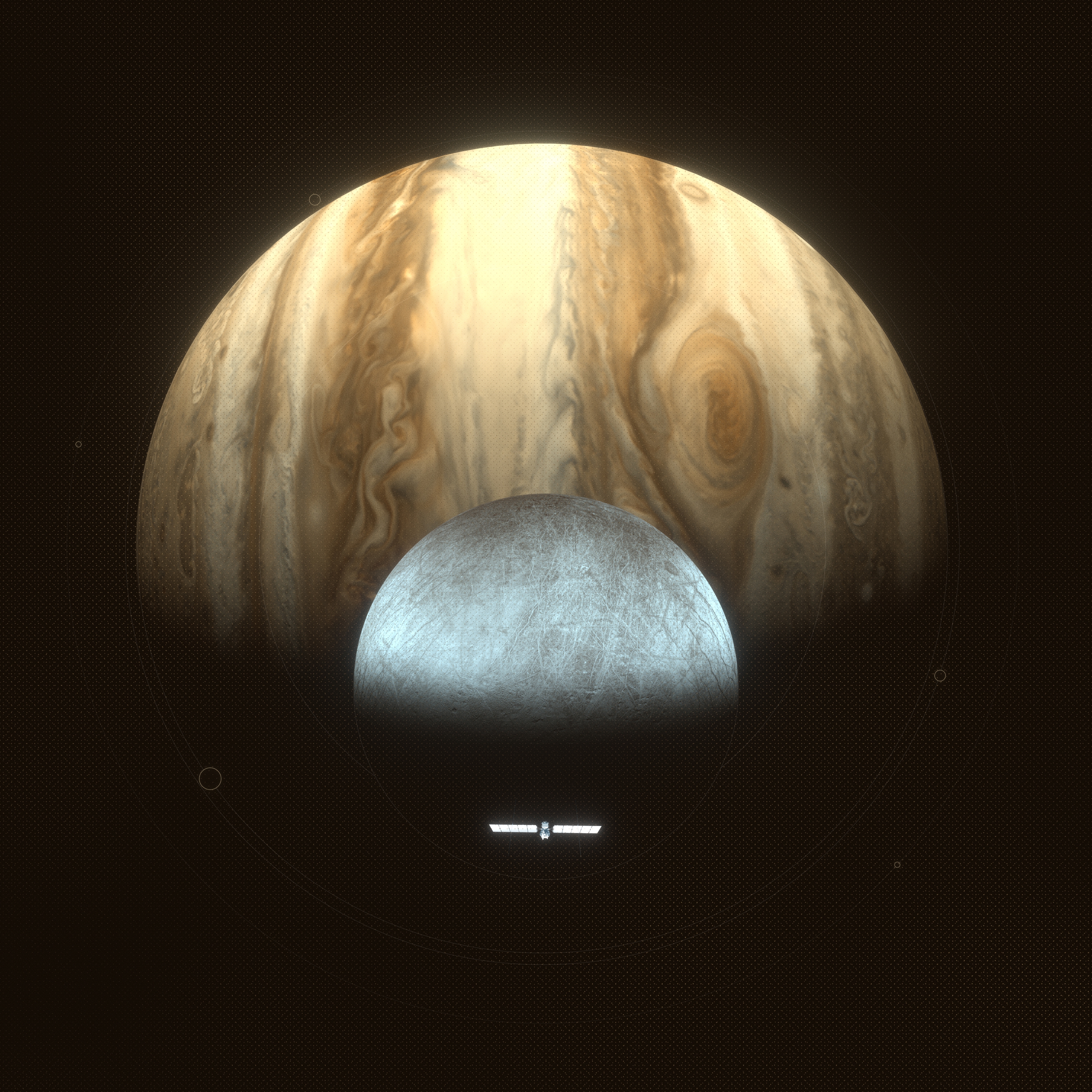
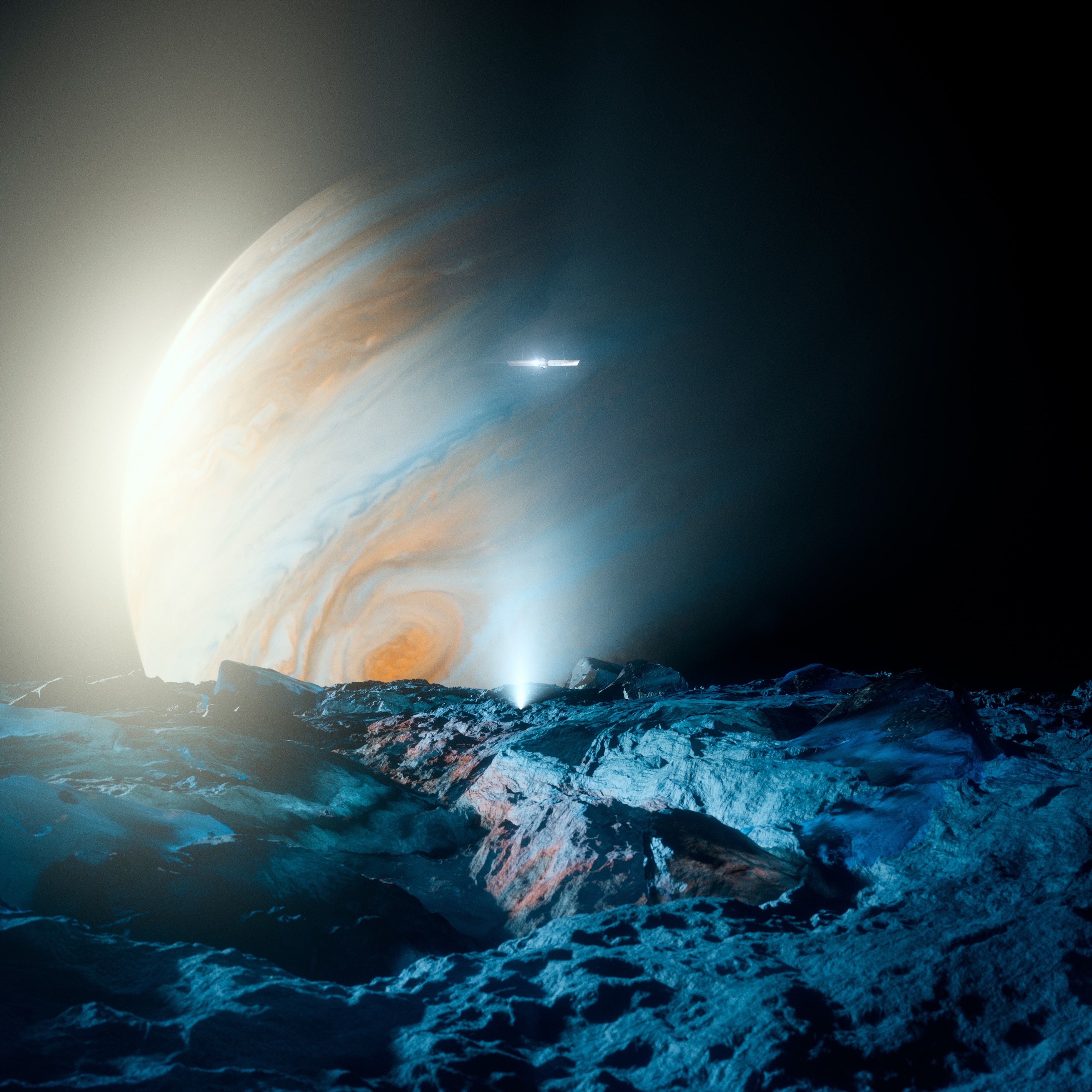
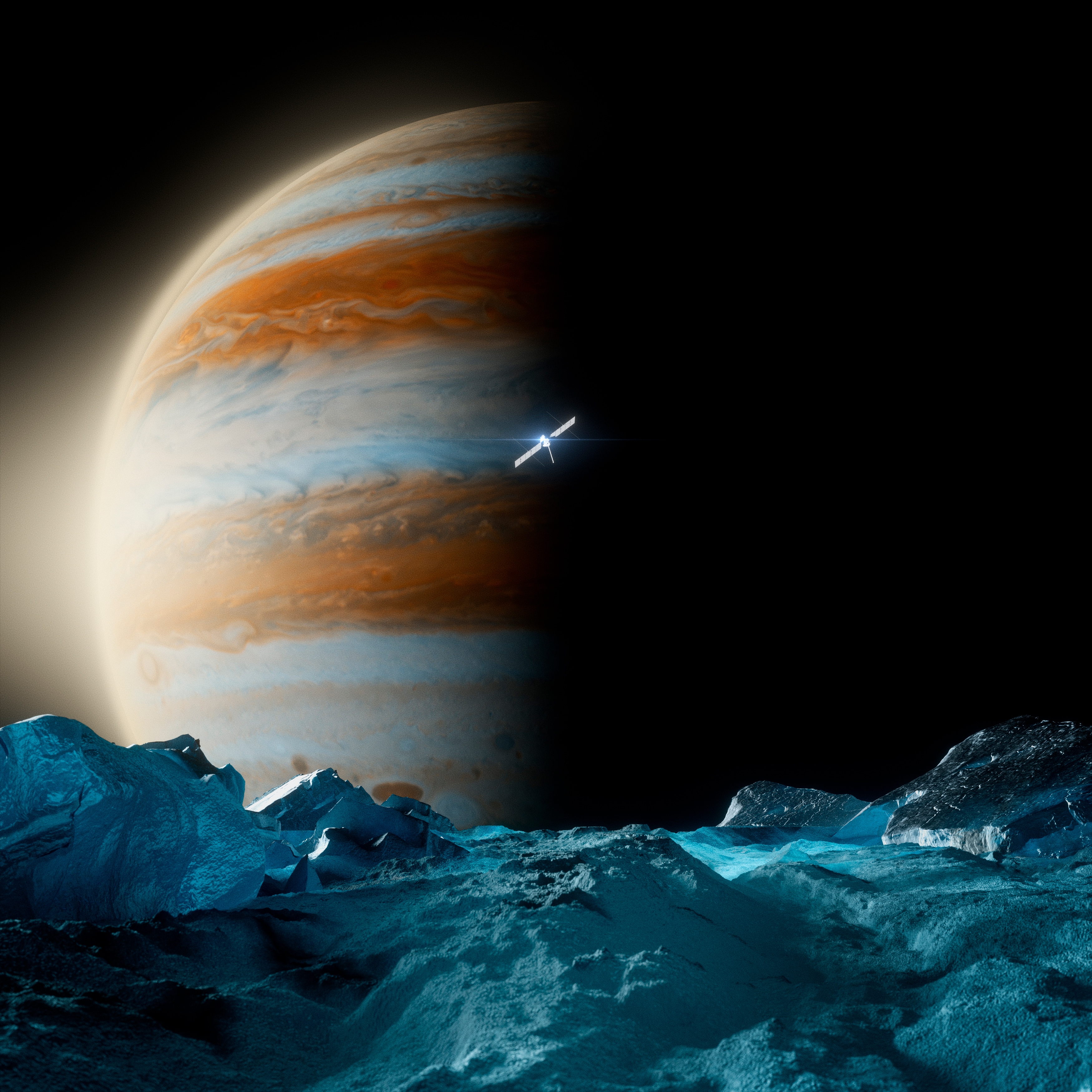
The key visuals needed to highlight the three elements of the mission – the spacecraft, Jupiter and it’s moon Europa using a cinematic low-angle evoking the interstellar crop-dusting type sweeps Clipper will make. The project ended up exploring two distinct design directions; one leaning into graphic design fundamentals and the geometric nature of planetary bodies and space exploration. The second direction leaned into a more literal, photographic aesthetic, aiming to envision what being on site, on the surface of Europe could look and feel like.
For this ambitious endeavor, Munky collaborated with his trusted creative powerhouse, the ever-handsome Toros Kose. Together, they explored and refined an immense volume of concepts and executions. While only one hero visual was ultimately chosen, the journey of experimentation presented unique challenges and equal inspiration.


Story
In the first set of images, the creative direction centered on telling the story of the mission through a photographic approach. These visuals aimed to immerse viewers in the journey of the Europa Clipper, focusing on the grandeur and significance of the expedition.
By combining cinematic composition with photorealistic details, the imagery sought to evoke what it might feel like to witness the spacecraft in action—soaring through space, framed against the colossal presence of Jupiter and the icy, mysterious surface of Europa. This direction prioritized an emotional connection, allowing viewers to visualize the mission's narrative: the Clipper's long journey, its precision maneuvers, and the profound potential for discovery at its destination.
This photographic storytelling brought a sense of scale, wonder, and realism to the campaign, grounding the visuals in the scientific and human ambition driving the mission.

Point of View
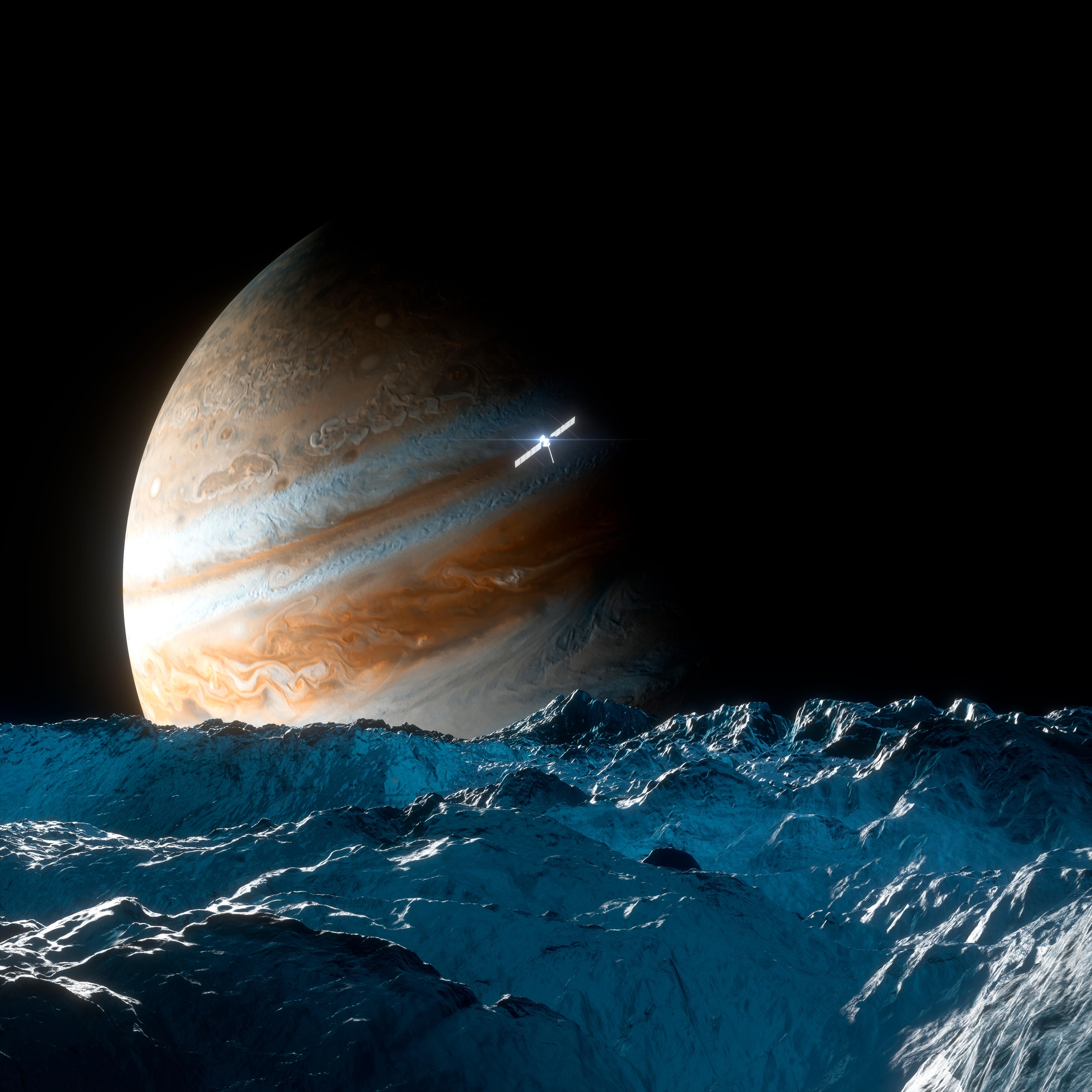
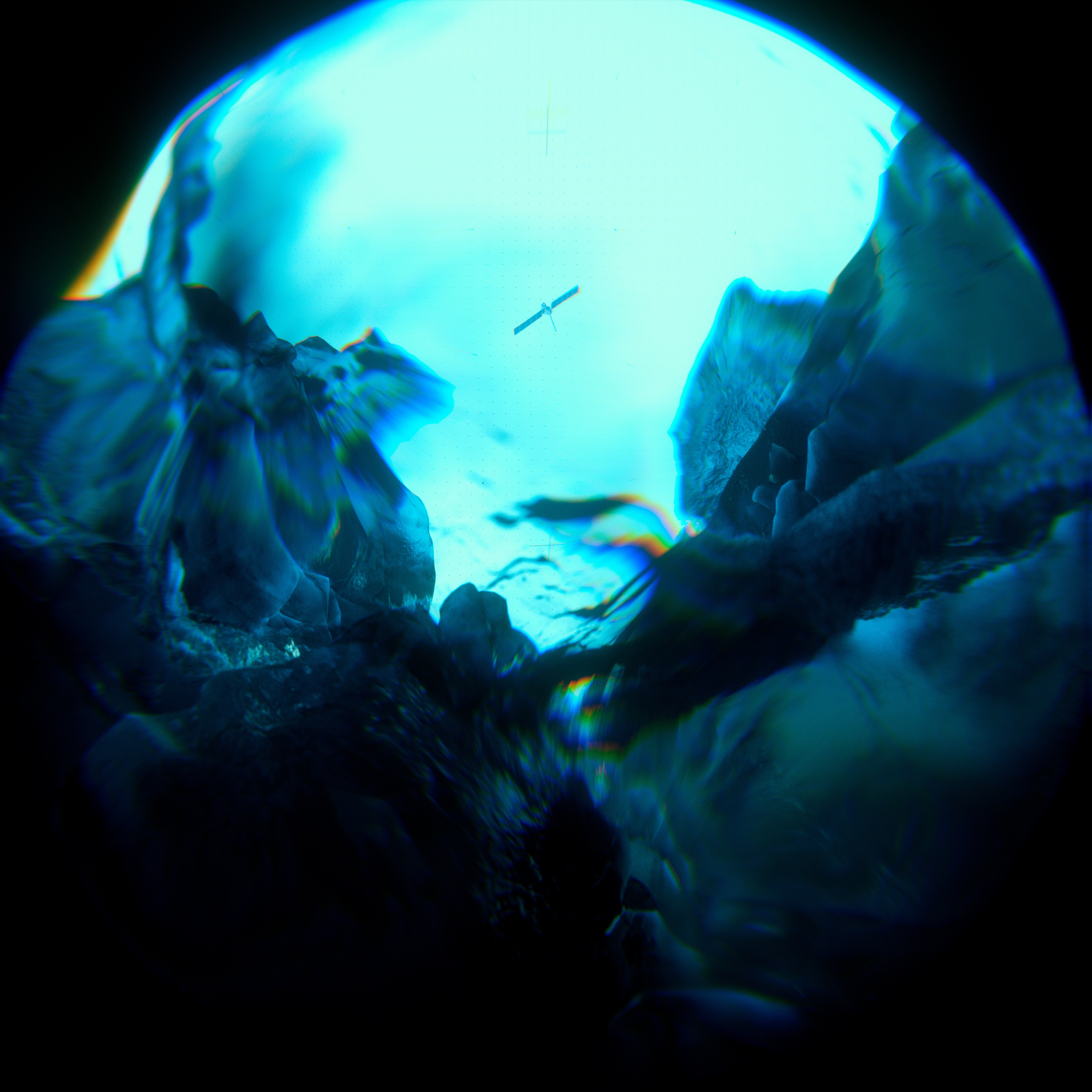
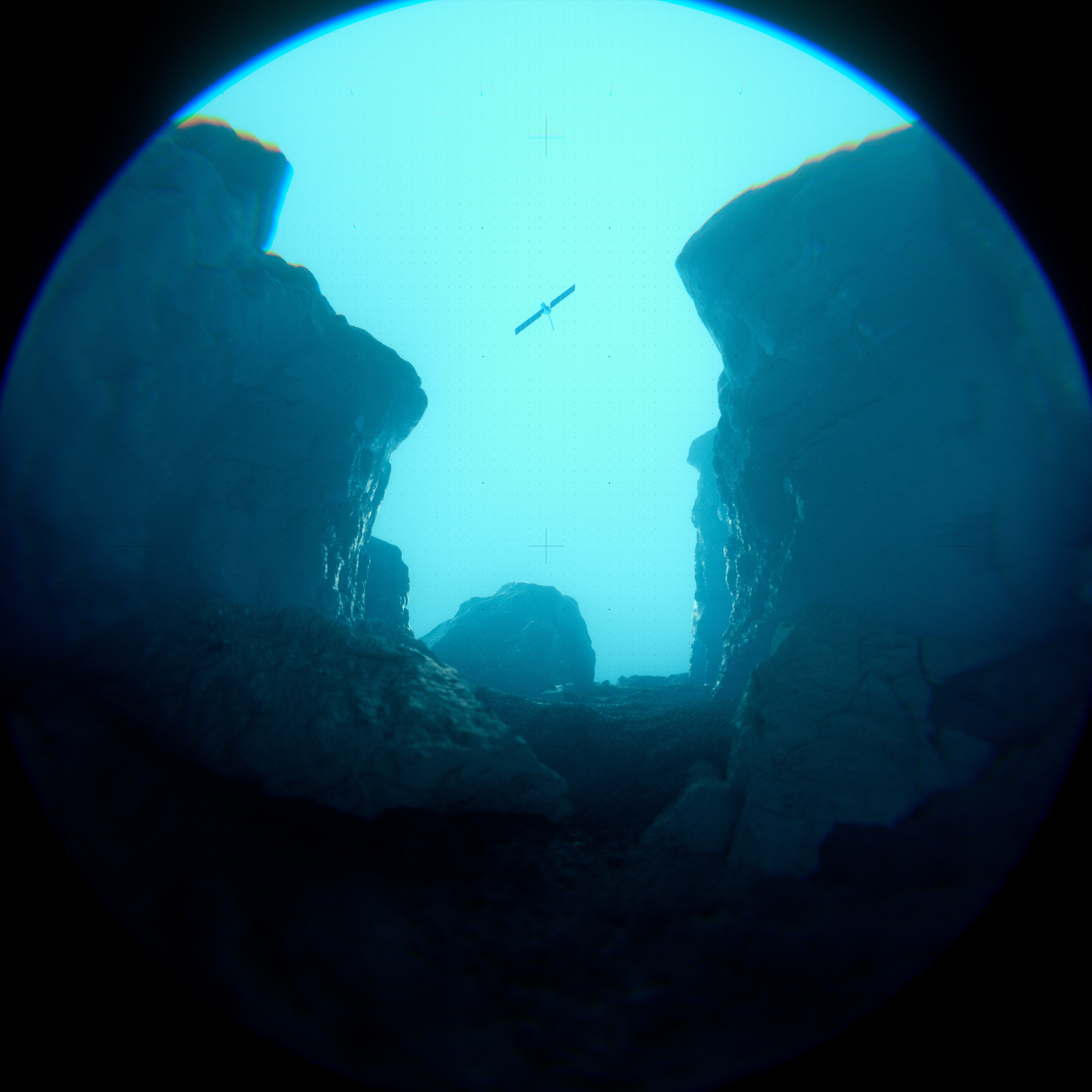
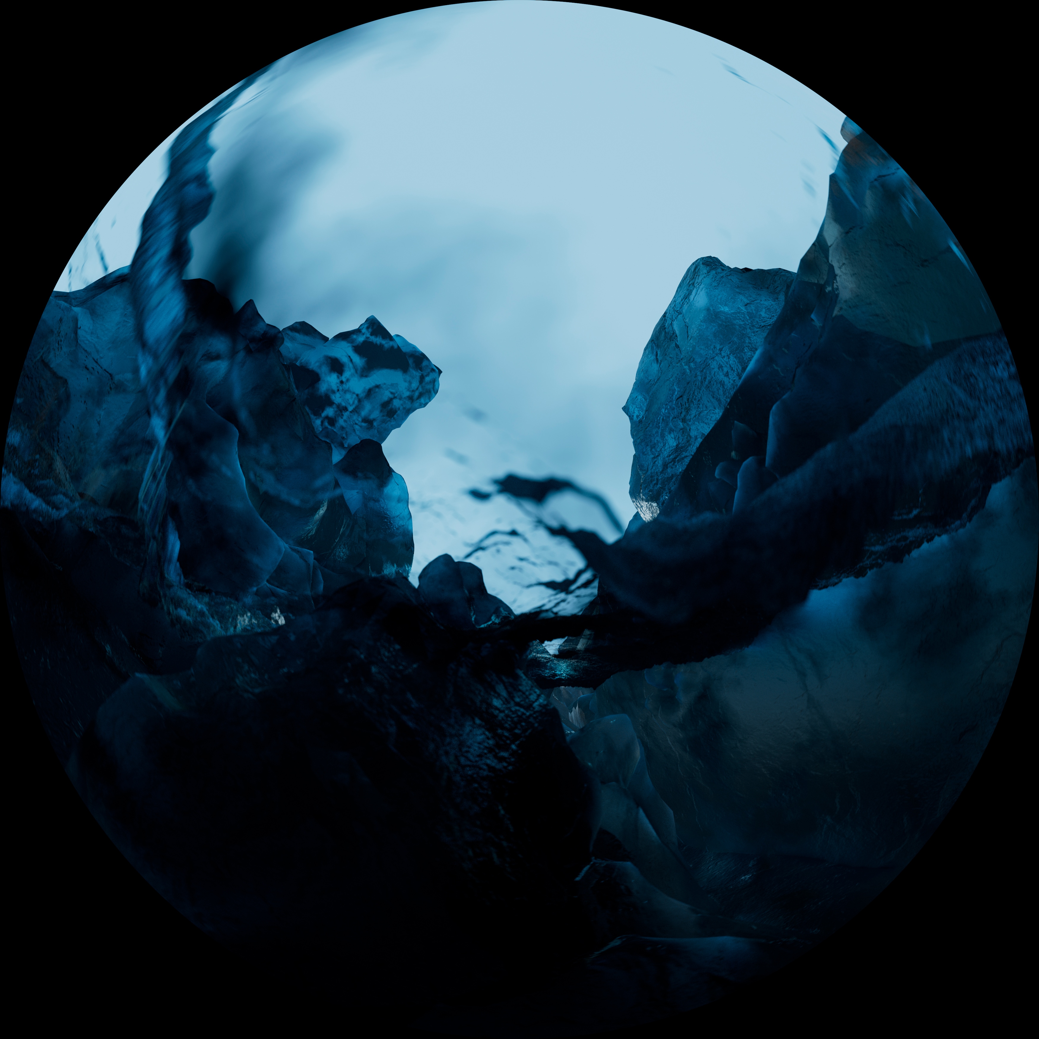
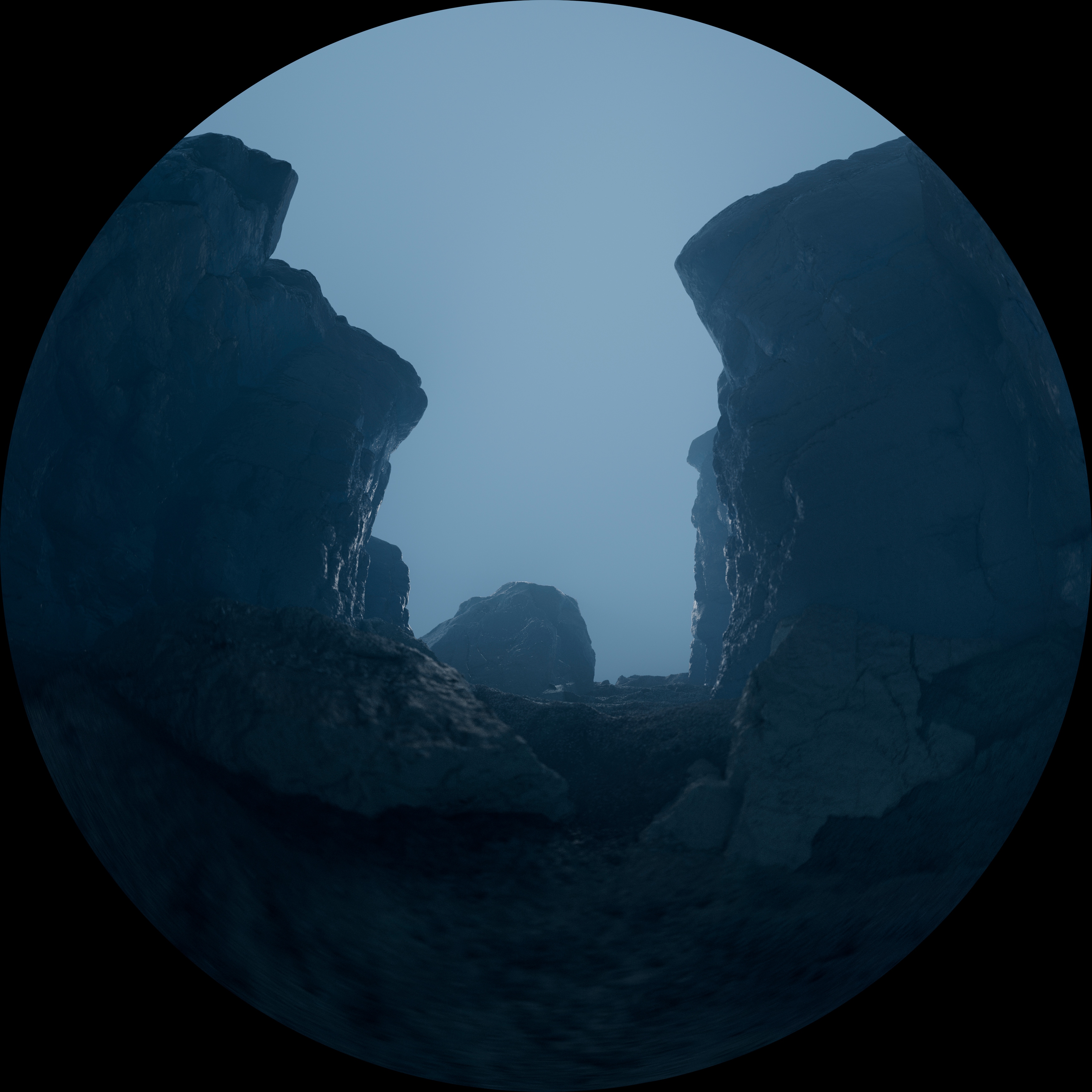
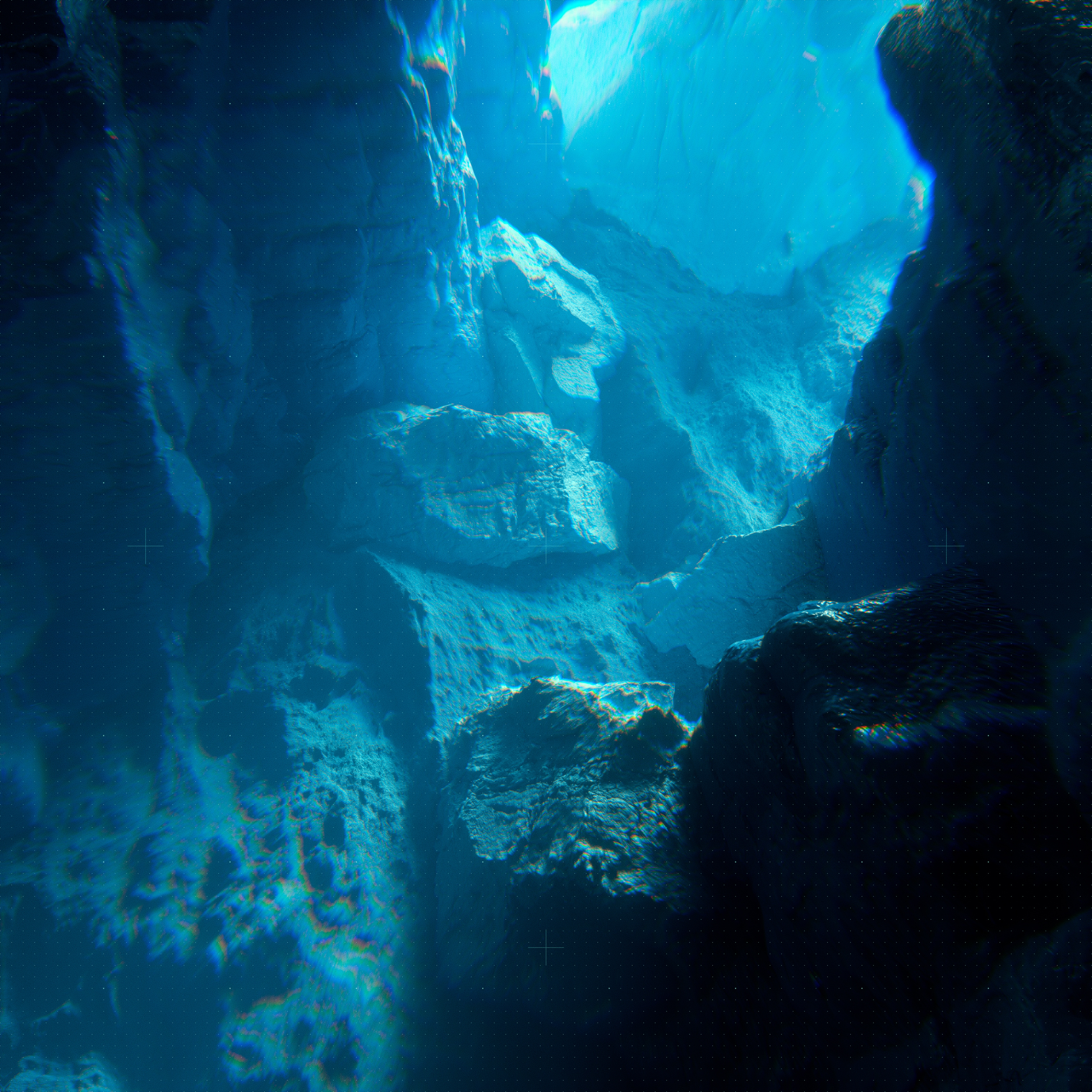
The second set of images shifted perspectives to a point-of-view approach, placing the viewer in the “eyes” of the Europa Clipper itself. This direction imagined what the spacecraft might witness on its journey—offering a unique vantage point of Jupiter and Europa through the satellite's perspective.
The visuals explored sweeping, immersive compositions that captured the raw, untouched beauty of Europa’s icy surface, the towering presence of Jupiter dominating the sky, and the spacecraft's methodical sweeps through this vast and alien environment. This approach was both intimate and expansive, creating a visceral sense of being there alongside the satellite as it scanned for answers.
By leaning into a first-person narrative, the imagery brought viewers closer to the scientific mission, allowing them to experience the perspective of exploration itself: the fractured ice plains, the shadowed ridges of Europa, and the endless void of space punctuated by Jupiter’s swirling atmosphere. It was an artistic exercise in empathy—connecting the audience to the spacecraft as an extension of humanity’s curiosity and reach.
This direction provided a cinematic immersion, helping viewers feel the enormity of the mission while inspiring a sense of awe and wonder for what might be uncovered on this distant, frozen world.
Abstracts
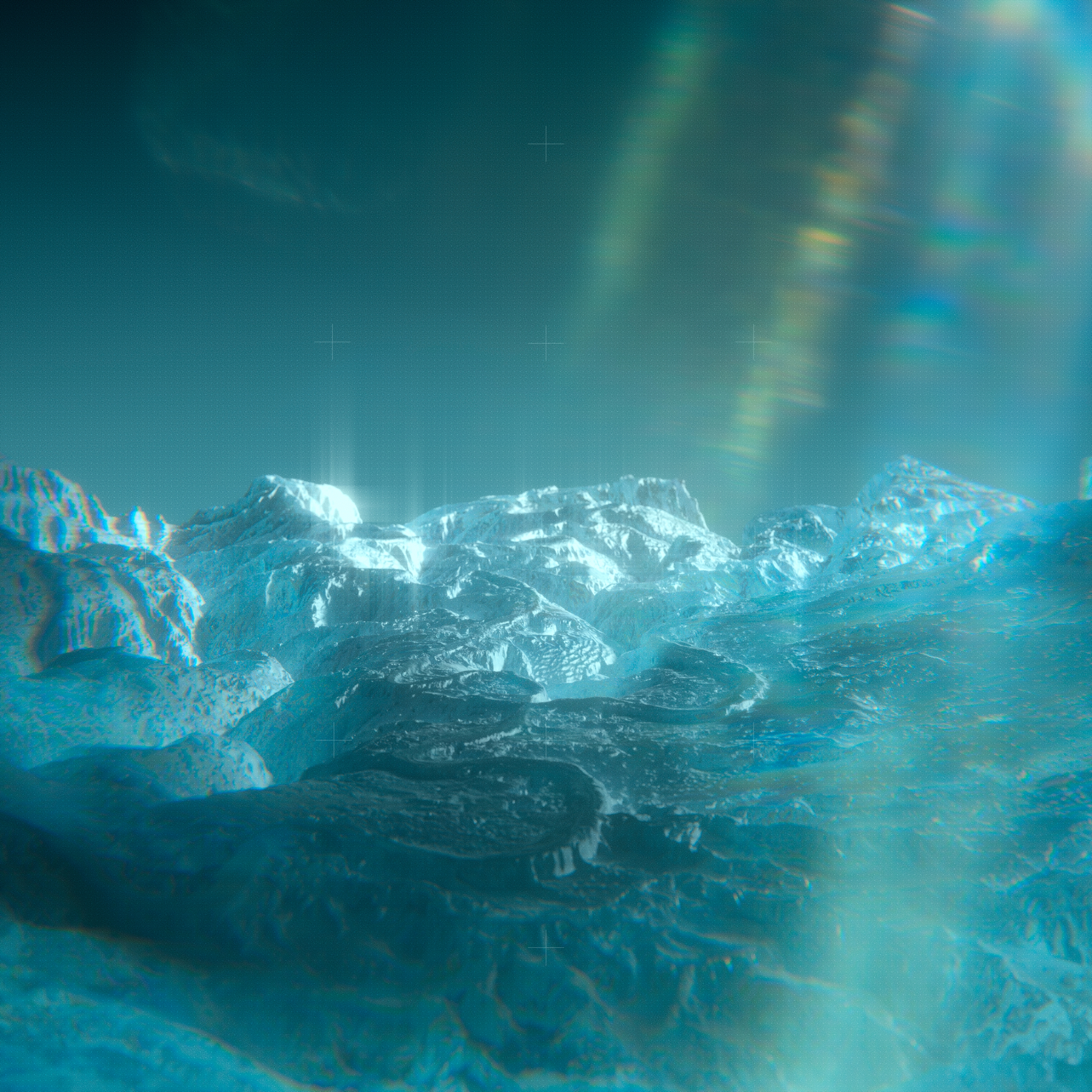
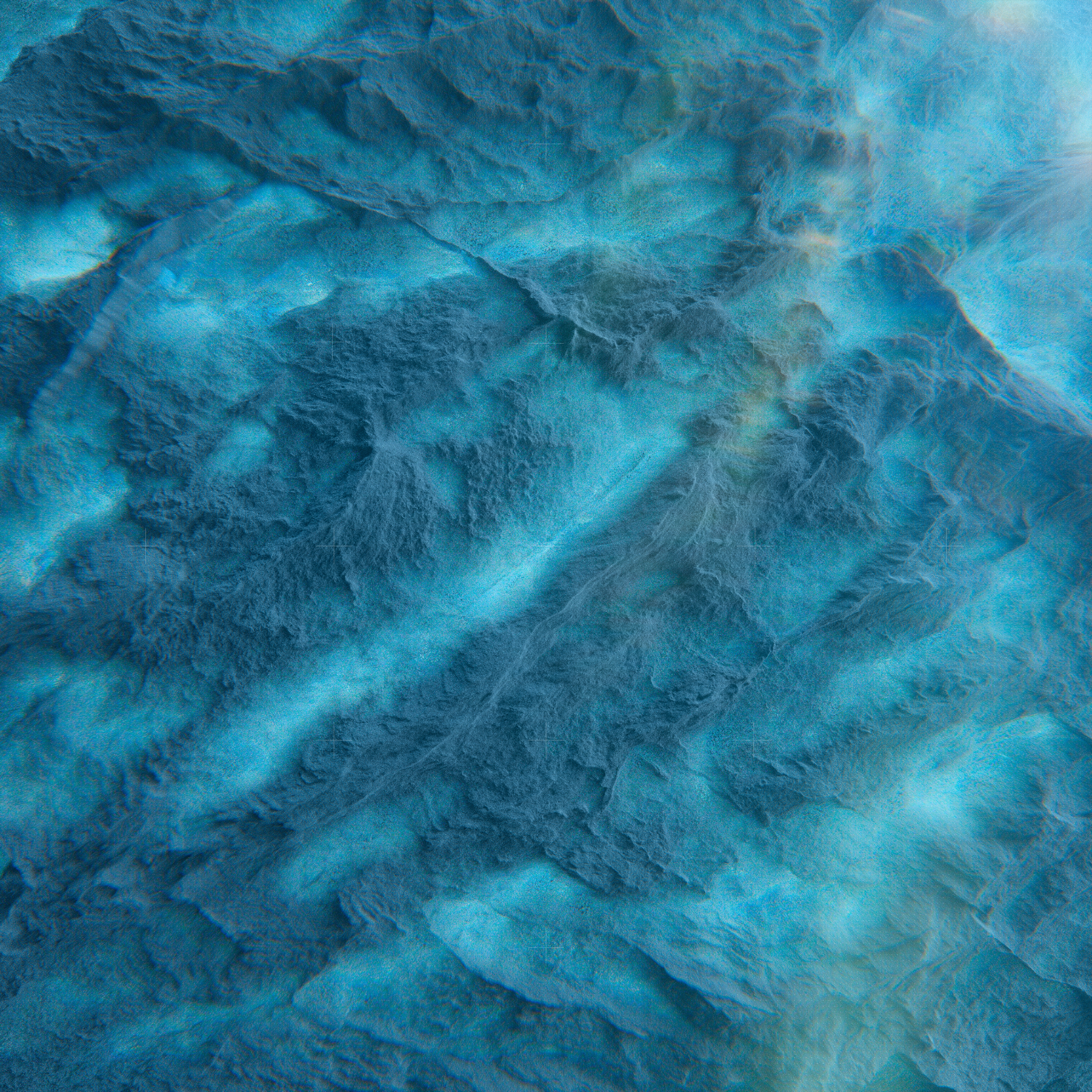
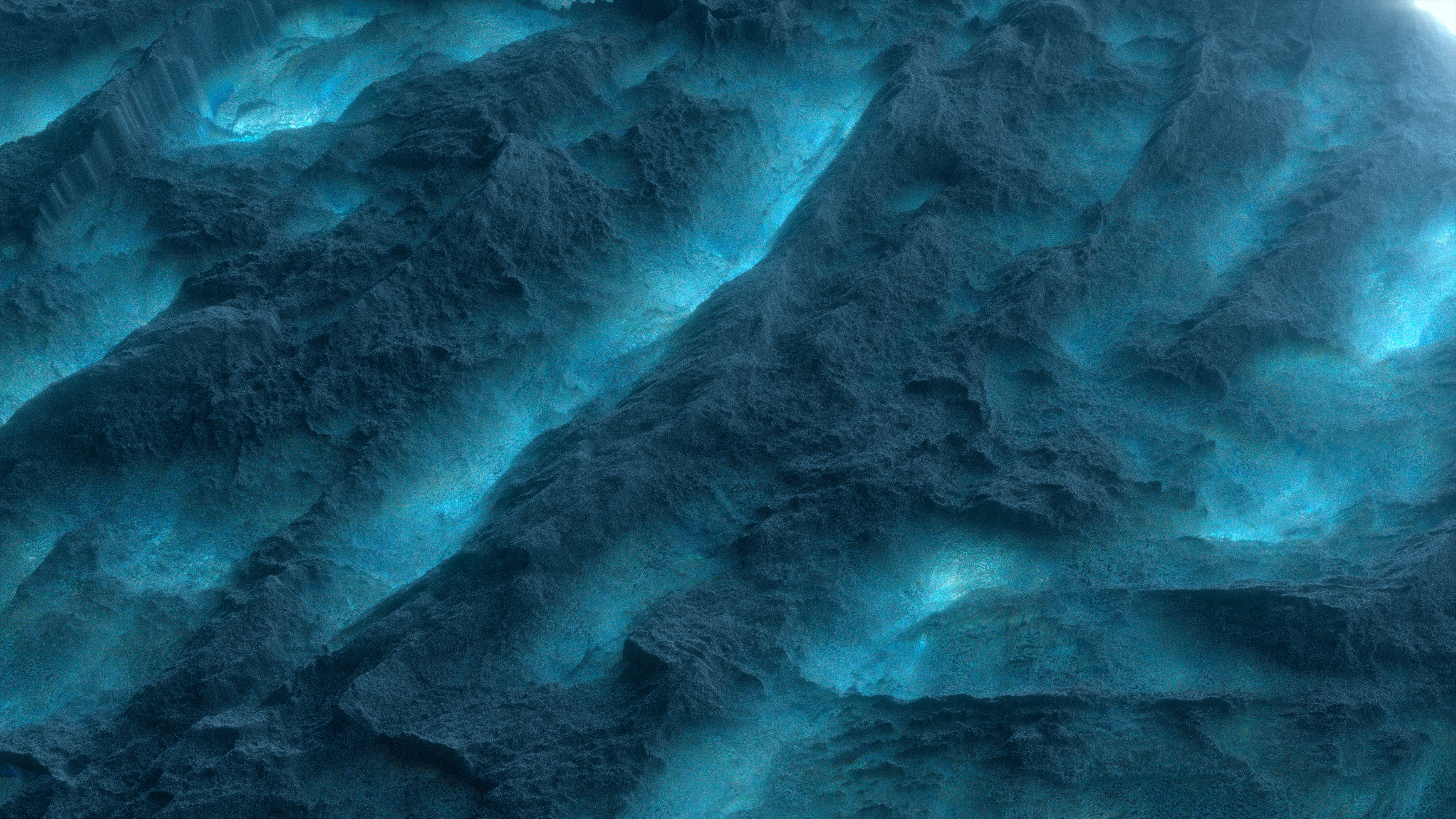
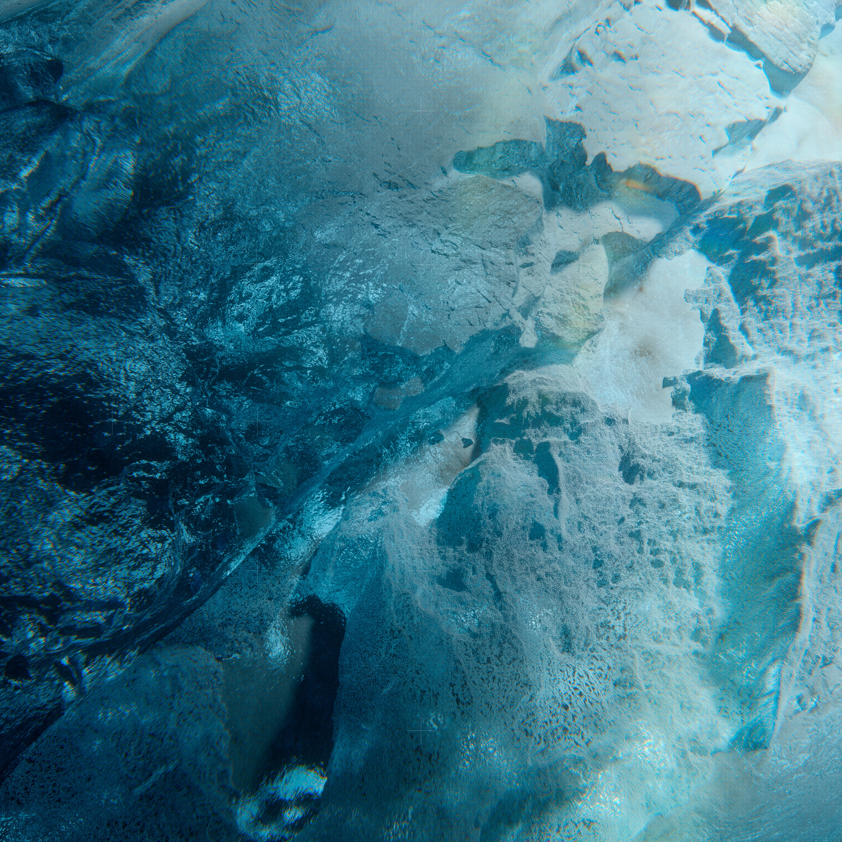
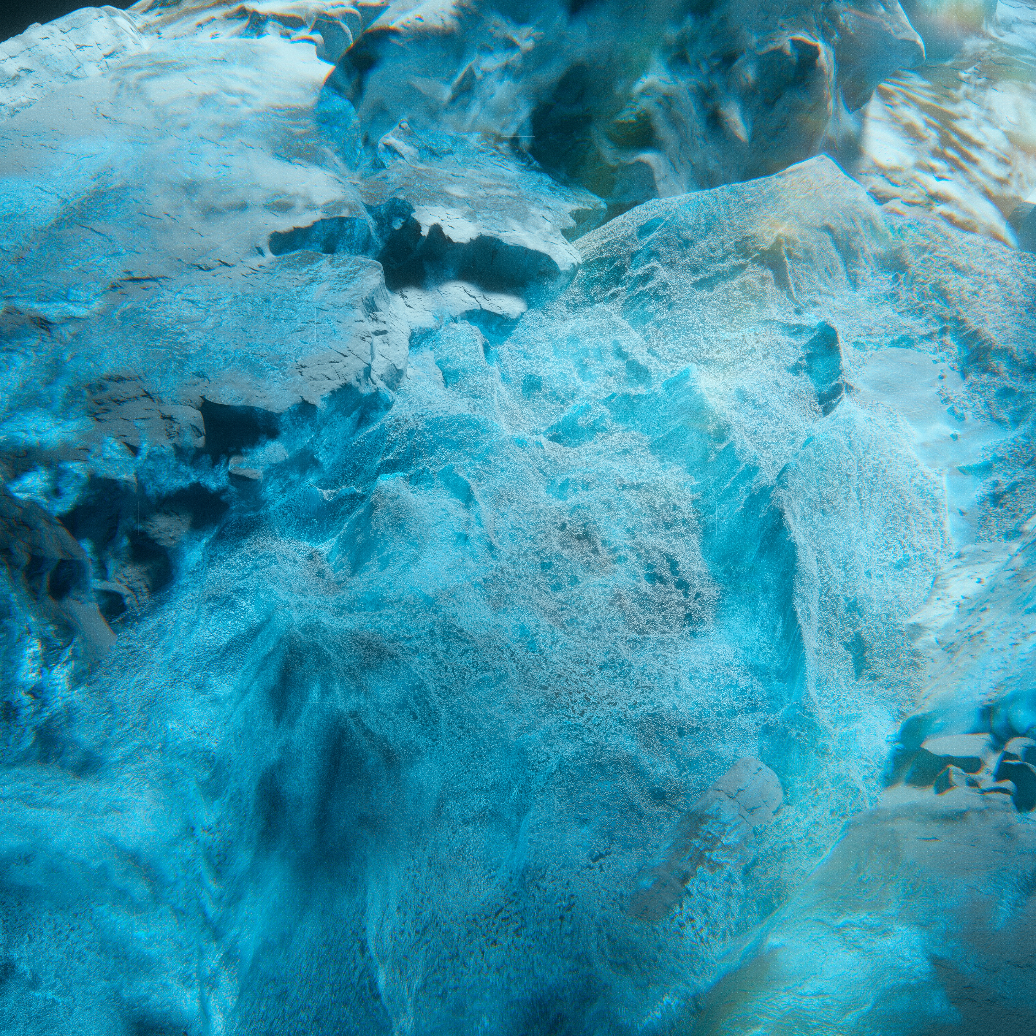
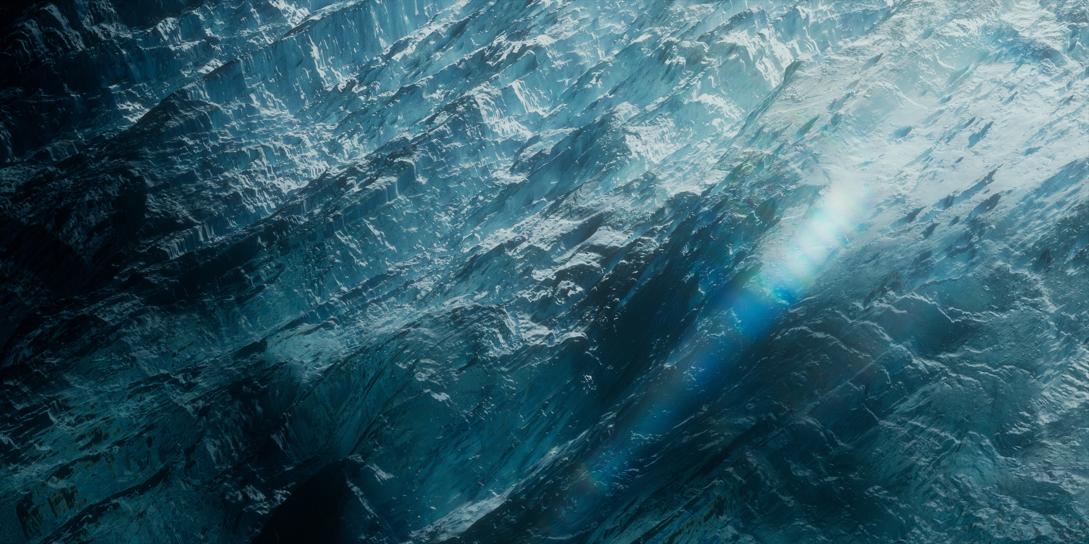
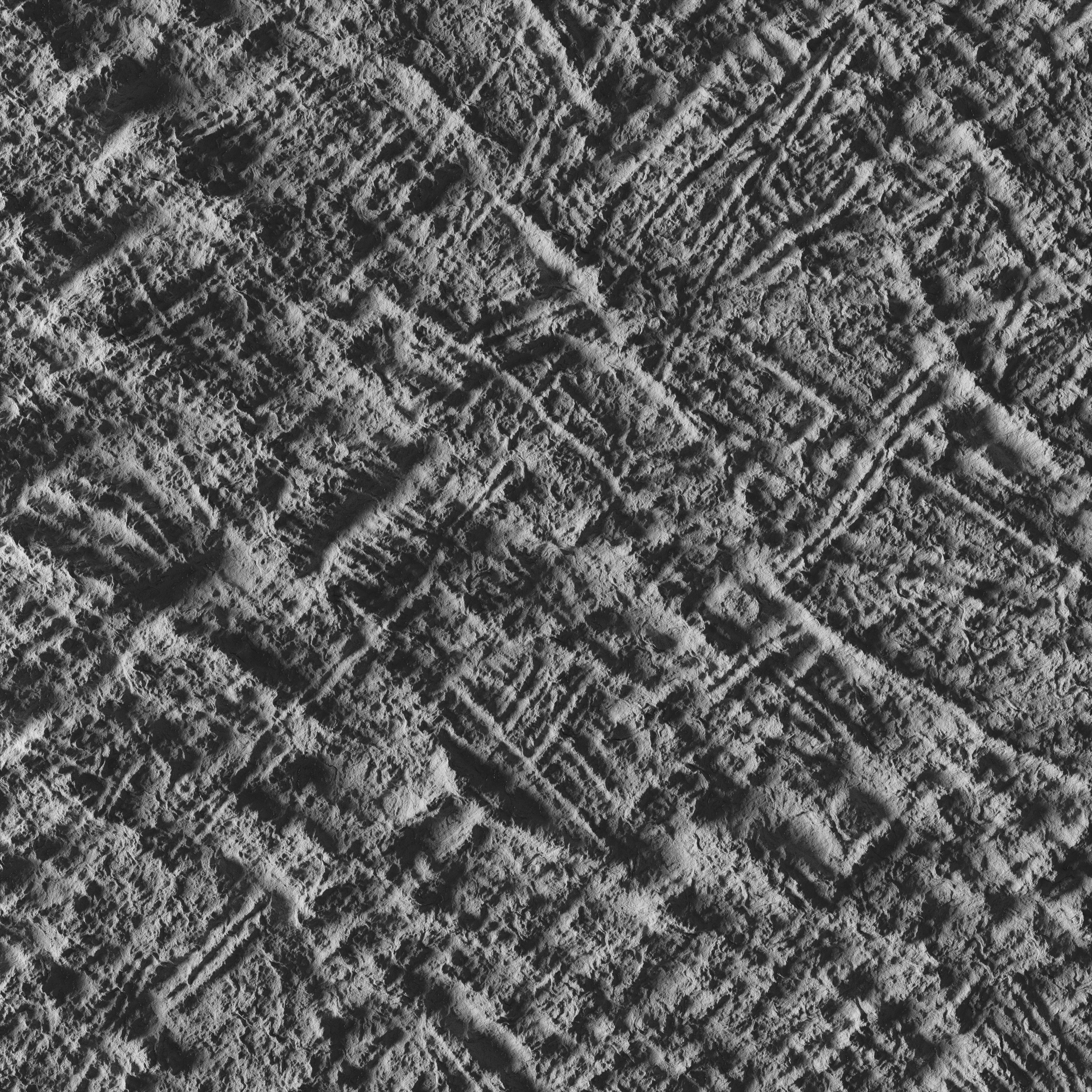
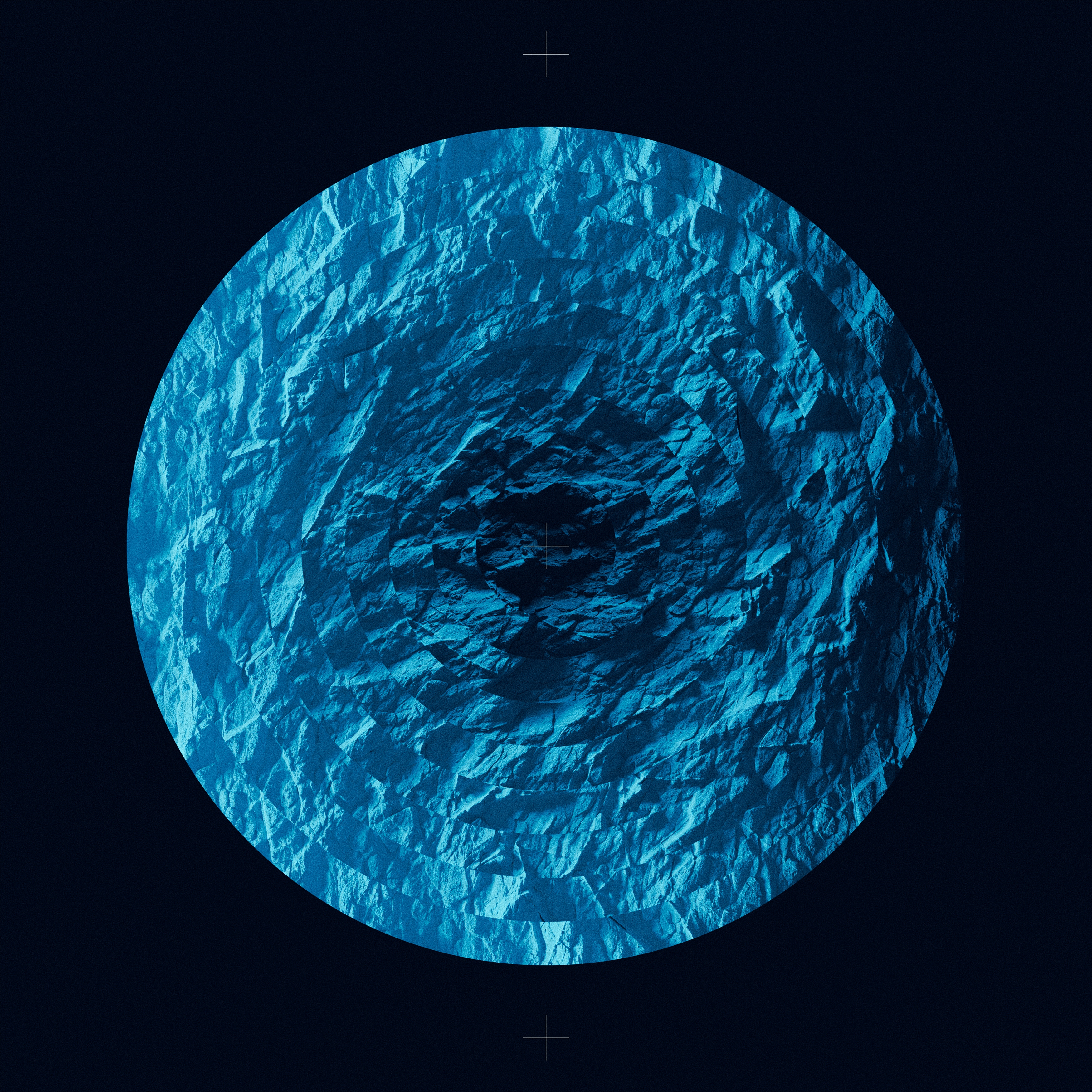
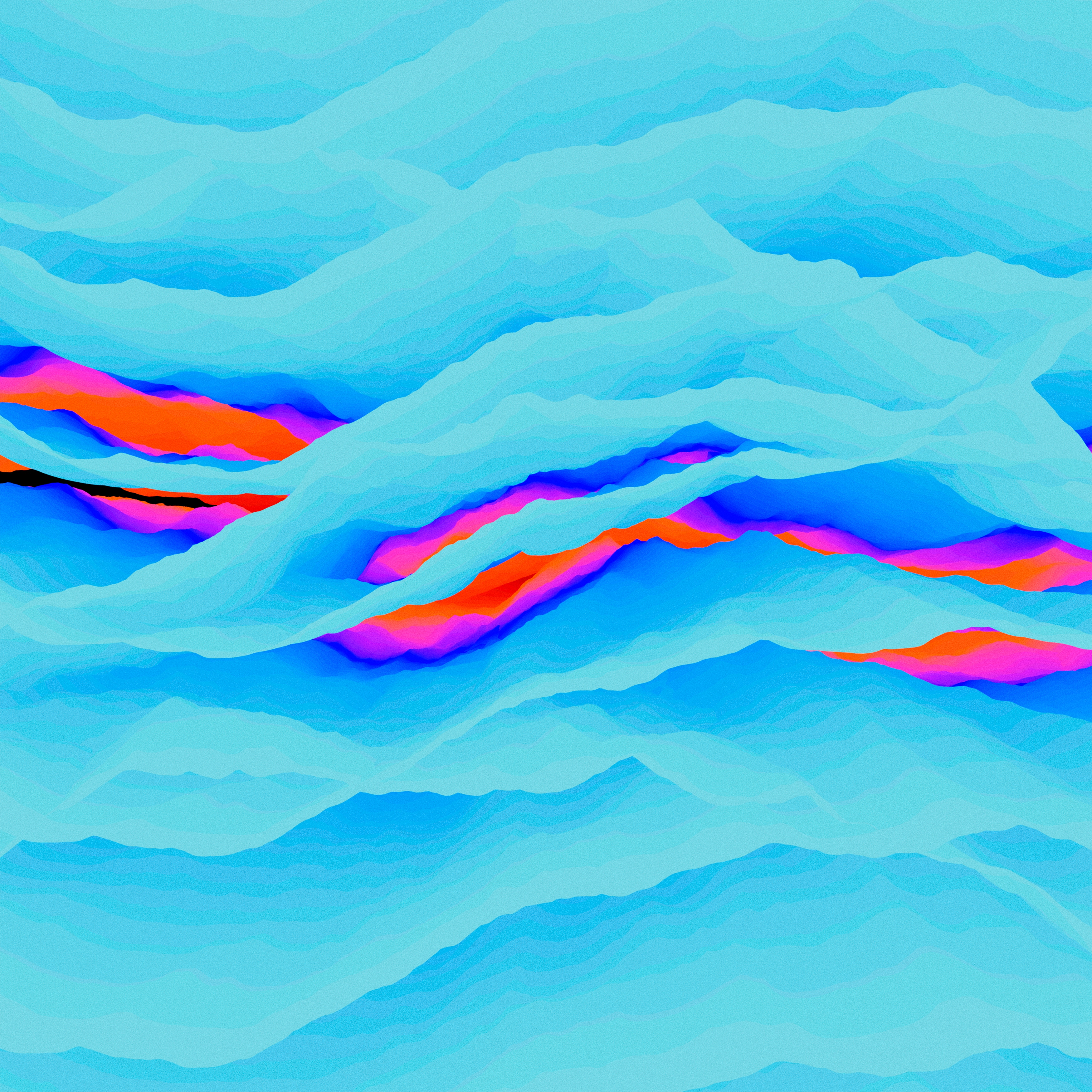
The third set of images ventured into a more abstract exploration, focusing on the textures and rich visual palettes of Europa's icy surface. This direction stripped away literal interpretations and instead leaned into the essence of the moon—its fractured ice, hidden oceans, and the intricate details shaped by extreme cold and time.
Inspired by Europa’s unique geology, the visuals embraced a textural approach, emphasizing the interplay of light, shadow, and form across the moon’s frozen plains. Crystalline structures, jagged fissures, and fluid-like patterns hinted at the dynamic processes happening beneath the ice—teasing the presence of water and the tantalizing possibility of life.
The color palettes became central to this abstraction, capturing the rich gradients of ice and water: cool hues of blues and aquas, punctuated by earthy streaks of brown and hints of white frost, evoking both beauty and scientific intrigue. This artistic approach celebrated the natural artistry of Europa, transforming its alien landscapes into something simultaneously familiar and otherworldly.
Through abstraction, these images aimed to create a visceral, emotional connection to Europa itself, showcasing its potential for discovery through textures, light, and color. By focusing on the moon’s most elemental qualities, the visuals invited viewers to feel the mystery, fragility, and grandeur of this distant, frozen world.





Posters
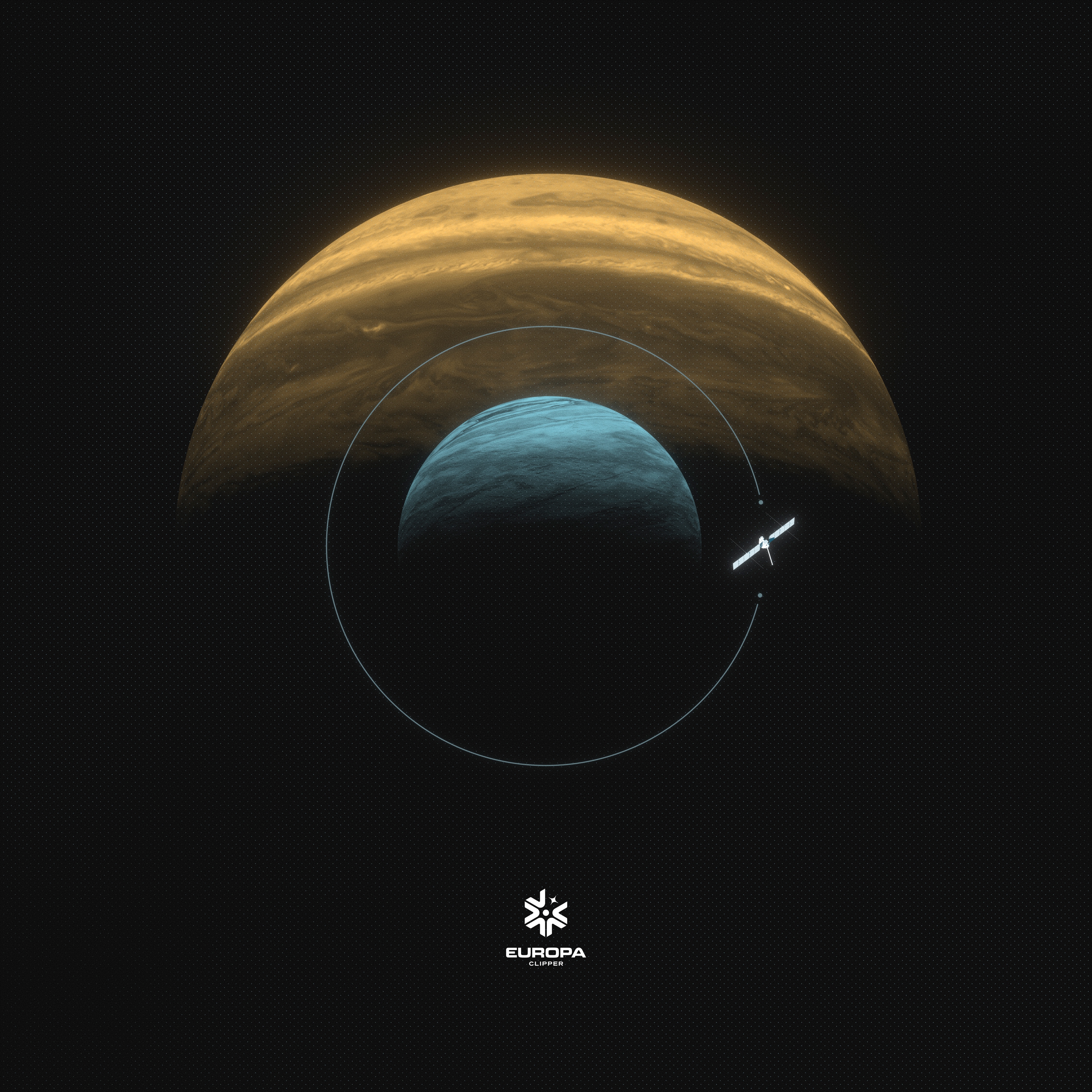
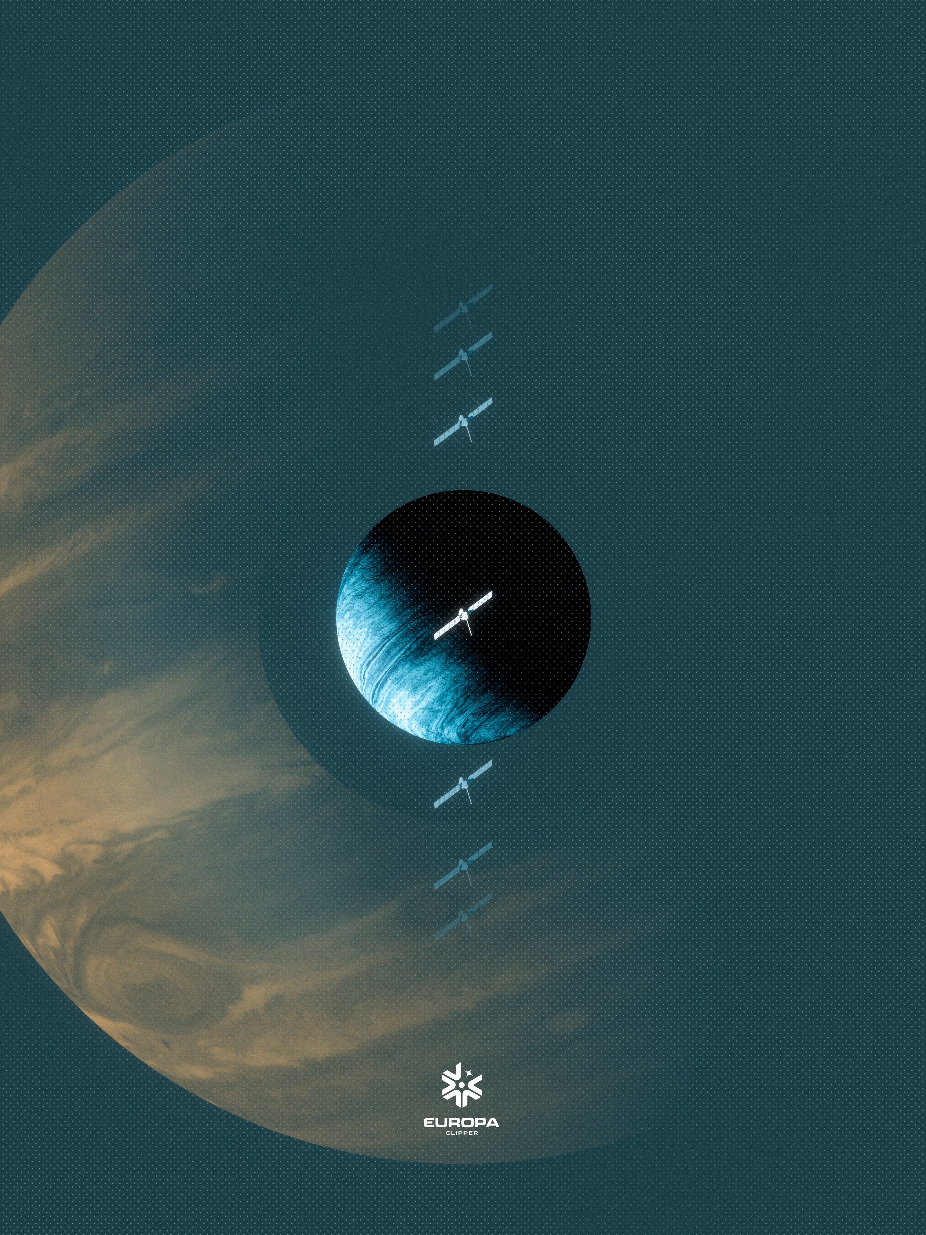
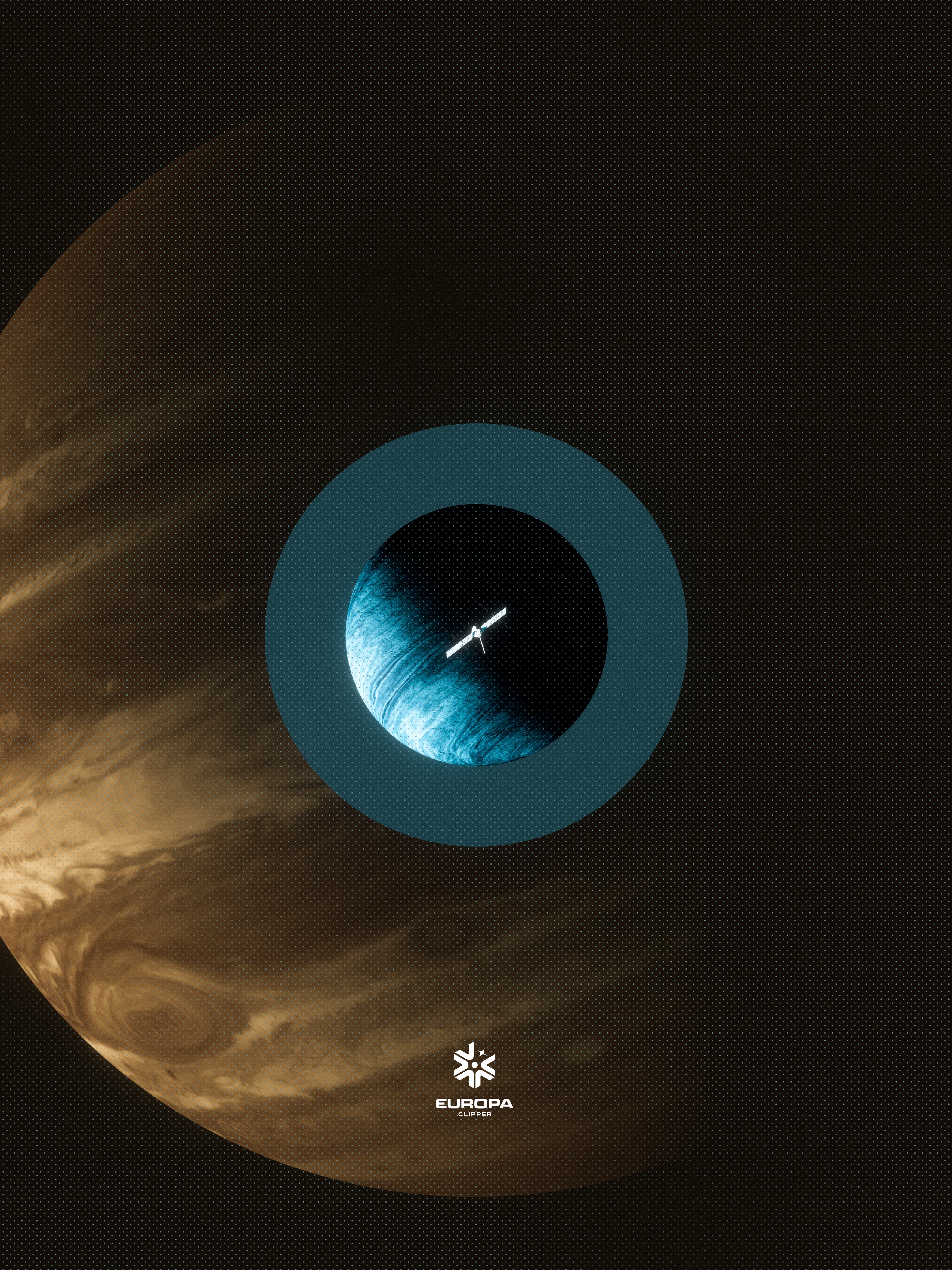
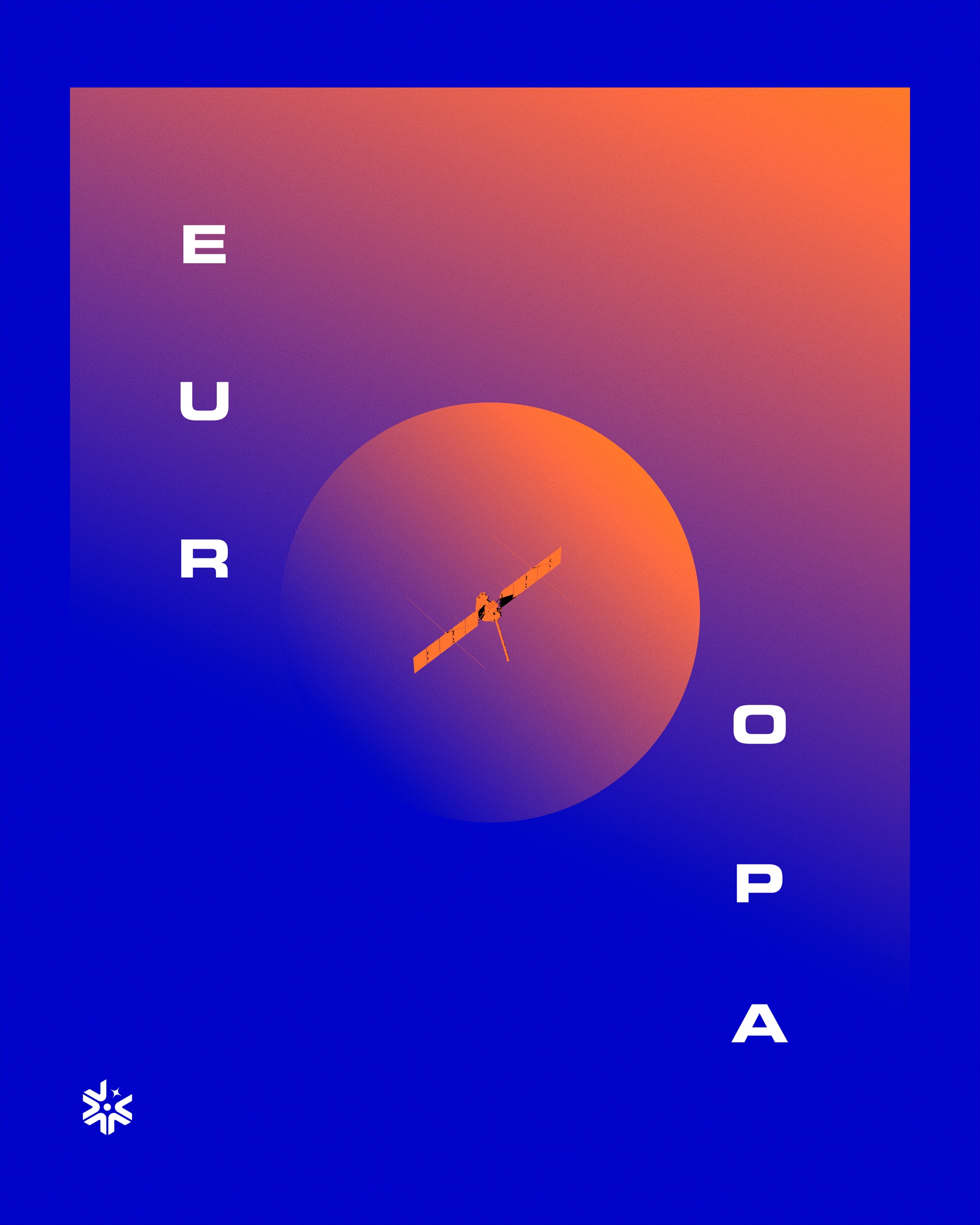
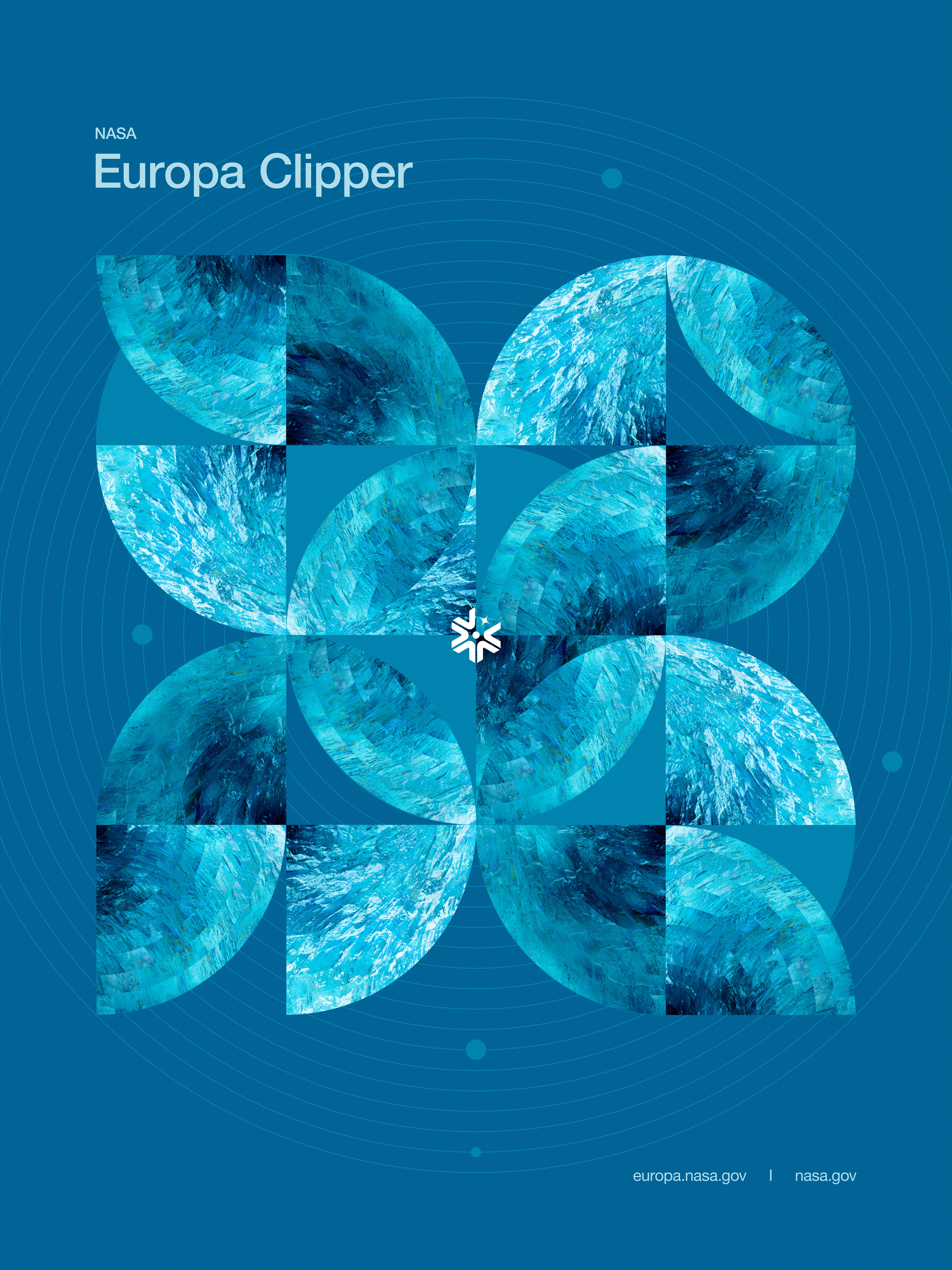
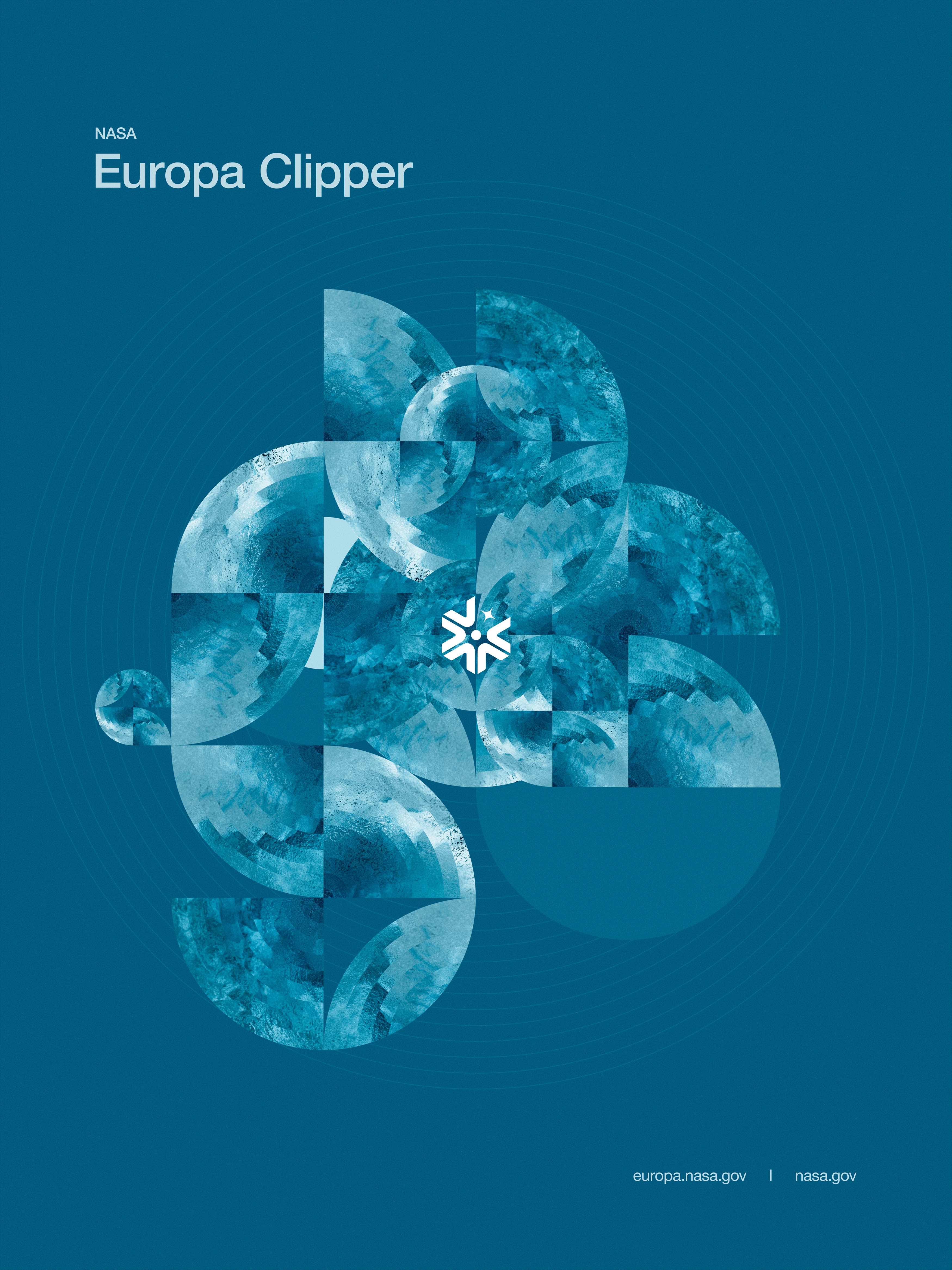
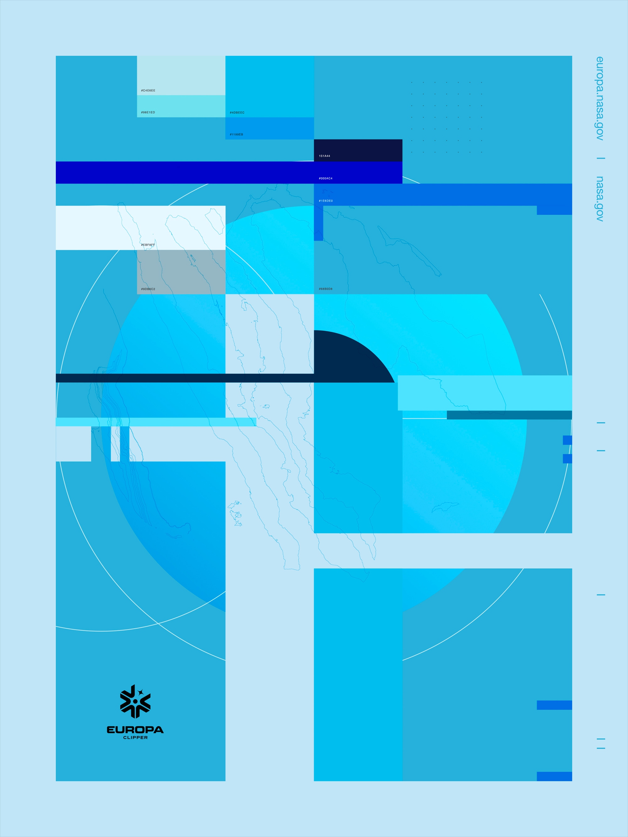
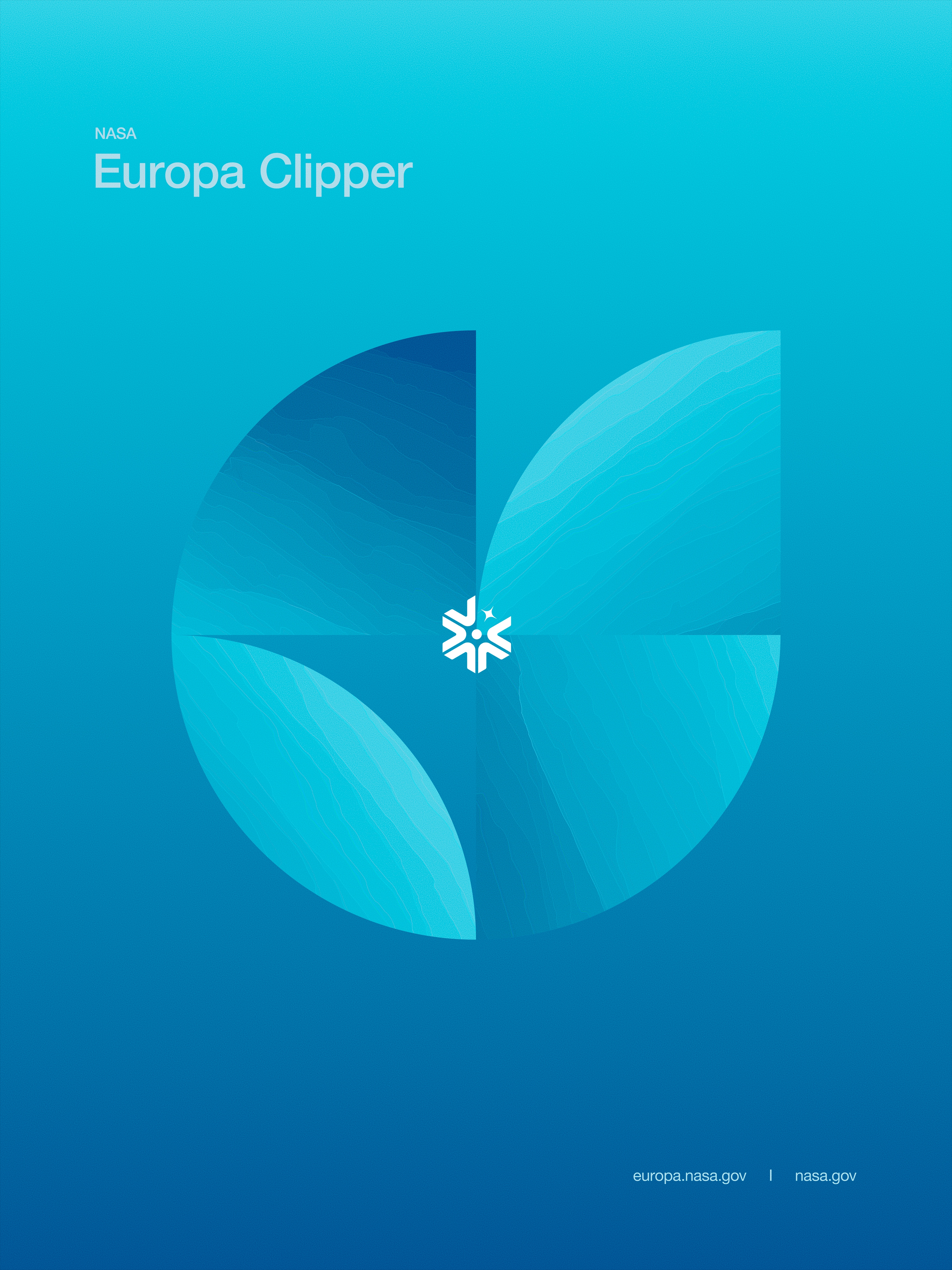
The fourth set of images took the form of a series of posters, meticulously crafted and rooted in the principles of graphic design and composition. This direction leaned into a bold, visual storytelling approach, combining striking imagery with carefully considered layouts that conveyed both the scientific precision and the aesthetic grandeur of the Europa Clipper mission.
These posters showcased a rich level of detail while maintaining a sense of clarity and balance, using strong typographic elements, clean lines, and geometric frameworks to complement the natural beauty of Europa, Jupiter, and the spacecraft. The juxtaposition of intricate textures—like the moon’s fractured ice—with carefully curated negative space created a dynamic tension, drawing the eye across the visuals and reinforcing the scale and significance of the mission.
Color played a pivotal role here as well, with palettes reflecting the icy tones of Europa, the deep, stormy hues of Jupiter, and the stark contrast of the spacecraft’s engineered form. These elements were arranged with a cinematic precision, creating posters that felt both timeless and modern—fit for galleries, classrooms, or mission briefings.
The result was a series of heroic, bold visuals that distilled the essence of the mission into a format that was accessible, impactful, and artistically compelling—reminding viewers of the beauty, mystery, and importance of this journey to a distant moon that could hold answers to life’s greatest questions.


Graphic
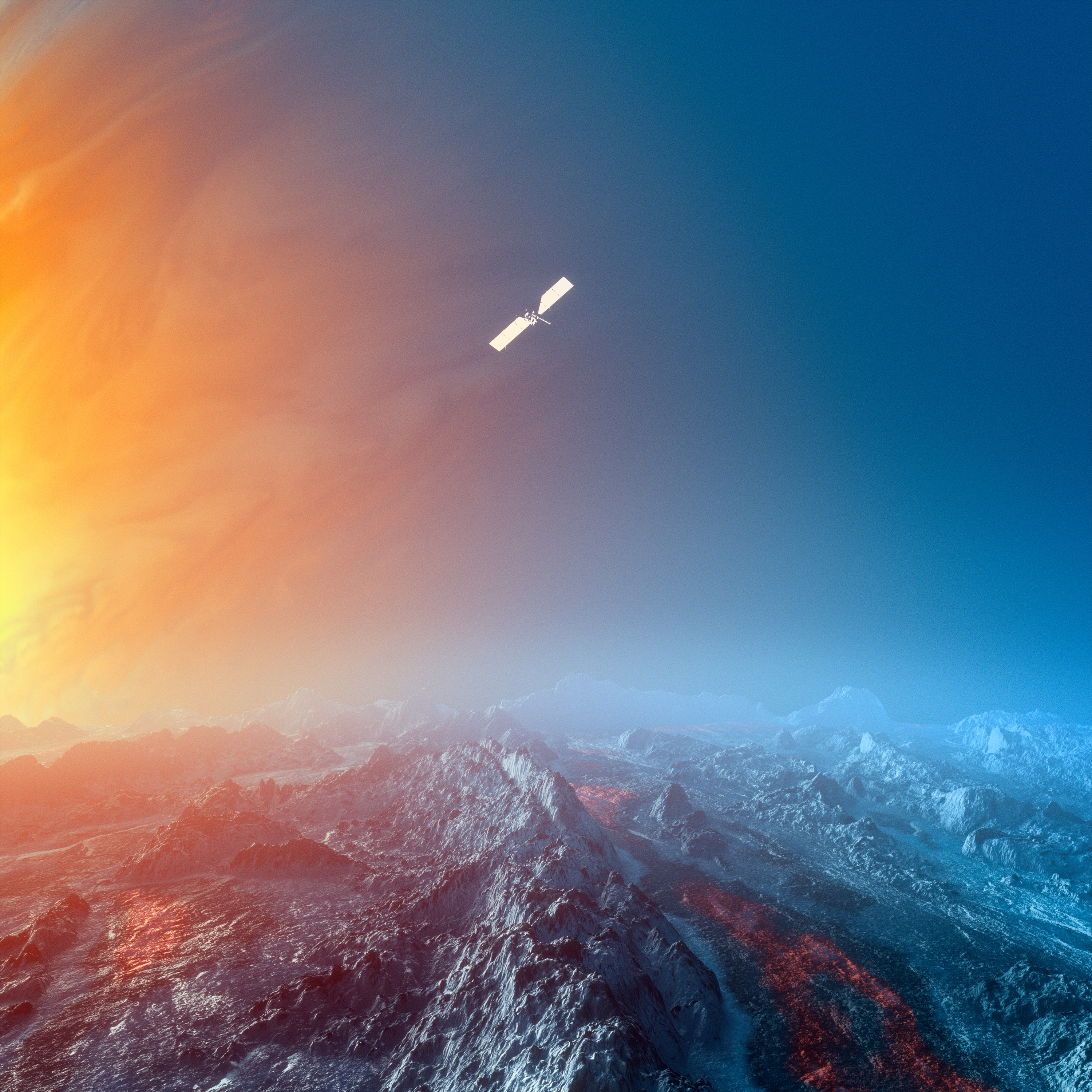
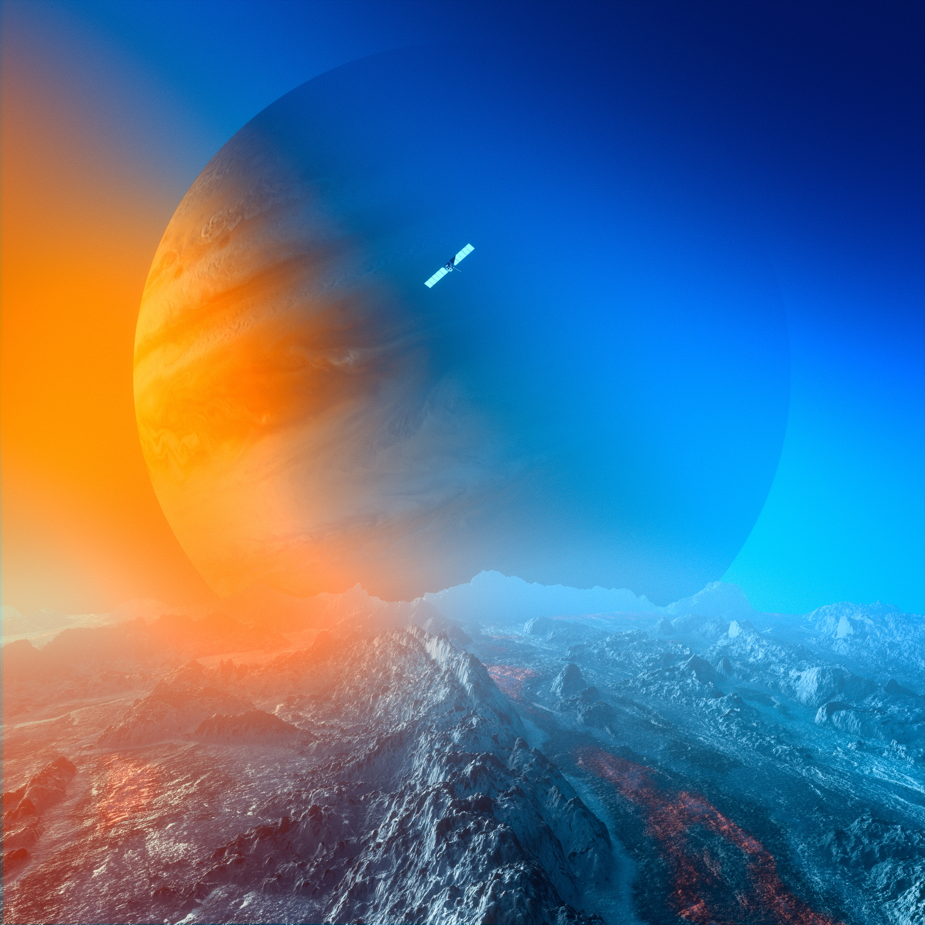
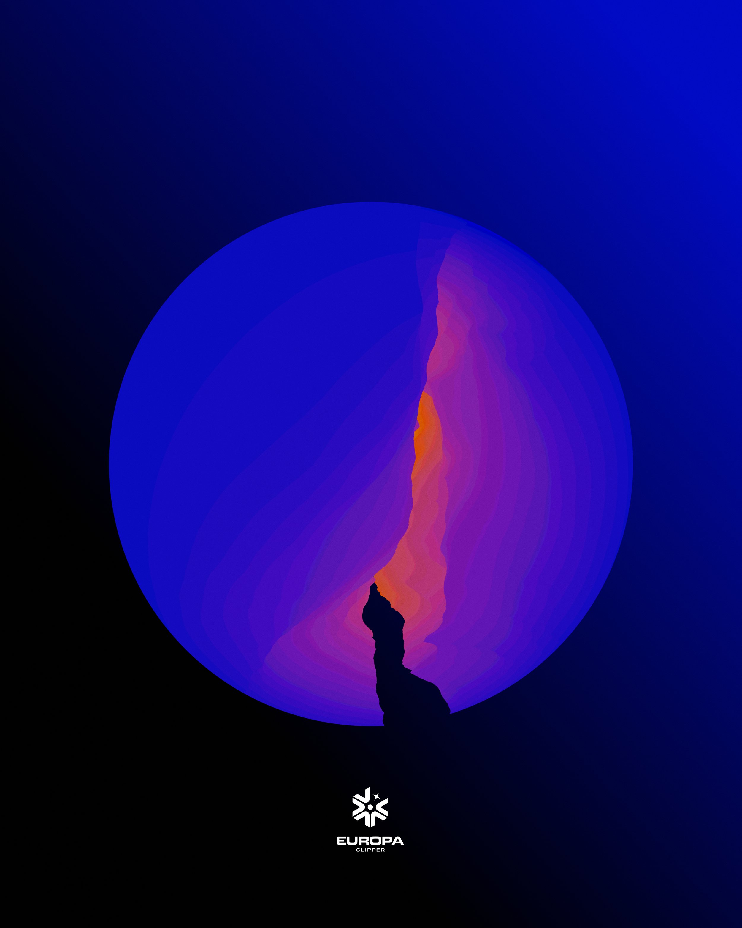
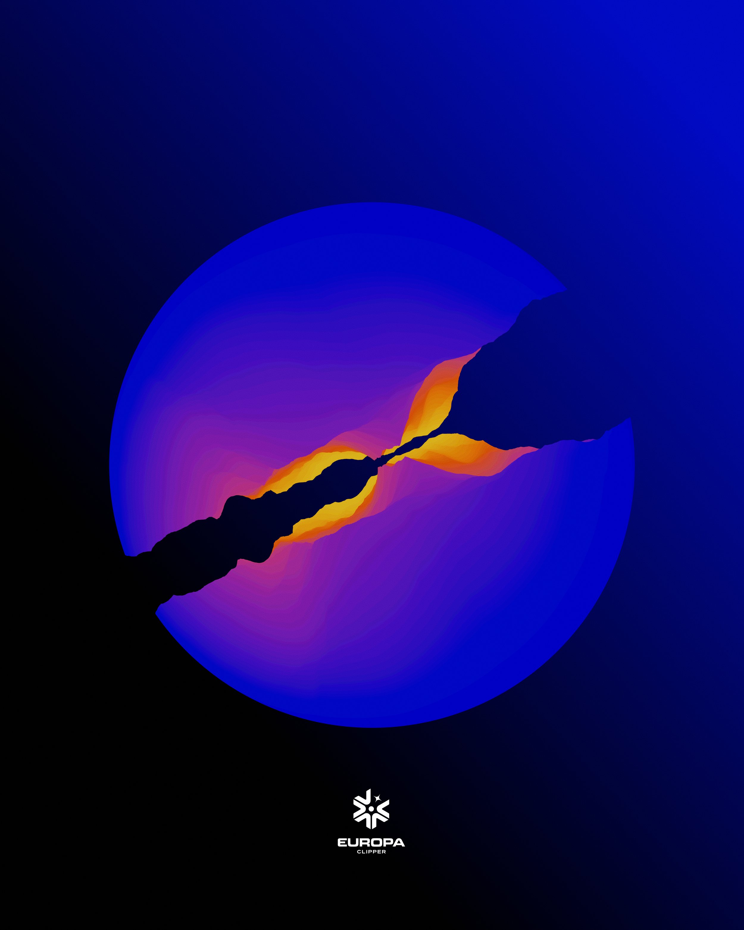
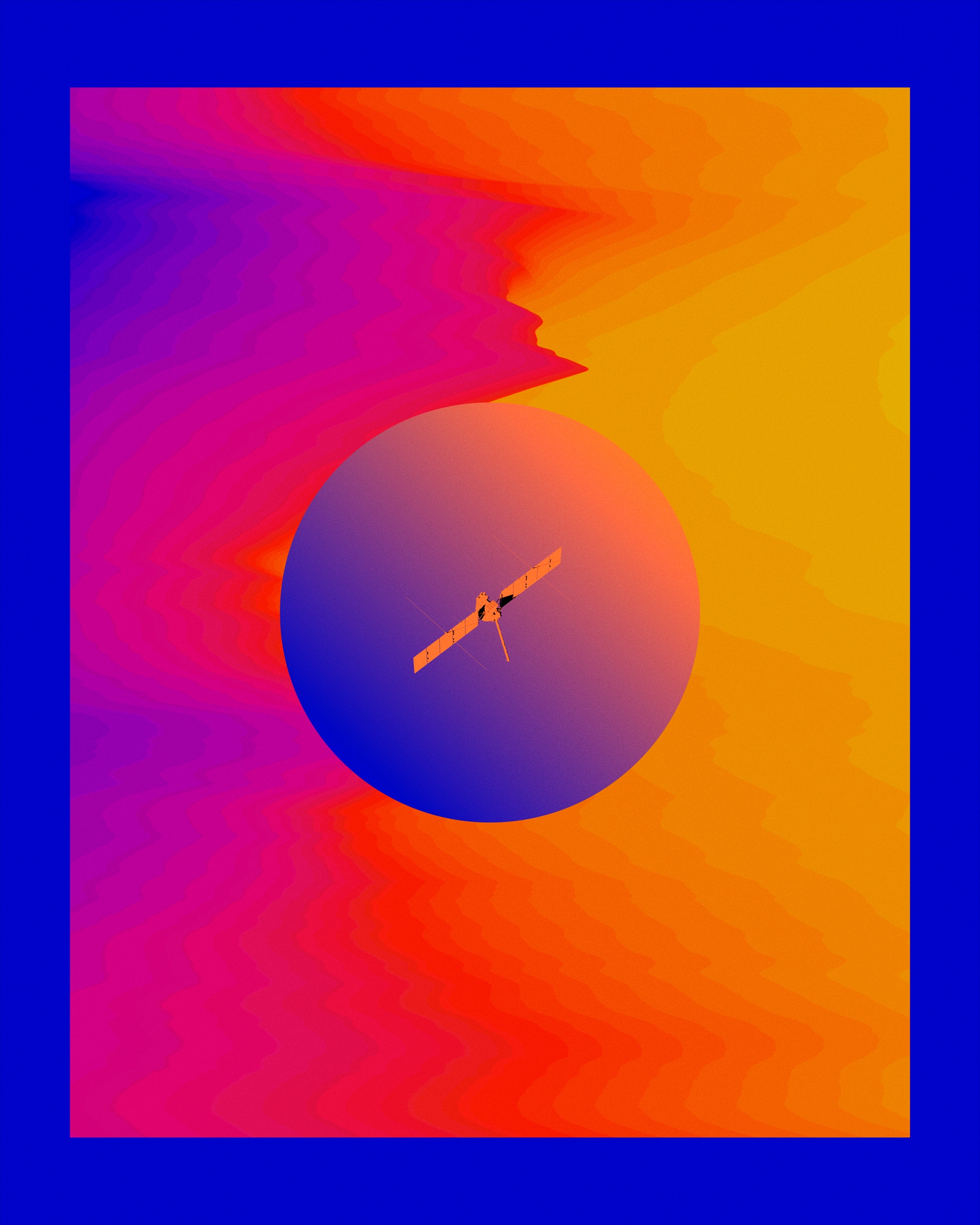
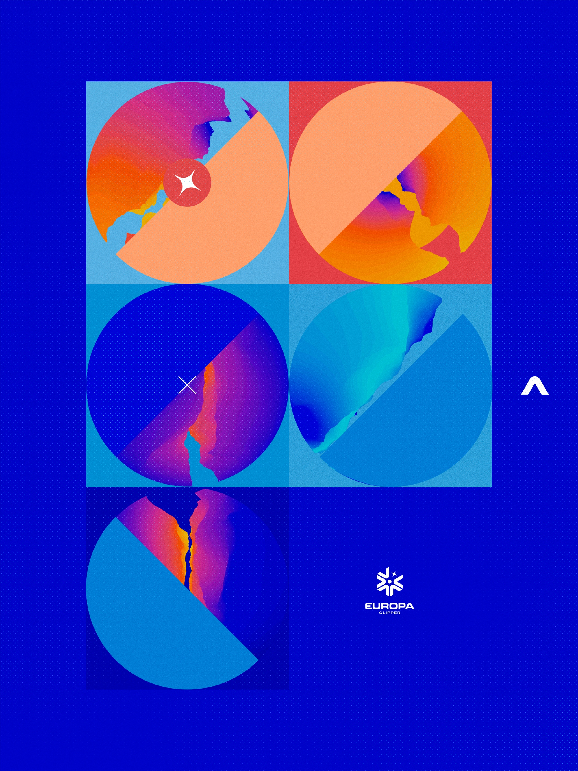
The fifth and final set of explorations sought to combine the abstract textures with the refined structure of the poster series, resulting in a rich collection of graphic explorations that felt both bold and contemporary. This direction embraced a flat design aesthetic while incorporating saturated, vivid color palettes to bring energy and depth to the visuals.
Building on the icy abstractions from earlier concepts, this series distilled Europa’s textures and patterns into graphic forms, presenting the fractured landscapes, crystalline ice, and flowing lines in a more stylized, simplified way. These elements were paired with the strong compositional principles of the poster series, integrating clean lines, sharp geometry, and purposeful typographic treatments to achieve balance and clarity.
Color became a defining feature here—moving beyond realism to explore rich, saturated hues. Deep blues, vibrant aquas, bold oranges, and hints of black and white created a striking visual contrast, making the designs feel dynamic, immersive, and modern. The result was a fusion of artistic abstraction and graphic precision, where the moon’s mysteries were reimagined through vibrant, iconic compositions.
This set of explorations offered a bold visual language that felt timeless yet contemporary—equally at home in scientific campaigns, digital art spaces, or immersive design installations. By merging texture, form, and bold color, it delivered a unique perspective on the Europa Clipper mission: a graphic celebration of exploration, discovery, and the beauty of the unknown.





Credit List
NASA Creative Director: David Rager
NASA Europa Logo Designer: Tobias van Schneider
Creative Director: Bradley G Munkowitz
Lead Designer: Toros Kose
NASA Creative Director: David Rager
NASA Europa Logo Designer: Tobias van Schneider
Creative Director: Bradley G Munkowitz
Lead Designer: Toros Kose